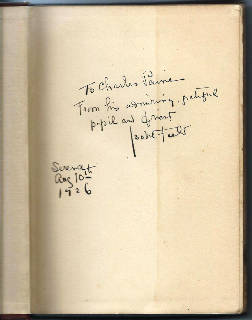
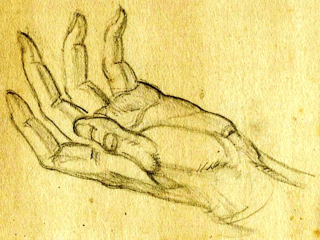
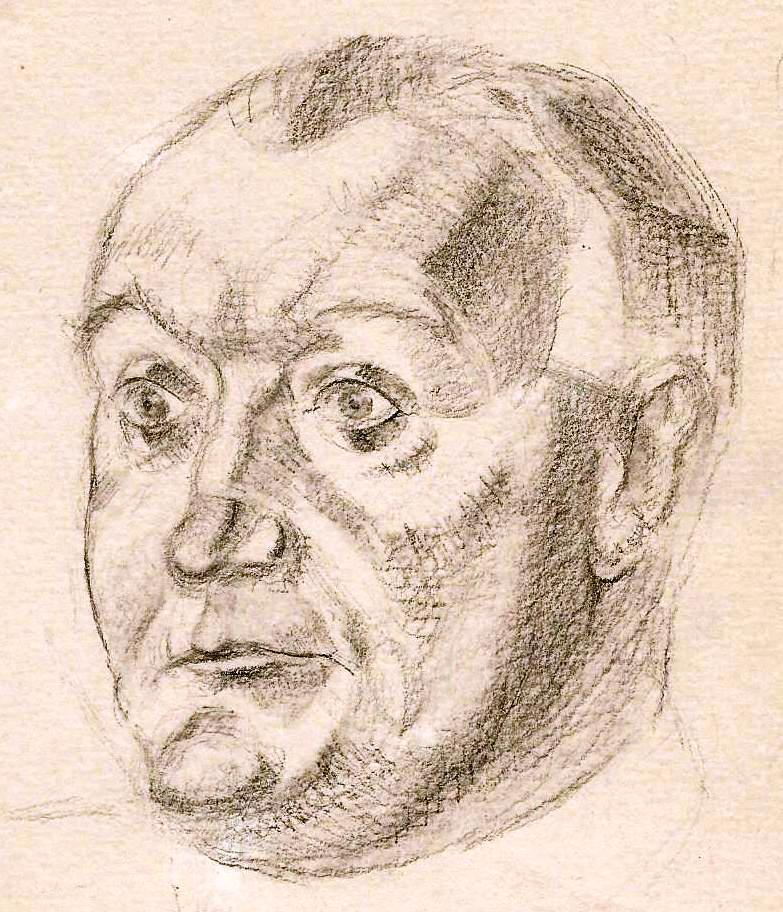
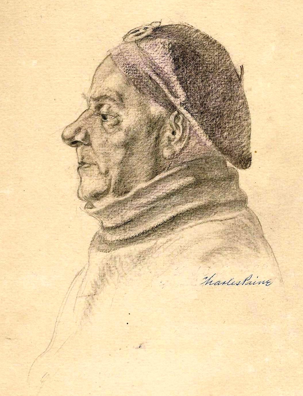
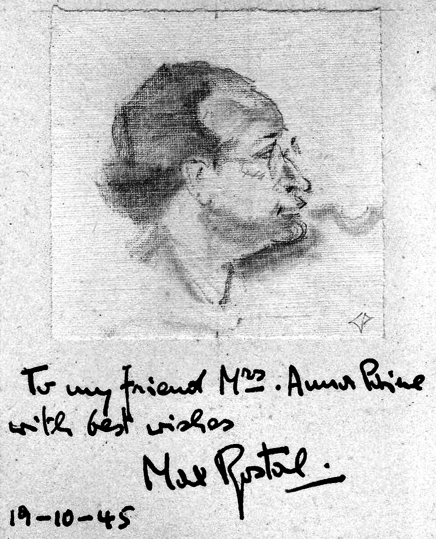
Following his return to England from California in 1930 Paine corresponded with Teuila. 17 of her letters, written between November 1936 and October 1948, are held by the National Library of Scotland. Some letters are undated as to the year. I have assigned a date to these by reference to the content.
13 November 1936 Serena, Carpinteria, California
My dear Charles and Jim*,
Won’t you please write to me? Strange that a letter from Pond Hill from Jimmie fell out of my old portfolio – Then I remembered a letter from Charles – with another and others written later. I looked it up. Remember I’m getting oldish and forgetful – so forgive me – but I will always remember you both – and the long day you came and spent in the garden. Your letters are so sketchy – and tell so little – when my interest is as great as ever. You will see by this little edge (black) to my letter that sorrow has come to me. My dear Ned – after twenty-two happy years – left me – so suddenly I am still staggering from the blow. He threw himself down for a Sunday siesta – and never woke again. He was in such good spirits and seemingly in the best of health – a long way to go. But oh my dears: That was on Sep 20th last – it seems so long ago.
My autobiography “This Life I’ve Loved” has been accepted by the English publishers Longmans Green and Co. The editor wrote ‘May I congratulate you on a delightful book?’ It will be a three dollar book with illustrations. I cried my eyes out when I got the letter that Ned was not here to rejoice with me. So you see I need a loving word from my old friends.
Affectionately yours
Teuila Mrs. Salisbury Field (aged 86 October 1944)
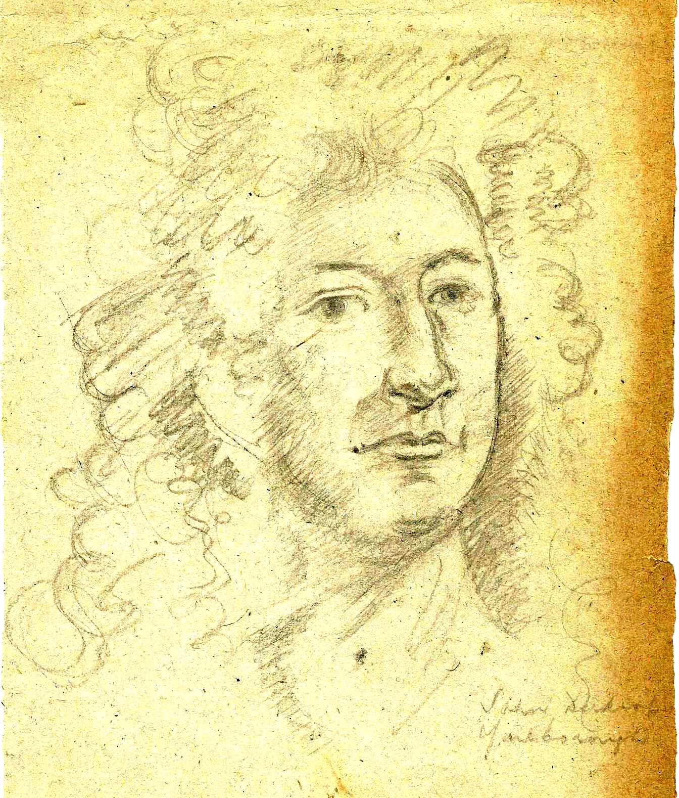
*cf. post 10 March 2018
13 December (1936)
My dear dear Charles,
You would be surprised to know how often I have thought of you these years since you left Santa Barbara – whenever I see something beautiful – like a single flower – that you taught me to examine and appreciate and find out its secrets ‘like Sherlock Holmes’ – Or the branches of a tree in a pattern against the light – ‘study the pattern of the light as well as the silhouette of the tree’ – You opened new doors for me on new delights. The other day I was shown some wonderful photographs taken by a man whose new hobby it is to magnify infinitesimal things – like a tiny insect’s wing – a feather – a cockle burr – a bit of dried weeds – and enlarging them and photographing them. I thought of you at once “How interested Charles would be – he would use some of these marvellous designs in his decorative work” – and I wished you were with us – to tell the photographer – and point out to him the beauty of the strange patterns. He appreciated them but you could have shown him much more than his eyes could see. I do hope and pray that you will wake up to enthusiasm in your work again.
Do not be afraid to write frankly and freely to me. You were so careful – so reticent that I was mystified. I cannot understand. I will read your letter once again – for the third time and then tear it up. But there is no-one near me who would ever read it even if I left it open on my desk. Do tell me please – as I understand it you could not get a divorce – what an unforgivable thing to send that ….. to your father! Have you and Jim parted for ever? Is your home with Anna? Thank God for her care of you.
I listened to the King’s abdication speech – and the tears rolled down my cheeks. How well you can sympathise with him. You too are denied what was denied him. Surely all this publicity should have some effect on the obsolete divorce laws of England.
It is not death that frightens me – what I mourn for is the companionship of twenty-two years – our foolish jokes and laughter – all the love and consideration that has surrounded me all these years. Ned even bought my hats. In New York he went into a millinery shop and said “I’d like to try on that hat” – and sitting before a mirror solemnly put it on his head. Then seeing the amazed expression of the sales lady he explained “My head is the same size as my wife’s – and I think this would just suit her. I’ll send her in to try it on” – I did and it was charming.
Strangely enough he chose a black dress for me when we were in NY. The modiste explained this – owing to the death of King George V black was the fashionable colour. I have never had on a black dress as Ned liked me in colors – but he agreed this I must be stylish – picked out the heavy silk crepe – came to superintend the fittings and my dear that was the dress I wore for mourning.
My book will be published in February – I’ll send you a copy. It is an autobiography and I’ve called it “This Life I’ve Loved” – Ned was so interested (in it) and when I received the letter saying Longmans Green had accepted it – it nearly broke my heart that he wasn’t with me. That’s what I mean – I miss him every minute. Something funny happens – or something interesting – and he isn’t here to laugh with me or exclaim or “celebrate” as he would have done over my book.
I have had a little shelf put up just outside my studio window where I put little dishes of seeds – and now as I write a bird is having a good breakfast. I can sit here and make drawings of the birds as they come for meals. They are getting quite tame.
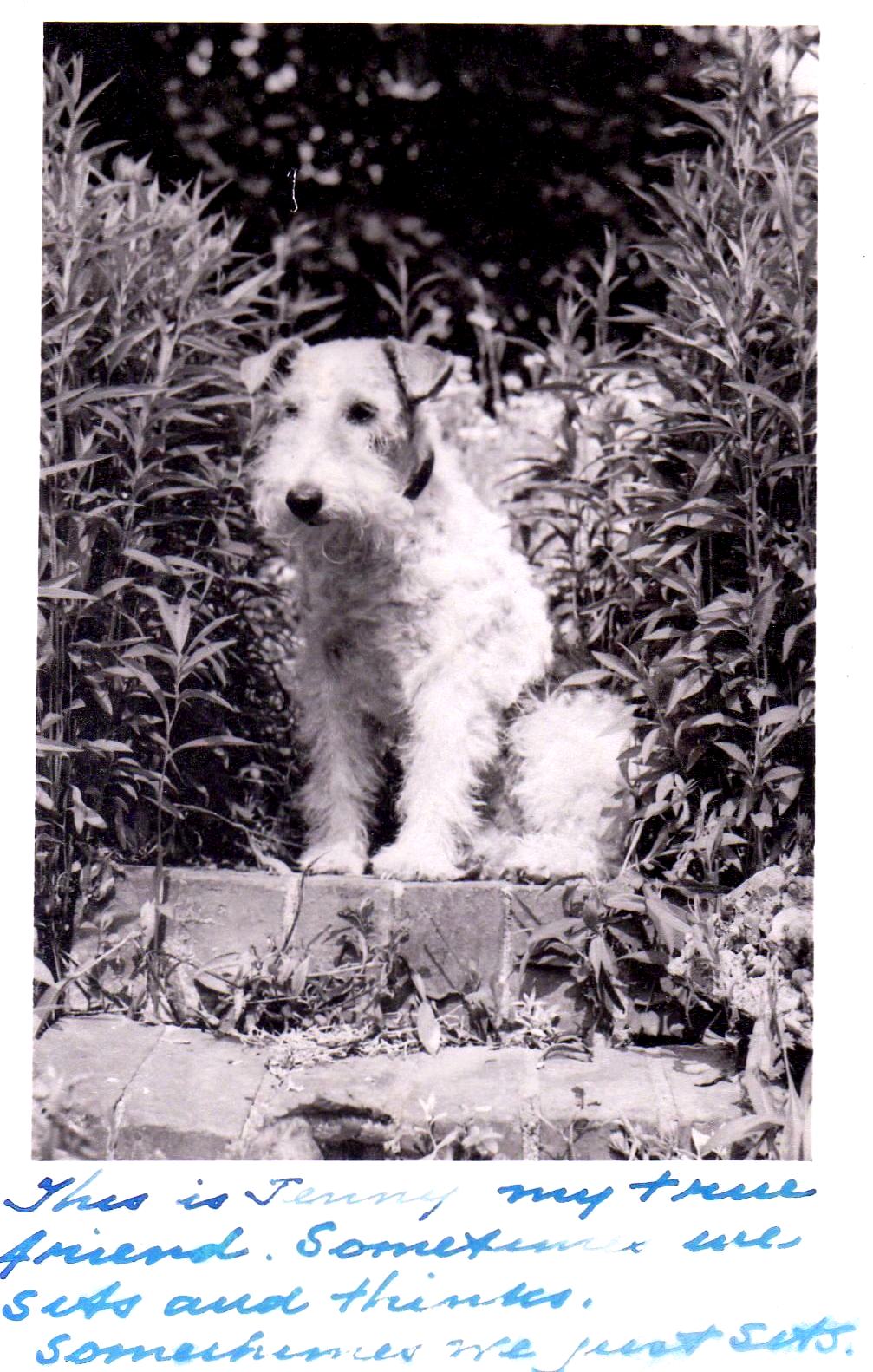
Our last little cocker spaniel Susie died of old age some time ago – and the house was very lonely without a bark in it. The other day driving home from Los Angeles we passed a place where daschund puppies were for sale. I bought a “miniature” one – a female three months old. It’s amazing what a lot of charm and laughter one little puppy can bring into a sad and lonely house. What breed is your little dog? Oh Charles dear you have such a great and glorious talent – not only to create beauty but to inspire others. I am so glad that you are beginning to “want to draw” – with a home and peace and love you should be able to spit on your hands and go to work with enthusiasm. God bless you.
Your friend always
Teuila
15 January 1937
Oh my dear Charles,
I got your cable this morning – no yesterday afternoon – and I’m so sorry to tell you there isn’t a chance.* The poor old Community Arts is all shot to pieces. The rich people who supported it were so disgusted with Mr. McLellan** they have all retired from it. The Carnegie Ins. doesn’t give it any more help and how it manages to survive is a mystery to me. I have always regretted that you did not stay on in California for times are picking up and you might be running the San Francisco School of Arts by now.
I’m writing this as fast as I can to catch the air-mail. I don’t like to cable NO – If the answer were yes I’d gladly do it.
I’ll write more later.
Yrs always affectionately
Teuila
* I presume that Paine asked Teuila if there was an opening for him to return to the Community Arts in Santa Barbara.
** ‘MacLellan first shows up in the Santa Barbara City Directory in 1927, the same year he’s listed on the Board of Directors for the School of the Arts. His title is listed as Secretary and Manager, and he is also Manager of the Music Branch of the school. He remained on the Board of Directors through 1934. He held a number of other positions in Santa Barbara including a short stint on the City Council, and ended up as an insurance broker and real estate agent. He disappeared from Santa Barbara records after 1967 and died in Los Angeles on 17th November 1969. I found nothing more than the School of Arts to connect this MacLellan to Paine or Fletcher. We have nothing here to suggest any arguments Fletcher may have had with the Board of Directors, other than the hint given in the letter to the Rosenwald fund. It is possible that the School’s archives, housed at UCSB, may provide some information.’ (Roy Regester, Santa Barbara Independent archive)
24 January 1937
My dear Anna,
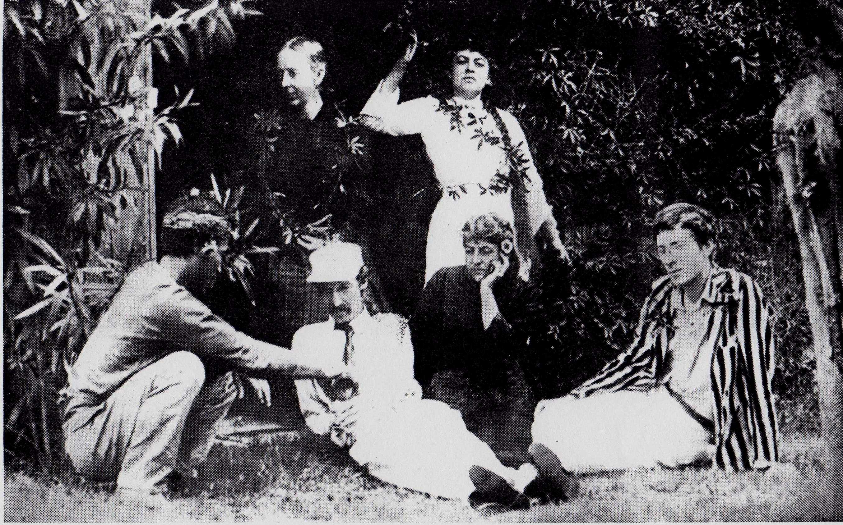
Thank you for your nice friendly letter. Now will you be still kinder and tell me a coherent story of what has happened? Charles refers to tragedy and hell – and yet seems to be happy now – and I’m really bewildered. It’s not idle curiosity for I really love and admire Charles for the great artist he is. When he came back here and we went to see him at the Fletchers I remember saying – on the way home – “I wish I could get him away from everybody. He’s too sensitive to be tangled up in other people’s emotions. None of them are considering his interests” – The Fletchers involved him in their quarrel – which was none of his. And though Jim loved him madly she wanted to get him back to England where she wanted to live. None of them realised that he had a great chance here – and none of them helped him – in fact they did everything in their power to hinder him.
Please tell me why he and Jim parted – or could you? Nobody here that I know knows any of you – though on all sides I still hear regrets that the greatest artist that ever came to California was allowed to leave – was really driven away by one assertive bumptious creature* who finally got control of the Community Arts and ran it into the ground. There is nothing left. The man who is now at the head of it has great difficulty getting the little money offered him – and has a hard time to get on. He’s no painter – in fact there are none now in the Community Arts. How it manages to stumble along is a mystery. I never hear of it any more – and nobody is interested. The rich people who supported it lost interest long ago – and the Carnegie Foundation withdrew their allowance.
I hated having to send that discouraging letter to Charles – but a cable with the word NO would have been worse.
Tell me something about yourself. Are you too an artist – in colours and stained glass? Russian or English? I want to get acquainted with so good a friend of Charles.
Yours cordially
Teuila
*Probably MacLellan
10 February 1937
Serena
My dear Charles,
Forgive this paper but it is much easier to write on than the other – where I always forget and run over the edge. The other day I read in the morning paper a glowing account of a(n) exhibition of Santa Barbara artists at the Faulkner Gallery. So I went down to see it. Oh my dear – you never saw such a pitiful lot of daubs. It was a(n) insult to the public to put such things in frames and lure people in by flattering comments. Young Julian* was as good as any of the others and better than many – but his work is hard and he has no idea of values. It is a pity he can not have lessons from a real painter as he is a hard worker and his mother is ambitious for him. Admiring friends hurt him a lot I’m sure. Truly there was not one picture in that whole exhibition that I would have in my house. I long to see some good modern paintings.
Will you ask Anna to do me a favor? I want a catalogue with prices of Sheffield steel — dinner knives-pocket knives — pruning knives – that sort of thing that I can send for myself – and choose from the catalogue. Can this be done without too much trouble?
I’ve just come back from town – while there I went into Osborn’s book store where I was told they had bought a hundred and fifty copies of my book and had sold half of them already. I was asked if I would come in and autograph them – and I said yes but what would I do if I sat at a desk pen in hand and nobody came? I’ll send you a copy of the American edition when it comes out – but if you want the English edition you’ll have to get it for yourself. It seems funny to me to have two editions. I saw the jacket of my book – with the big Teuila flower – the sweet scented ginger – as the decoration. It is charming – I’m so pleased with it.
Do write and tell me how you are getting on – and don’t leave out any of the details. With best wishes always.
Yours affectionately
Teuila
* Paul Julian (1914-1995), aged 21 in 1937. He was born in Illinois on June 23, 1914. Raised in an artistic home, Paul was the son of artist Esther Julian. By 1922 he and his family had moved to Santa Barbara. His mother was his first painting teacher; she was both a student and a teacher at the SBSA. He later studied with Lawrence Murphy, Millard Sheets, Belmore Brown, Charles Paine and at Chouinard Art Institute. He worked on animations at Warner Bros. (where, among other things, he was the voice of the Roadrunner [“Beep, beep!”]). He also worked at UPA Studios. He continued living in Santa Barbara during the Depression and in the 1940s. In 1937 Julian, under the auspices of the Federal Art Project, painted a large mural at the County Hospital, “Picnic on the Cliff” which shows some young families enjoying a picnic on a famous Santa Barbara locale. “”The cliff was real…” he said. “My brother and I had wandered all over the Mesa in the late Twenties before there were houses on it.” That same year he had an exhibit in Santa Barbara, in the gallery of the Art and Frame Shop “…where he exhibited not only the marine scenes for which he had previously received acclaim, but paintings of figures in which he experimented with more complex composition, similar to that found in the hospital mural.” The painting of this exhibit may be the one which Teuila’s letter refers to (though this exhibit was apparently held in the summer of 1937). {“Noticias” Vol. XLI, No. 3, pp. 56-58 – a journal devoted to the study of the history of Santa Barbara County) He was an employee of the Federal Art Project. He was active in the Los Angeles art scene into the 1950s. He died in Van Nuys, CA on September 5, 1995.
1 April 1937
(Americans move quick ???) Serena
My dear Charles,
Please forgive a typewriter but I have it all set up and it will be much easier for you to read. Your long letter interested me very much. Oh my dear – I wonder if there ever was an artist – a real one whose life was smooth and easy. Think of writing a screen story the best you ever did – and then find it badly cast because the studio had actors under salary — or worse still to find another person’s name on it with yours — one who livened up the story with some “Gag” – that are revolting. Then in play writing my son wrote the best play of his life with Lafayette as the hero — and it was all ready for production — fine actors engaged – when it was all called off because the French repudiated their war debt and a Frenchman would be an unpopular hero. I could tell you millions of heart-breaking stories like that. What a grand idea the Japanese used to have – to give an artist a lovely house – plenty of money and let him work along his own line. My book will come out in America on March 17 — I haven’t heard yet about the English edition that will be published by Michael Joseph.
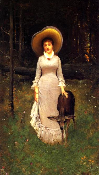
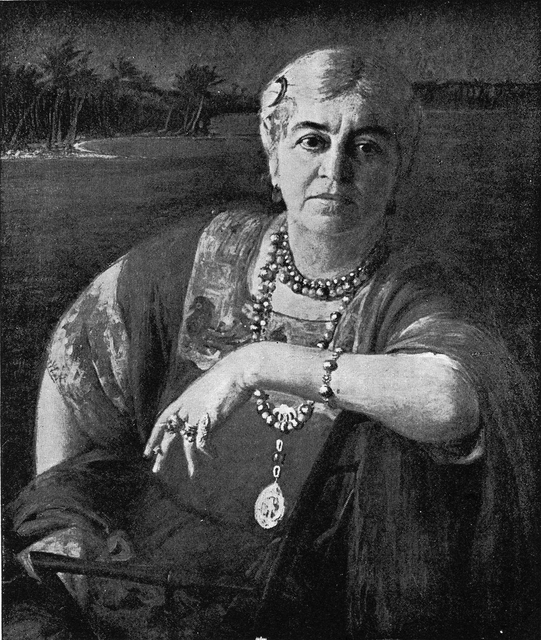
I sent twenty or more photographs and sketches to Longmans and they chose eight – now Mr. Joseph has sent for them all as he wants more illustrations. It will be funny having two editions. I’ll send you one of Longmans books. They have used my portrait by Herter for the frontispiece.
How happy I would have been if I could have cabled “Come at once”. I’d like you to see my murals — that you instructed me about by long distance. I was able to criticise a mural Lilia Tuckerman was doing with something like intelligence. No perspectives – and the cut-out as important as the design – other teachings of yours which she had never heard of and was much impressed.
The papers are full of horrible stories of floods and strikes but life at Serena flows smoothly on. A little dog – a daschund is a great help to cheerfulness – and Minnie (a real fat darkie momma C/) is of course the same rock of strength. She just came in to say “I’m going mit the dog out”
With love dear Charles
from
Teuila
P.S. Reading this letter over it sounds very unsympathetic – Other people’s troubles don’t make yours any easier. Believe me I do feel for you and it exasperates me that cheap work should be preferred to yours. I’m hoping and praying that something good is coming your way – as a great and joyful surprise – and when it does nobody would rejoice more sincerely than your friend. Teuila
May 25th [1937]
Dear Charles and Anna,
I like beautiful people – I said once to Ned that strangely enough my best friends had always been beautiful – he rather spoilt that by declaring “When you like people you think they are beautiful.” Well anyway I loved Anna’s portrait – and as for you Charles I always thought you were beautiful. Anna’s face is so lovely – it’s no easy thing to write this letter. Austin comes in to ask where the key is to the chest of tools – the wood-carving tools you got for me years ago. I left off to search frantically. Now I think I remember the key is on the ring that I put in my safe deposit box at the bank. Discussion – not very complimentary about the care of keys — Now they are off – I hear the car door slam – and I can go on in peace.
You do such nice things – I loved the gay little book marker with the crown on it – and I am reminded of you so often as I pick up my book and find my place. Then yesterday the stamps came – of the king and Queen. I kept the inside one and gave the one on the envelope to Mary, my daughter-in-law. We sat up all night to listen to the Coronation ceremonies – isn’t that amazing – and were thrilled by the drama of it all and wept a little from sheer sentiment. Austin and Mary have motored about England and love it and have many friends there. When the prince – I forget his name – married the Italian Princess Mary was in Nantucket. She got up at four in the morning – and wrapped in a rug she sat and listened to the wedding ceremony. Her description of that was delightful.
So many people are telling me to write more of my life – bring it up to date – now you ask the same. You don’t realise that the only excuse I had for publishing an autobiography (“Who does she think she is?”) is the fact that I was related to R.L.S. Now if I go on it will be all ME. Of course Ned Field and Austin and Lloyd too – but though they are well known they are not internationally famous as Louis was – and is. One thing I like very much is so many write to me that they are re-reading Stevenson again.
Hollywood friends on vacation in Honolulu told me they went over my tracks there. From my cottage on Nuvan(w) Avi out to Waikiki stopping at the Palace – even going around the back colonade where I sat while the King had breakfast – then they took a boat and went to Maui to see the old plantation Ulapalakua. While in Honolulu they sent me a box filled with Hawaiian delicacies – guava jelly – Papaia jam – kona coffee and the like with a golden lei on top!
Damn the Royal Academy – Don’t they know a good thing when they see it? Oh you – I sent you a pack of my cards for Anna. I can’t tell them for her myself as she has to shuffle them and make a wish – but she can easily tell her own – and yours – and may your dearest wish come true.
I am re-reading your letter. Strangely enough the rare and lovely face of Anna doesn’t suggest a class at all. I think I would like her very much – indeed I do already for your introduction with the background of her family was charming.
I am in a dilemma – whether to mention or not the fact that the same mail that brought me the book-mark also brought a long letter from Katherine (Miss Jim) – I couldn’t help him thinking of your (?) Shelley or Keats – (I rank you with the immortals) how valuable that letter would be to future historians. As it is it only embarrasses me. However I’ve lost it – or mislaid it – so I won’t have to answer it – and yes it seems discourteous not to. So many people live their lives with a constant fear of “What will people say” – that I’m thrilled to know people who don’t care – at least I hope you don’t care – and I wish you happiness and peace and prosperity.
With love from
Teuila
23 August 1937
Serena
My very dear Charles,
I do hope you are better by now – if you were only nearer I could run in and see you – and bring you a dish of my own Tamales – I’m making a batch of them today – real chicken – tamales – all wrapped in corn-husks and steamed – as different from the bought things as home-made pie and the kind you’d get at the grocers. Did you learn to like them when you were in Santa Barbara?
Last night I saw the most beautiful thing – I thought of you – and what a glorious picture you could make of it. There is a new out-door theatre here – a place cut out of the hills. A semi-circle of seats rising one above the other. Across a wide space is the stage – behind that the mountain rises and there is a road along the summit. Looking from the benches of the amphitheatre is like this [a rough sketch Ed.]. Along the top of the mt – at night by moonlight there came a procession of white Arabian horses and their riders – The mountain was softly lighted and along the summit came the lovely horses winding down to the corral. they were like spirit horses descending from Heaven. A lovely moon helped the scene – and as there was no light on the stage one did not see it – Only the horses – It was breath-takingly beautiful.
We have had a three-day fiesta with booths – parades – stage-coaches – cow-boys and forest rangers – dancing in the streets and the pageant in the ‘bowl’ with the horses.
My son and his wife are with me and they were delighted with it all. Now we are pretty tired and willing to rest a bit. It seems strange that Santa Barbara should have such a happy peaceful frolic when such terrible things are happening in the world. In the midst of the parade an air-plane soared over – head the lights showing against the sky. A beautiful sight but I thought of the horror air-planes are making in Spain and China! How I wish you were here in this peaceful spot. Europe is getting very dangerous. We read the papers anxiously but the news is so confusing and contradictory it is hard to understand.
My scrap book of reviews of my book is filled to the brim and there isn’t a bad one among them! I’m getting a little shy of the word ‘naive’ – also when I tried on last year’s hat and found it too small for my head you can imagine the comments made by my family.
When we were visiting in Hollywood a maid at the house told our hostess it was so nice to ‘see a mother and son so congealed’ – and added that most of the sons she knew were ‘nit for nothings’ – when I told that story to a friend she said a lady describing a fancy dress ball said her son went ‘in the garbage of a bishop’ –
I have a little shelf outside my studio window where I scatter seeds. The birds come and are so close I can draw them – just now a mocking bird is sitting on the rose bush trying to make up its mind and to come and get something to eat.
I’ve looked everywhere for your last letter for I know there are things in it I’d like to answer but I put it away so carefully I can’t find it! Anyway this brings you my best wishes for your health and your success – Give Anna a kiss from me and tell her to take the best of care of my dear Charles.
Affectionately
Teuila
25 September 1937
Serena
My dear Charles,
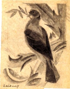
It is a lovely sunny afternoon and I’ve just read your long and friendly letter when you were getting well enough to walk again. I was so glad to hear from you but oh why did you use such a terrible faint pencil so that I could hardly read your letter – even with the aid of a magnifying glass. You – who live in England where they have the finest pencils in the world. I remember you gave me one once that I kept and used until it wasn’t an inch long. Talking of that – I’ve kept everything you ever gave me. Austin was turning out an old chest in my studio looking for some photographs and came across the sketch of a bird. It is in colour chalk – so gay and perfect you expected the little thing to burst into song at once.
I can’t understand why you haven’t a crowded class – there never lived anyone who could teach so well – for you some way arouse enthusiasm not only in those who want to draw – but in the pupils who are sent to your class by their parents and arrive perfectly dull and unresponsive. I’ve seen them after three lessons eagerly calling out ‘Come and see what I’ve done! Tomorrow I’m going to do …’ that sort of thing. I know you made me want to try my hand at every form of art from stained glass windows to iron grille.
I wish I knew how these Englishmen who come over here to lecture get their jobs. I know one who was paid 4000 dollars for three months at a College to give lectures on Shakespeare! He lived at the College and had his meals there so he must have left with his $3000 intact. How I wish you could get a job like that – and what you could teach would do a lot more good than a knowledge of Shakespeare. Anna asked me if I thought you could paint – What a question! My dears I never knew anyone who could do it better – not only painting but drawing and wood carving and stained glass window work and any mortal thing you turned your clever hands to. In the old days when genius was recognised you’d have been given a Cathedral and told to go ahead and decorate it – and what fun you’d have had.
Have you ever heard of San Simeon?* It is Mr. Hearst’s estate on the coast – the most magnificent place my eyes ever beheld. He has bought the insides of Cathedrals and palaces in Italy and elsewhere – and built them inside his grand houses. When Ned and I visited him I saw Italian workmen very busy. Where the mosaic didn’t fit or a carved ceiling was too small they had to fill in with replicas which they were making themselves – and they were having a grand time doing it.
When I visited the big moving-picture studios in Hollywood the people I envied and admired the most were the artisans – the men who built the miniature cities and ships – and designed scenery villages – wandering through a sort of warehouse I saw a lovely old door of carved wood – and looking closer I saw it was made of papier-mâché or I was told it was. The Chief Artisan said to me ‘We have more fun than the actors – We are told what is wanted – but no-one shows us how to do it’ – ‘What do they want?’ I asked – and he laughed ‘Anything from a fleet of miniature men-of-war to a castle on a rock with mountains behind it’ – Never the same twice. You’d love that kind of work – and golly how you could do it!
The little dog that runs this house is a daschund – that isn’t the way to spell it but you know what I mean. Her name is Mitzi and a little while ago I went out to see what she was whining about – and learned that she wanted a string bean. One was given to her and she ate it greedily – raw. I never knew such a dog. She’s healthy and lively so the diet must agree with her.
I can’t remember if I sent you an interview in the News Press – if I did throw this one away. I thought it might amuse you. The other day I got a review of my book from Hobart Tasmania.
With love to you both and all my good wishes for better luck.
Affectionately
Teuila
* Home of William Randolph Hearst. Xanadu in Citizen Kane
Undated [1937]
Mrs. Salisbury Field Serena Carpintaria California
My dear Charles,
The pruning knife has not come yet but it will probably appear when I’ve sent off this letter. I sent you a cent – for it would be a tragedy if anything could come between us —–
‘If you love me as I love you No knife can cut our love in two’
I have received catalogues, of courtesy from England and America thanks to you. A friend of mine and her husband (an Englishman) are on their way to London for the coronation – and I gave them several of the catalogues with a description of what I want and they will get them for me. I know they will because I expressed a wish for an Edward VIII mug and now I have one on my mantelpiece. Oh dear I had one with Queen Victoria’s picture on it – a relic of the Diamond Jubilee – but it got lost.
I hope you have received my book by now – the American edition. I wonder what the English publisher will do with it? I’m sure of one thing he can’t make it any more attractive – on the outside I mean.
The reviews have all been so good my head is fairly turned – and it is now the second edition – before the month is out (It was on sale March 17th).
I do hope Anna is out of the hospital and much better in health. I think the worst suffering there is – and I have gone through several kinds – is to see one you care for in pain and be unable to help.
It is a glorious California day. The little shelf outside my studio window – that was your idea wasn’t it? – is full of little birds coming for the grain I scatter there every morning. With the window shut I can get close enough to them to make very careful drawings.
My son* and his wife bought a Ford car and are motoring across the continent singing ‘California here I come’ – And am I agitated? it has taken the form of house cleaning – and I’m putting things away so neatly I’m sure I’ll never find them again. I’m a little nervous about my daughter-in-law spending the summer with me. I love her – but she is a neat Yankee house-keeper and her house is spotless. Minnie and I are not in her class.
We have a little dog – Mitzi six months old. We’ve had her since Christmas as I gave her to Minnie as a present. A daschund is as different from a spaniel as possible. She is lively gay mischievous full of the devil – but has none of that endearing charm of the spaniel – but of course we are getting more and more devoted to her. Minnie spends a lot of time ‘going mit the dog out’ –
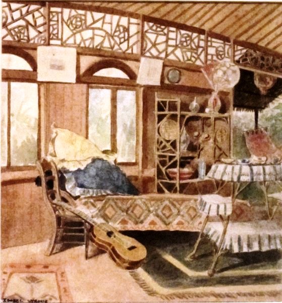
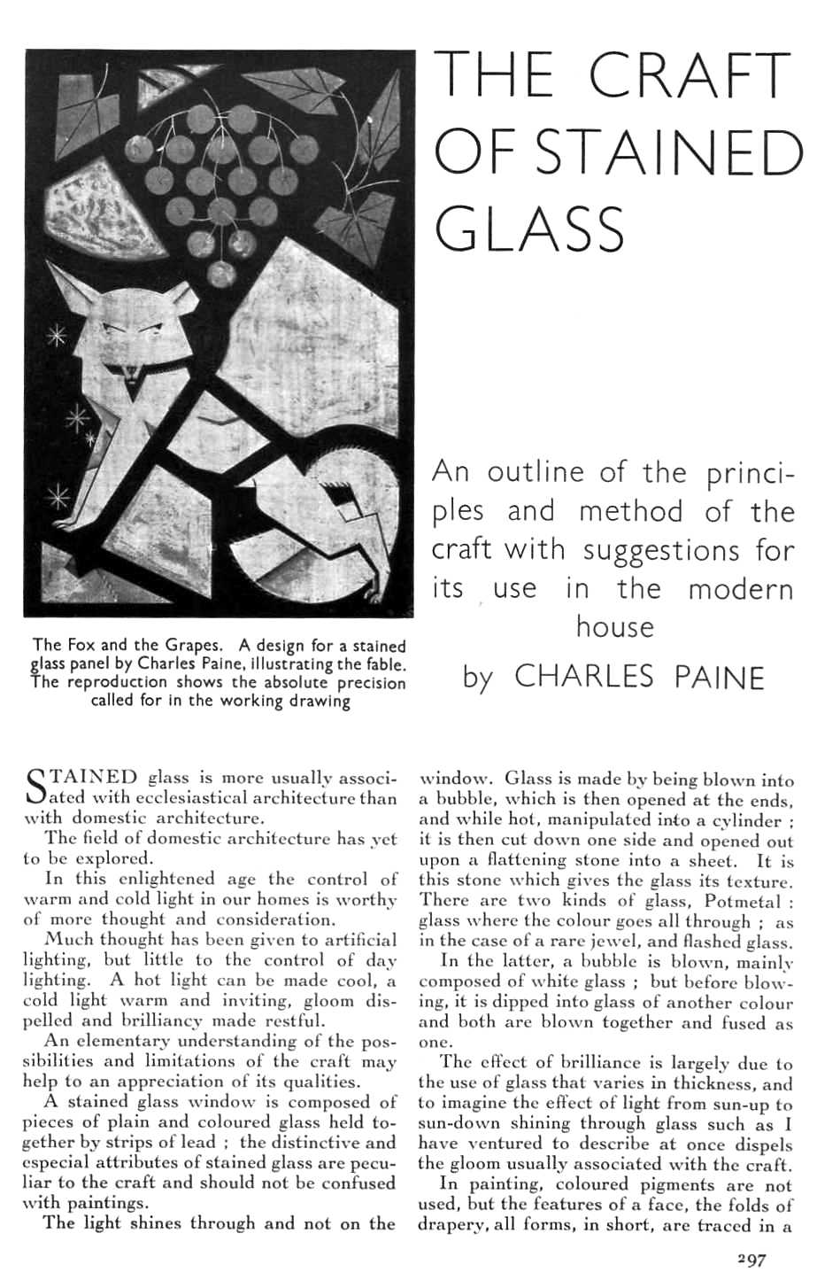
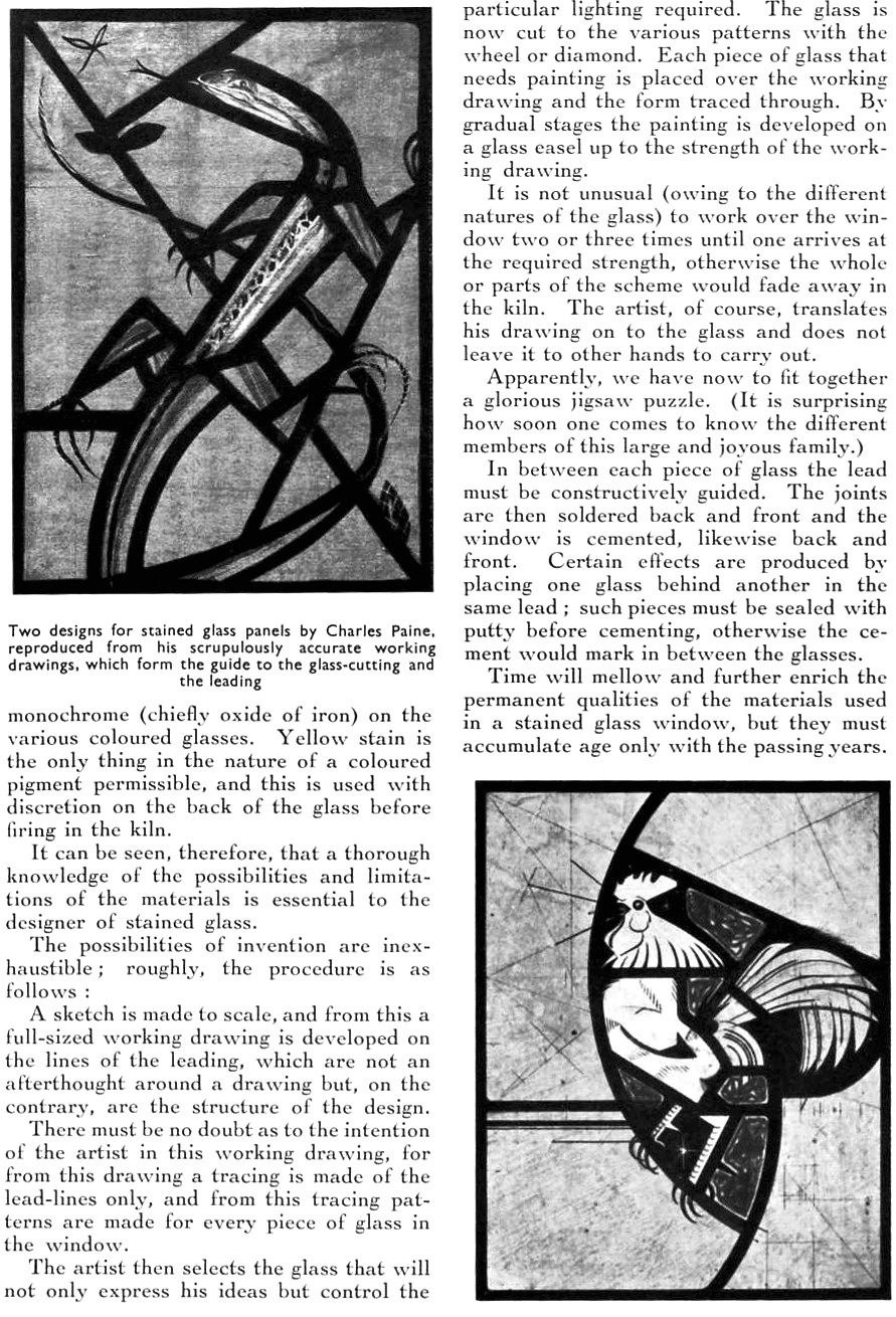
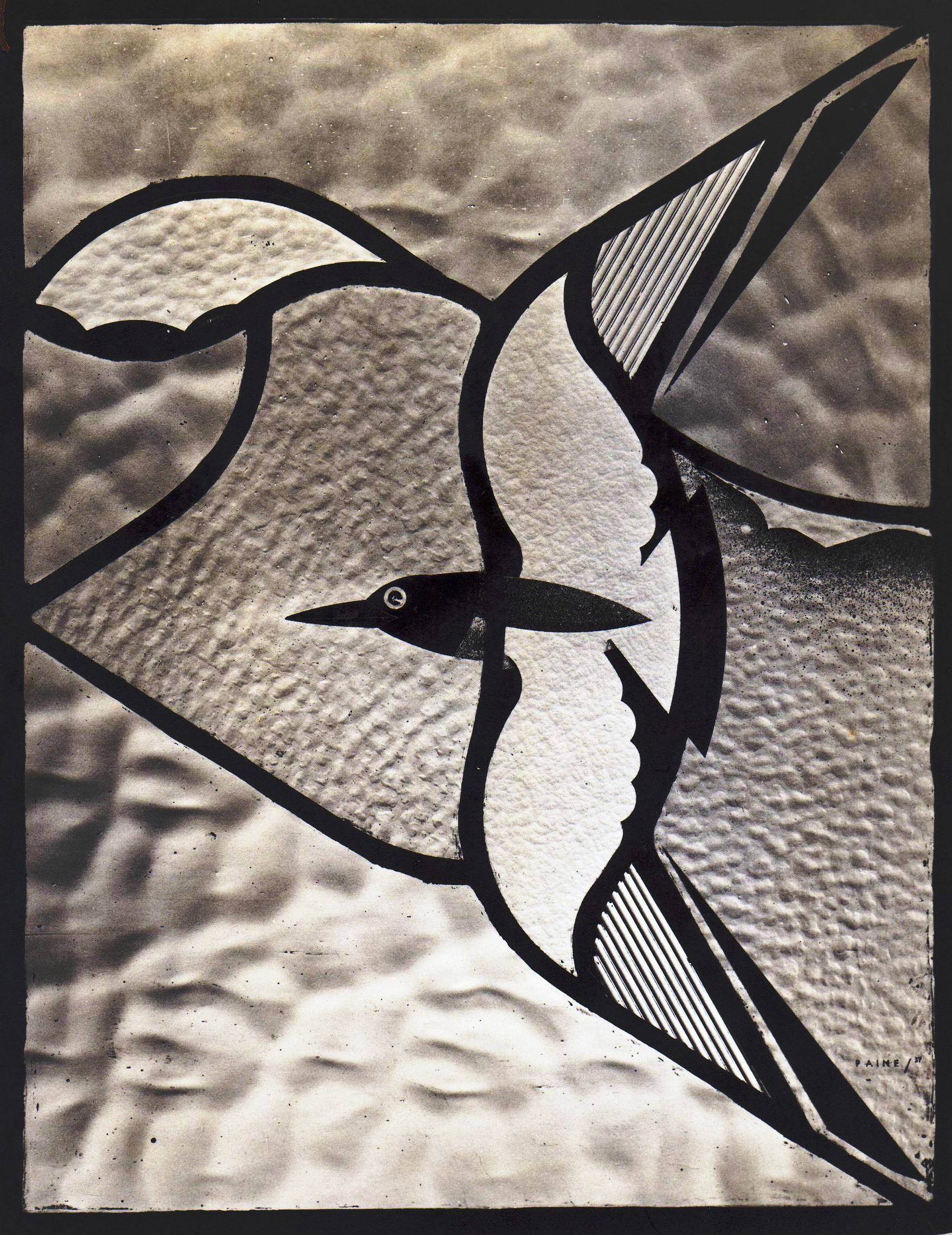
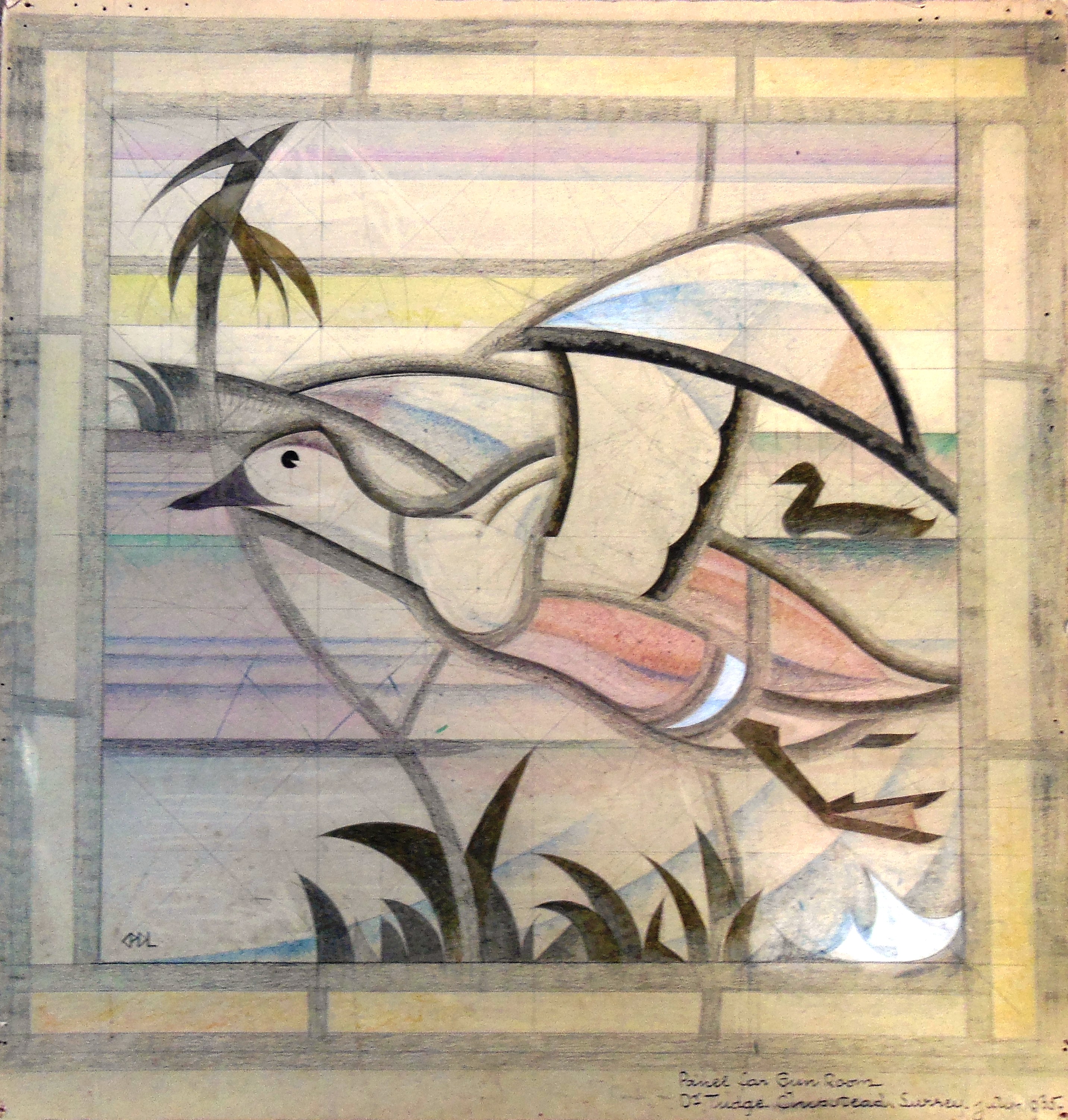
Do tell me if you got your picture into the Exhibition? I can’t tell you how much I value the stained glass window you made for me. It is much admired and throws a light on St. Gaudens plaque of 1219? – hung across the narrow entry. Below on each side are narrow book-cases where I keep RLS first editions. When you were here last did you see the new additions we have put on the house? The library upstairs and the studio? Oh dear I wish you weren’t so far away there is so much to talk about.
With love to you both
Affectionately
Teuila
* Austin Strong (1881-1952), son of Teuila’s first marriage to the artist Joe Strong. He wrote successful Broadway plays, The Drums of Oude and Seventh Heaven, among others. He died 17 September 1952, pre-deceasing his mother then aged 95 who died June 26 1953.
Undated [1937]
Mrs. Salisbury Field Serena Carpinteria California
Dear Charles,
The knife has come! And a fine stout one it is. I wanted to go out at once and prune everything in sight. The postman brought the package – nothing to pay – no customs dues – it might have come from Los Angeles.
I’m so eager to hear about the works of art you sent to the exhibition. I hope they have the sense to accept them and give them a good place on the line. I remember how the artists in Paris used to yowl when their pictures were ‘skied’.
My son and his wife will be here soon. How I wish you were here. he would love your work – with real appreciation for he’s a born craftsman himself. I wish you could see the sets he designs for his plays – all in miniature with every detail worked on. One I remember was a room in a NY flat. The radiator – the view of the housetops from the window. Pictures on the wall and even the man’s pipe and newspaper on a table with a comfortable chair beside it. All in bad taste and real comfort if you know what I mean. He would follow you about and want to try his hand at everything you were doing. He’s had a year of horribly hard work with a cruel disappointment at the end. Cast all engaged play ready for rehearsals and his leading lady who was to come from California was taken ill – All put off and delayed till the autumn. He came near to a nervous breakdown and says he yearns for the peace and rest at Serena. Even the name is soothing. They are motoring out taking their time – stopping by the way – visiting historical places. Taking time off to stay with friends. He telephoned me from Virginia that he was already much better – well in fact and would arrive all rested to spend the summer with me.
Anna said nothing about her health so I’m hoping she’s all right again.
Now my dear – I’ve just lit a taper before Ko Ung – asking her to bring you luck. What I see is a turn of the road –
‘Not by appointment do we meet Delight and Joy – They heed not our expectancy – But round some corner of the street of Life They on a sudden greet us with a smile.’
I don’t know who wrote that but it has been my comfort in many a dark hour. And it’s True – as I’ve discovered. I did that so badly I’ll copy it out for you on a card.
My love to you both
Always yours affectionately
Teuila
10 December 1937
Mrs. Salisbury Field Serena
My dear Charles,
If I wrote to you as often as I think of you you’d get a lot of letters – but I’ve never been so busy in my life as during the last few months.
Think of me – ME – talking before clubs in Monterey – Sacramento – San Francisco – Los Angeles – Santa Barbara and Hollywood: Also yapping over the radio and spending afternoons in bookshops autographing copies of my book: Then I have been getting shoals of fan letters that I feel I really should answer when people are kind enough to write telling me how much they like my book. But it takes a lot of time – all this is explanatory and dull.
I meant to have written you long ago after meeting Mr. & Mrs. Lockwood de Forest. Your ears should have burned we talked about you so enthusiastically. They are both devoted to you – and as I am too we all felt very friendly. Strangely enough it was the first time I ever met them and I remembered that you had asked after them in your last letter. They were so pleased to be remembered. We praised you and damned – double-damned Mr. McClellan – which reminds me that you (have) another friend and admirer here in Mrs. Curtis Cate. I was glad to hear that everyone who upheld Mr. McClellan when he was riding roughshod over the Community Arts are – is – bitterly opposed to him now – even Mrs. Raymond and Mrs. Gould. Mrs. Cate declared that the only time she was tempted to use bad language was when she spoke of Mr. McC and what he did to the Community Arts. She admired your work tremendously – so you see you are not forgotten.
In your last letter you said you were getting better in health. I wish you could have some of our sunshine – we are now having the first rain in seven months – and it’s a soft warm rain at that.
This is wishing you and your Anna a Merry Christmas and a really prosperous New Year. I hope this old year will see the last of your many troubles – it’s time Lady Luck looked your way – more than once I’ve lit a taper before Ko Ung begging her to do you a good turn. I hope she has – and will.
Do write again soon – and ask Anna to write – women have a way of filling in the details. My love to you both.
Always yours faithfully
Teuila
P.S. Austin and his wife are still with me and this year we are preparing a good old-fashioned Christmas with turkey and plum pudding – a tree and presents. My nephew and his wife and my favourite cousin Col. Orr are coming for it. We will drink to ‘absent friends’ and I’ll think of you.
31 December [1937]
Mrs. Salisbury Field Serena
My dears,
How sweet of you to send me a cable on Christmas Day. It brought you both so near.
I wish I were twins. One of me could write another book and the other one could draw paint and make wood cuts. I have a careful line drawing of one of our Christmas trees set up in the studio window with packages piled up around it. In a block print one could put in the coloured papers and fancy bows and gilt and silver. I want to do it for next Christmas. Then my publisher and friends keep pestering me to write another book which I could do before this one is forgotten. (In 1951 A Bit of My Life was published). But it’s hard to throw my mind back over the past when the present is so interesting.
We’ve had glorious weather these last few months – the kind of sunny days sunsets and moonlight nights that make California famous. Not enough rain yet so we won’t mind when we get a real downpour.
Some of my Christmas presents were bulbs – big boxes of them – and there isn’t anything so promising.
I had a lovely Christmas with my son and his wife with me and I reveled in doing ‘matriarch’ with relations gathered about the Christmas tree – my nephew and his wife and my favourite cousin.
It is the last day of the old year. 1938 doesn’t look so very bright with wars and strikes and stock-market slumps. I’m glad I’m not young for the future doesn’t appeal to me. If only the English-speaking peoples could join together without jealousy or discord they could do wonders – Perhaps they will.
My love to you both and my best wishes for a Happy Healthy and Prosperous new Year.
Affectionately
Teuila
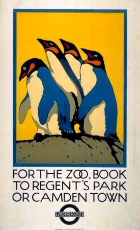
22nd June 1939
Serena, California
Dear Charles,
How sweet of you to send me that delightful poster. I didn’t have to look at the signature to know who did it. I think I’d know one of your birds anywhere.
It’s been so long since I heard from you. You never did explain how it was that you gave up the plan of a round trip to New York. I was so excited about it, and sent radio messages out to the ship, not getting your letter until later.
Judging by the dash and splendour of the poster, I imagine you are well again, and I hope you have plenty of work ahead.
I get so worried about you and Anna when I read about gas masks and armaments and horrors. I was relieved, though, when the King and Queen left for their American visit, for I was pretty sure they wouldn’t go away from England if the island was in any danger. They made a tremendous success here, and my son and his wife had the honour of — seeing them. They were penned up behind a rope — invited guests — for four hours, and had the privilege of seeing the royal couple pass by. Austin, whose boyhood was spent in Vailima, under the British flag and who went to college in Wellington (a military college [in New Zealand] where he wore the British uniform, with a little pillbox cap strapped under his chin), would have waited four hours more for the privilege of seeing British royalty.
Do write me, my dears, and believe me, always,
Yours affectionately,
Teuila
7th November 1939
Serena, California
My dear Charles,
I enclose some cuttings that may interest you. if this thing turns out to be any good, I will try to interest Mrs. Schott in you, though I think it’d pretty difficult when you’re so far away, and getting here would be so difficult. How I wished you had stayed on when you had that offer in San Francisco.
Do you remember a young man who was studying at the Community Arts – Dick Kelsey?* Well, he went down to Hollywood, got a job with Disney, and is doing very well indeed. His salary has been raised several times, and he has even bought land; he and his wife are making plans for building a house. That was the opportunity I wanted for you – something in Hollywood, where the real money is. To be sure, they work you to death, but Dick loves it, and says they have a night school free for the artists, where he is learning more than he ever could in any other place.
Do write and tell me how you are getting on. I am so worried about you, and so sorry I couldn’t send you an encouraging cable.
My best wishes to you both,
Always yours affectionately,
Teuila
P.S. If I should have to send you a cable, haven’t you a shorter address that would reach you? Every word counts, as you know, and your address is a terribly long one.
* Dick Kelsey, by given name of Richmond Kelsey, was an important early animation art director and pioneer theme park designer and illustrator of chidren’s books. His career spanned several of the most beloved Disney films in the 1940s – 1950s, after which he assisted in the design of Disneyland in 1955. Translating the screen arts to real building, Kelsey was hired by the Marco Rngineering firm of Cornelius Vanderbilt Wood to be a lead art director to design Magic Mountain theme park at Golden, Colorado in 1957. Later Kelsey became mentor to another prominent Disney artisan, Ron Dias, whose films include Sleeping Beuaty. In time, Kelsey returned to Disney work, including Bedknobs and Broomsticks and illustrating children’s books of Disney films. (Wikipedia)
24th September 1948
(A post card)
[In 1947 Mrs. Field left Serena and moved into the luxurious El Mirasol Hotel, demolished in the 1960’s]
Mrs. Salisbury Field, El Mirasol Hotel, Santa Barbara, California
Dear Charles and Anna,
I’ve just had a 90th birthday – and I’ve had to write so many ‘thank you’ cards I can hardly hold a pen – I received two cheques from royalties of ‘Twin Beds’ and ‘Wedding Bells’ – my dear Ned’s plays – and they came like birthday gifts. My avalanch (sic) of birthday cards were, many of them, from strangers – showing how much I owe RLS – I’ll write you a real letter when I get my breath. My love to you both. How I wish I could see your water colours of Ireland!
Teuila
Addressed to: Charles Paine Esq., 43 Longcroft Lane, Welwyn Garden City, Herts. England
31st October 1948
Mrs. Salisbury Field, El Mirasol Hotel Santa Barbara, California
Dear Charles and Anna,
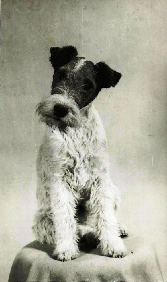
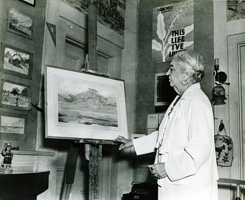
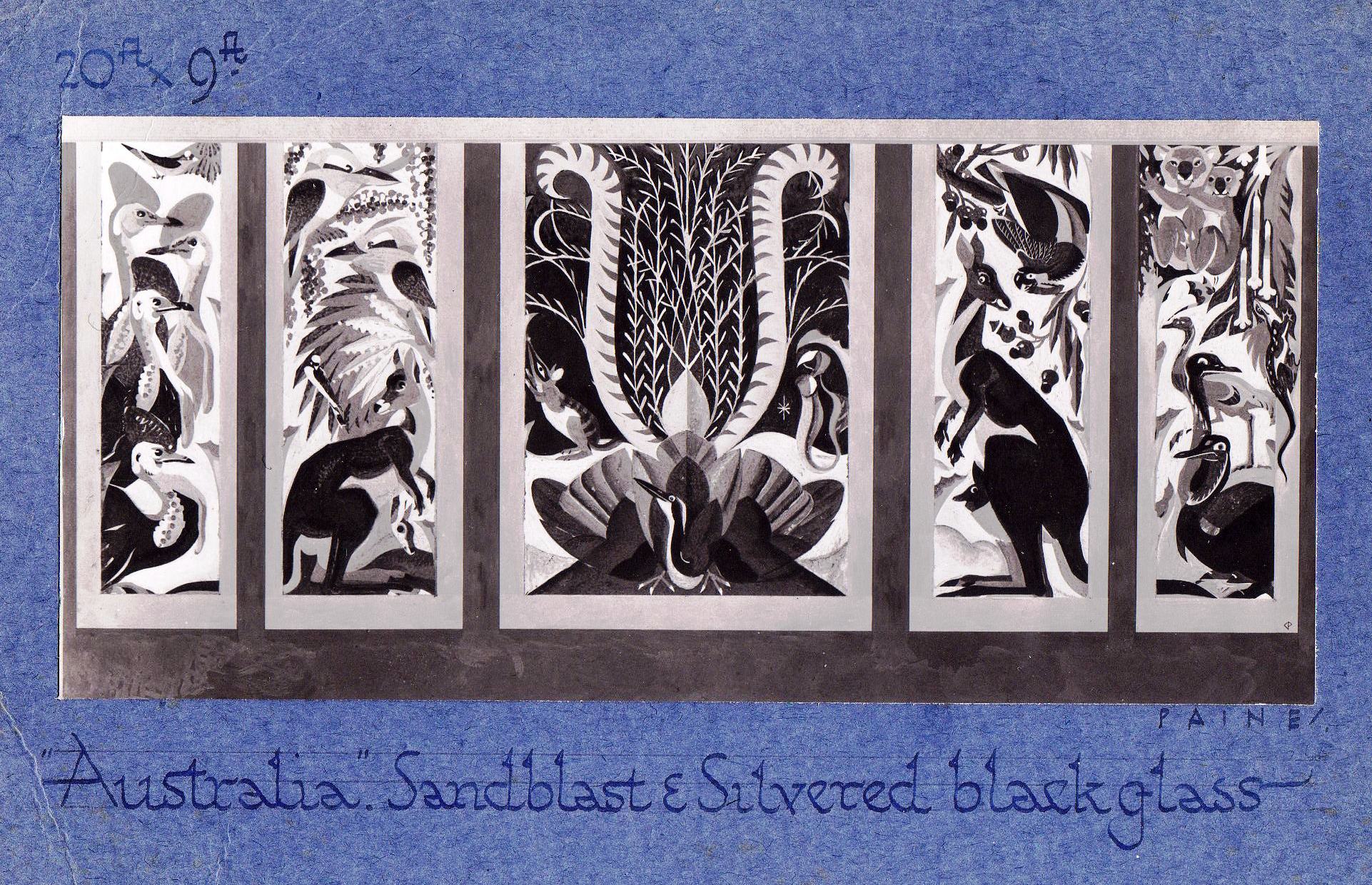
This little book* has been treasured by me all these years. When you wrote that you were teaching a class in drawing I thought you might like to have it. I had a copy made some years ago – what fun I had doing those murals for my studio! When I sold Serena I hated to leave them there – for with your help and advice I did some pretty good work. I wish now I’d had photographs made of them. They were all scenes from Haiti the Negro republic in the West Indies. I sketched all the time I was there – two months – and hated to leave. Every way you looked you saw picturesque subjects – the houses old French architecture – Negro huts – wonderful grill work over gateways – but it would take pages to describe that country. When I was in Hollywood I joined a class that was modelling and now I have two figurines I did from some Haiti sketches. A week ago I sent you a CARE** parcel which I hope arrived safely. My love to you both – and I hope Wendy is still with you. The years of a dog’s life are too few – while my own two cats lived for twenty years.
Aloha from Teuila
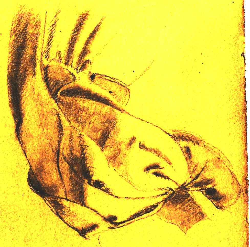
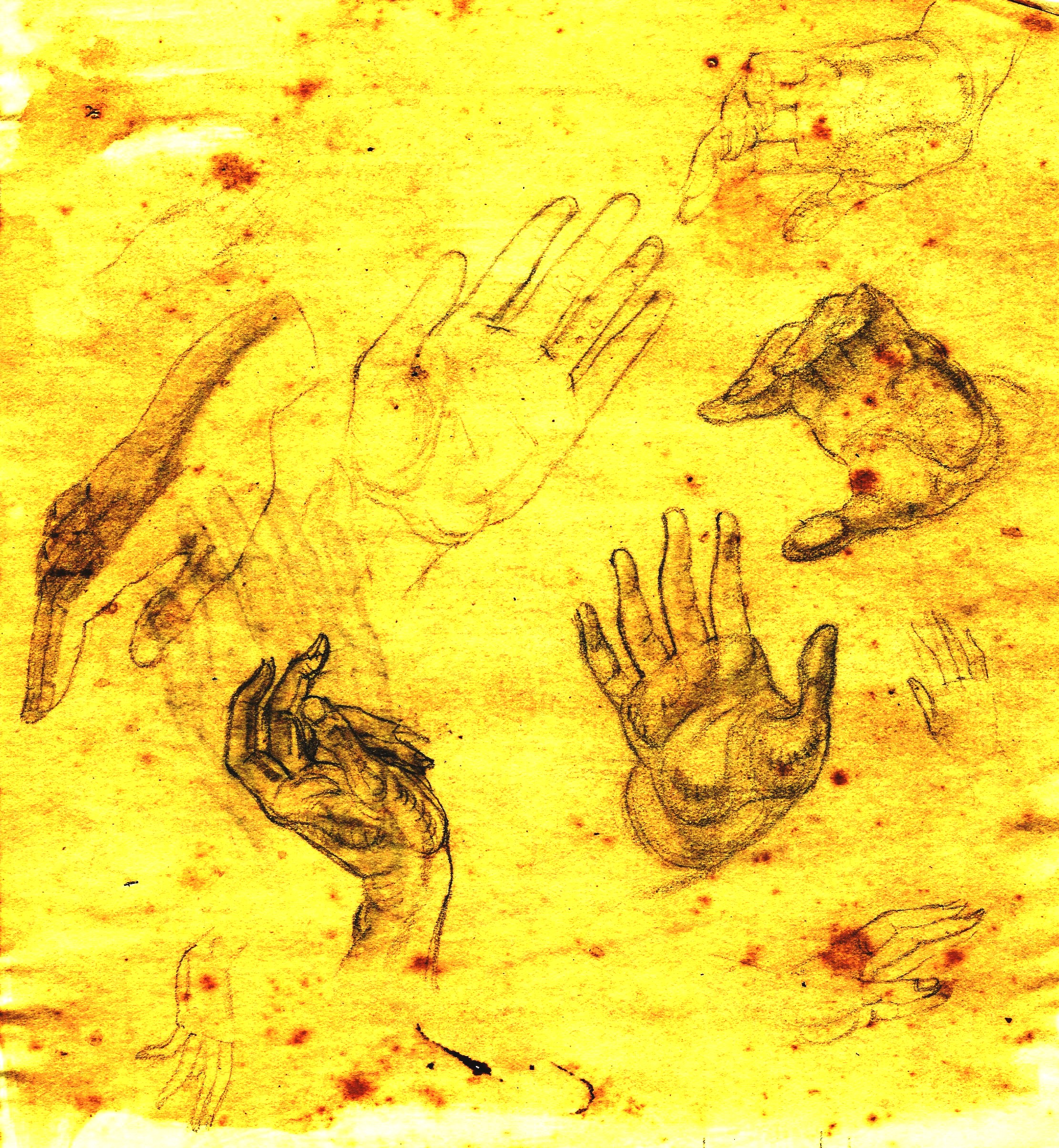
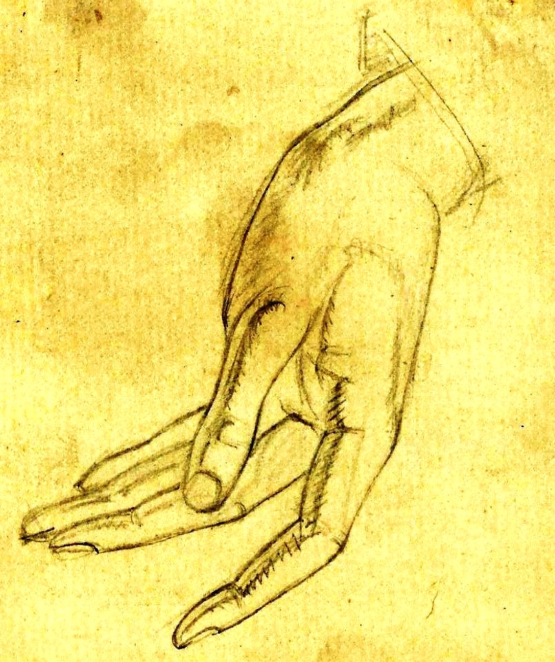
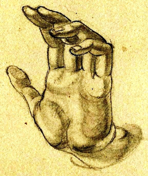
* This is Teuila’s ‘Precious Book’, her art class notebook of ‘What I learned from Mr. Paine’. It is now held by the National Library of Scotland along with her letters.
** CARE was founded in 1945, when 22 American organizations came together to rush lifesaving CARE Packages to survivors of World War II. Thousands of Americans, including President Harry S. Truman, contributed to the effort.) In 1945, the newly formed CARE (then the Co-operative for American Remittances to Europe) initiated a programme to send food relief to Europe, where large numbers of people were at risk of starvation. The organisation obtained permission from the U.S, government to send U.S. Army surplus ’10-in-1′ food parcels to Europe. The parcels had been prepared for an invasion of Japan, which never transpired. Americans were given the opportunity to purchase a CARE Package for 10 dollars to send to friends and relatives in Europe. Packages were guaranteed to arrive within four months. Even when a donor did not know an address of a beneficiary, CARE would find that person using the last address known. the CARE package thus became a ‘missing person’ service in the chaos following World War II. (Wikipedia)

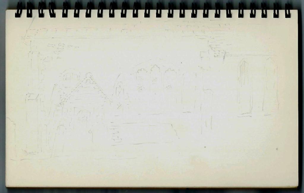
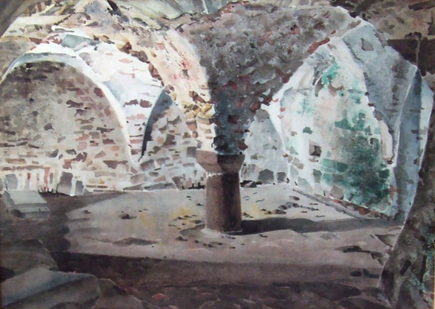 St. Mary’s Crypt, Gorey Castle
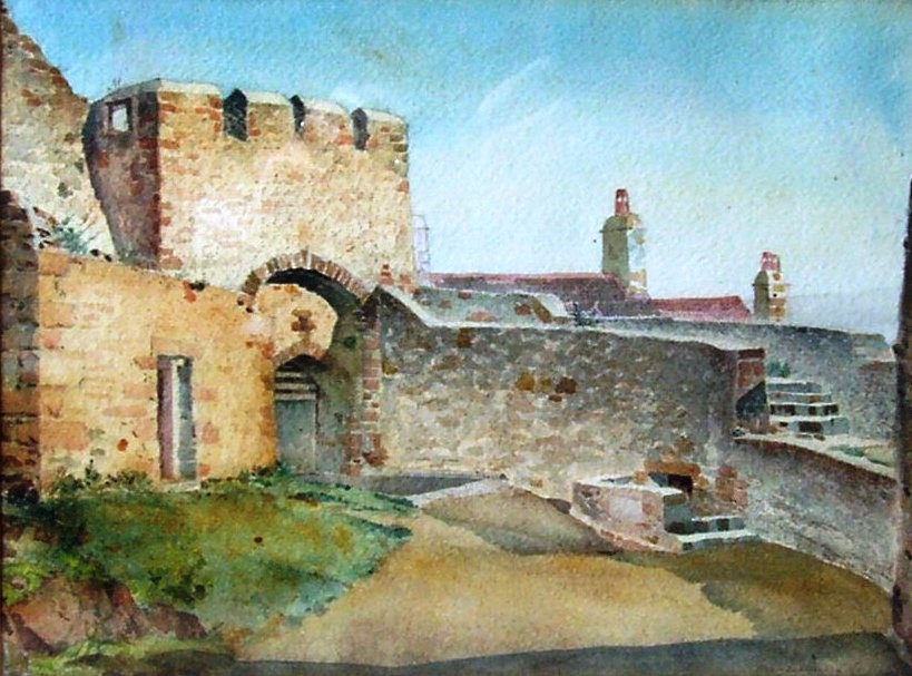 Gorey Castle Gate
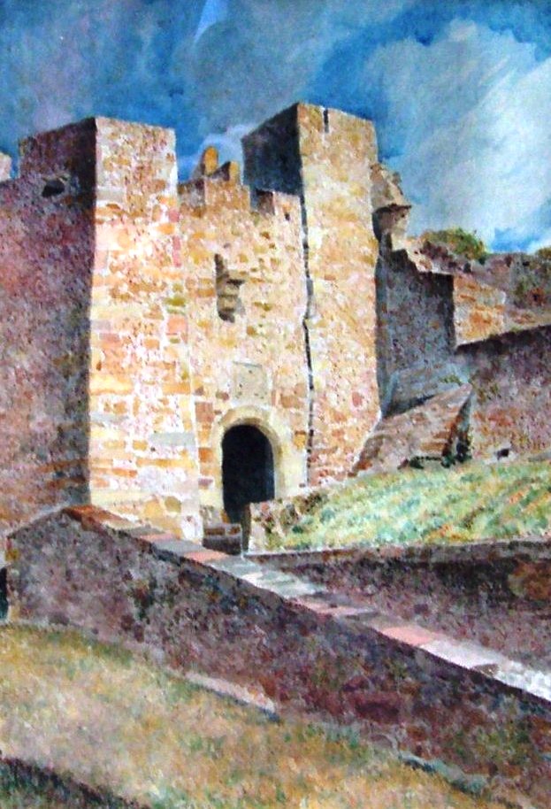 Queen Elizabeth Gate, Gorey Castle
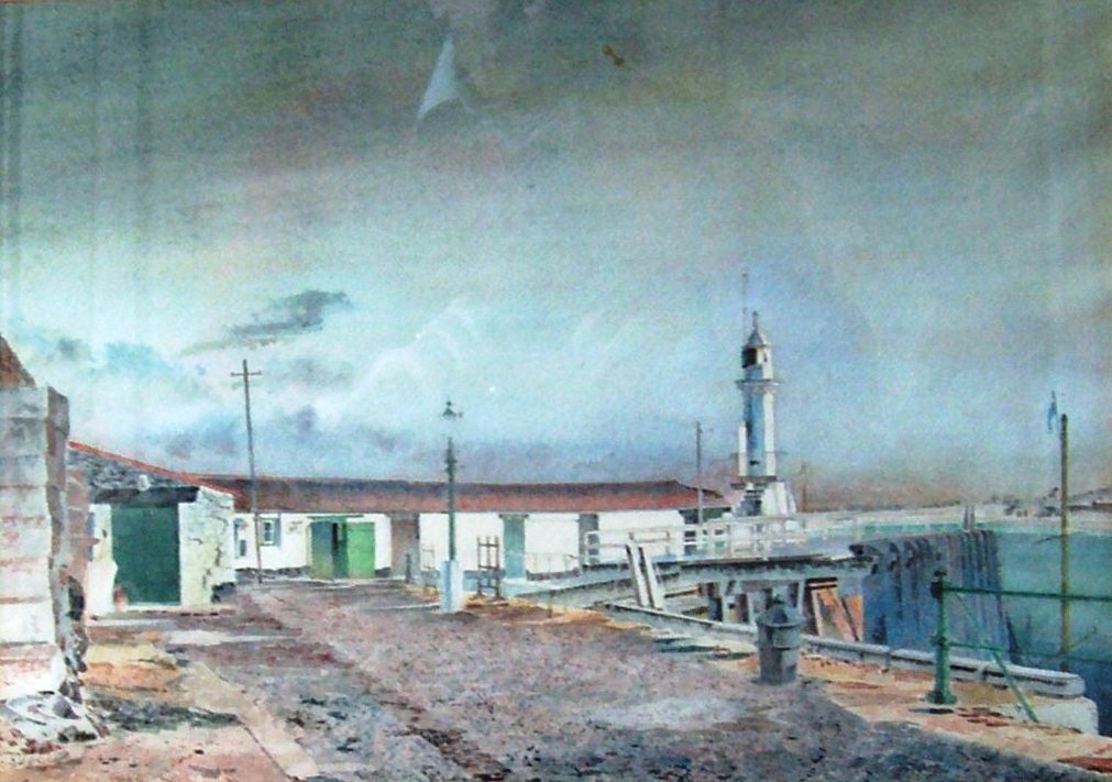 Gorey Pier
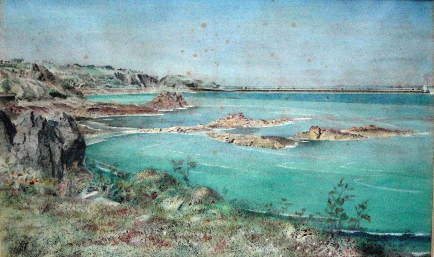 Geoffrey’s Leap and St. Catherine’s Breakwater
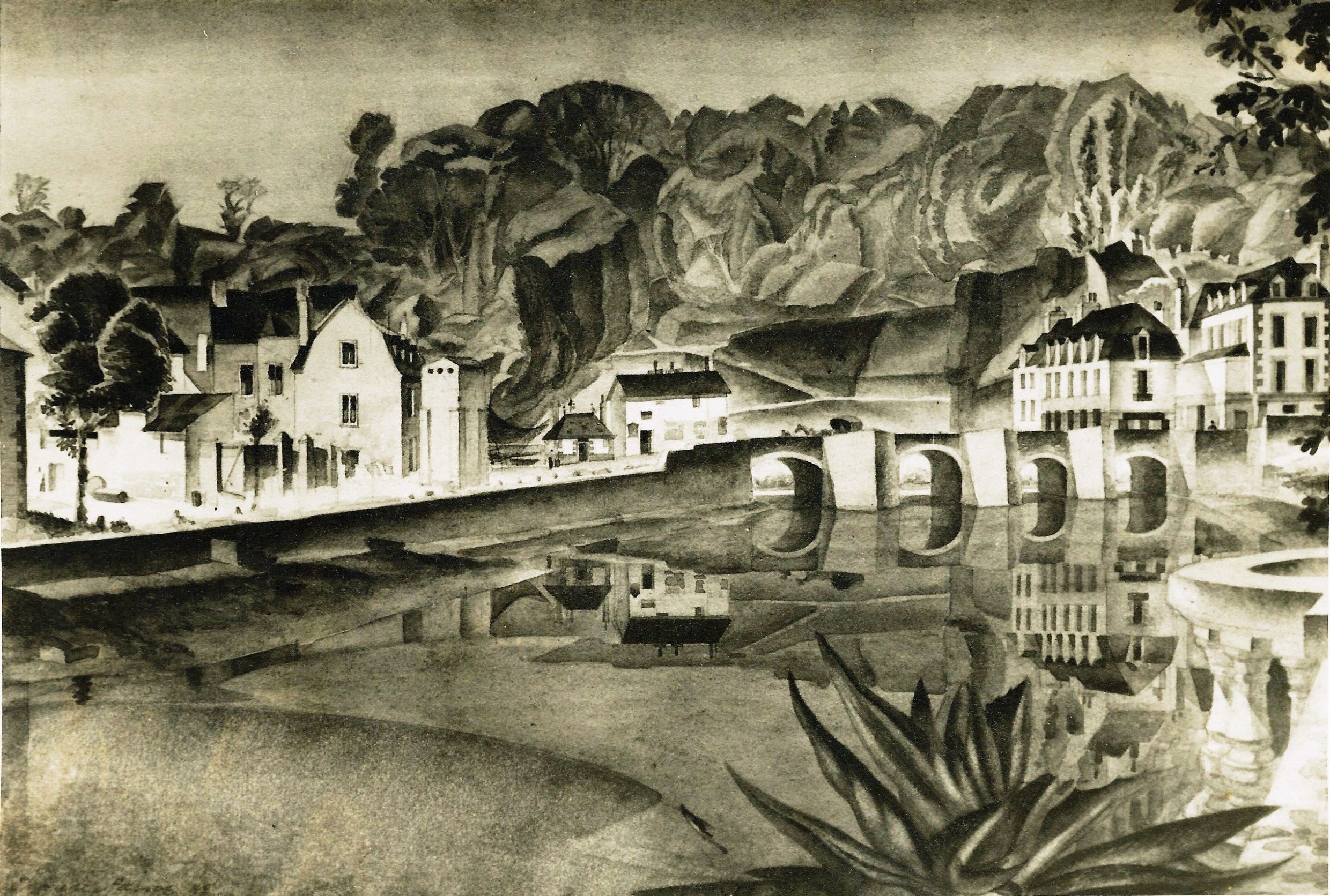 Auray, Brittany, dated 1947
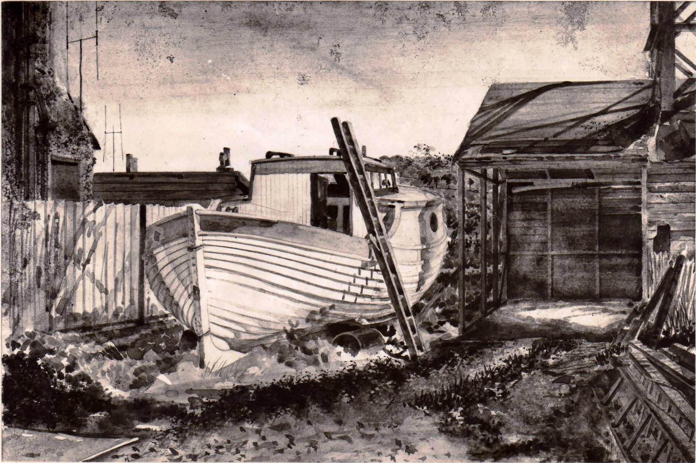 Jersey Boat Yard 1950’s
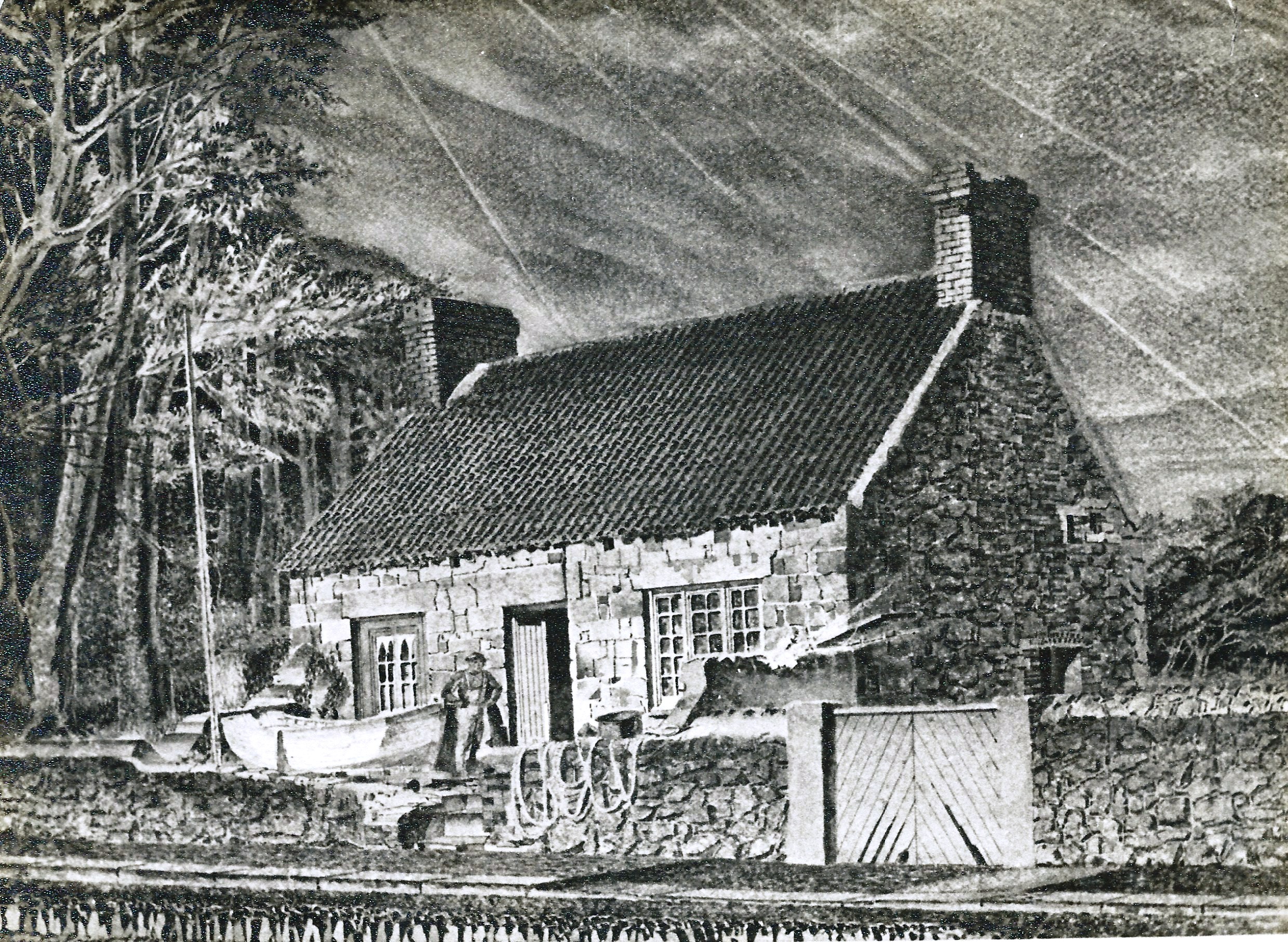 ‘Jersey Shipwright’ July 1959
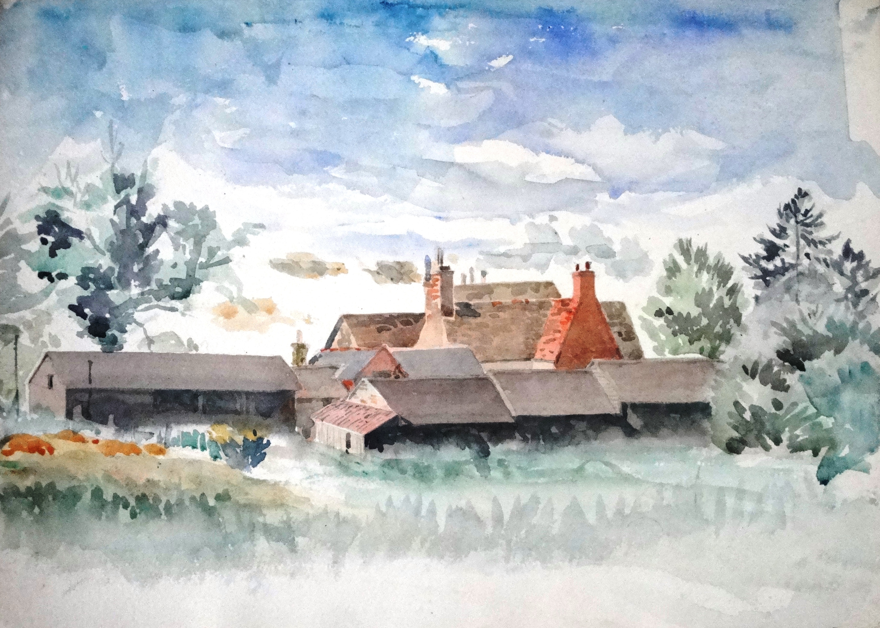 Jersey Farm (watercolour sketch)
 Jersey View
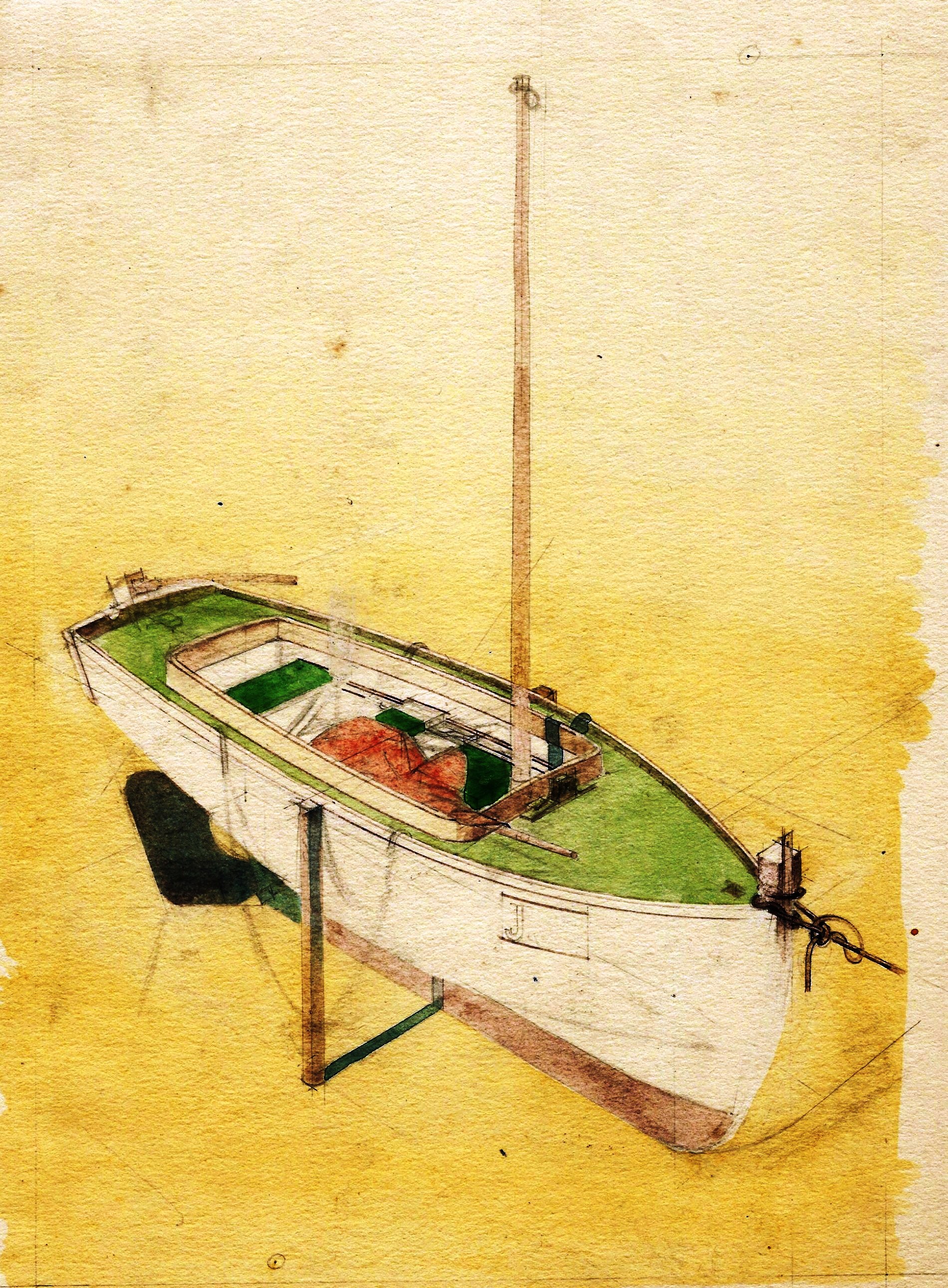 Possibly ‘Sorcini’
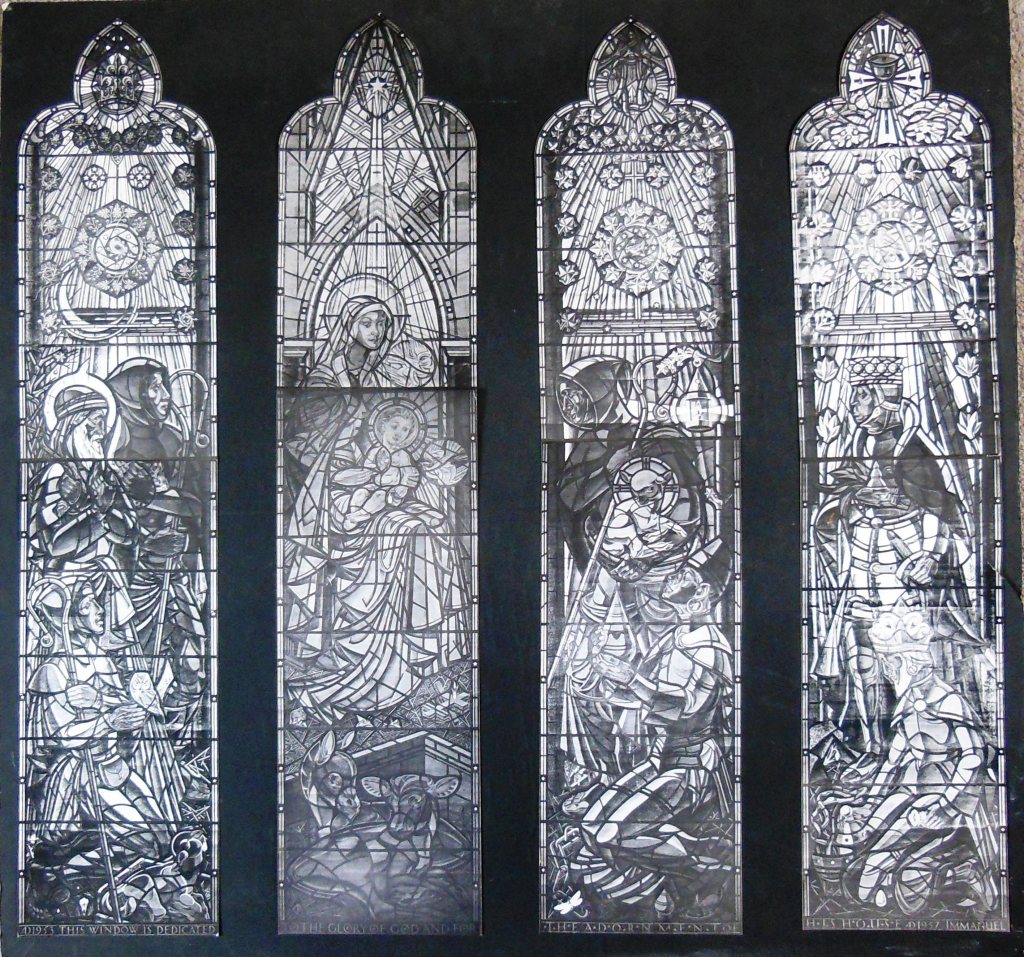


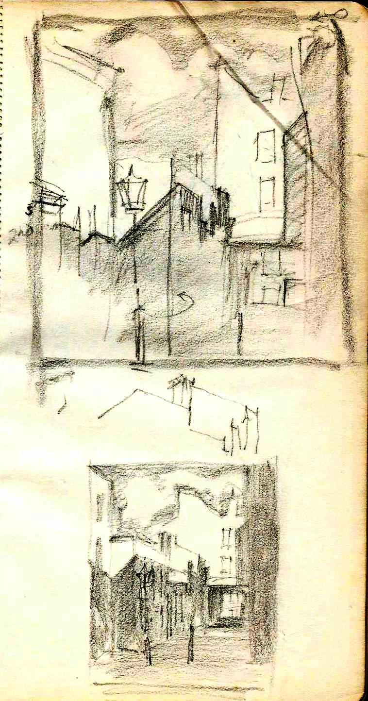
 Undated


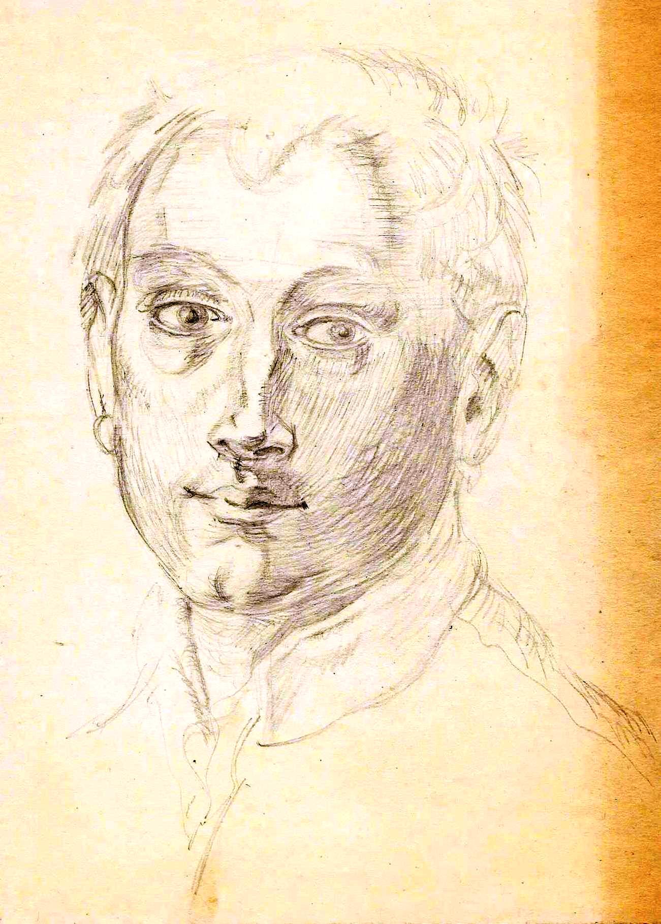
 See post March 10, 2018

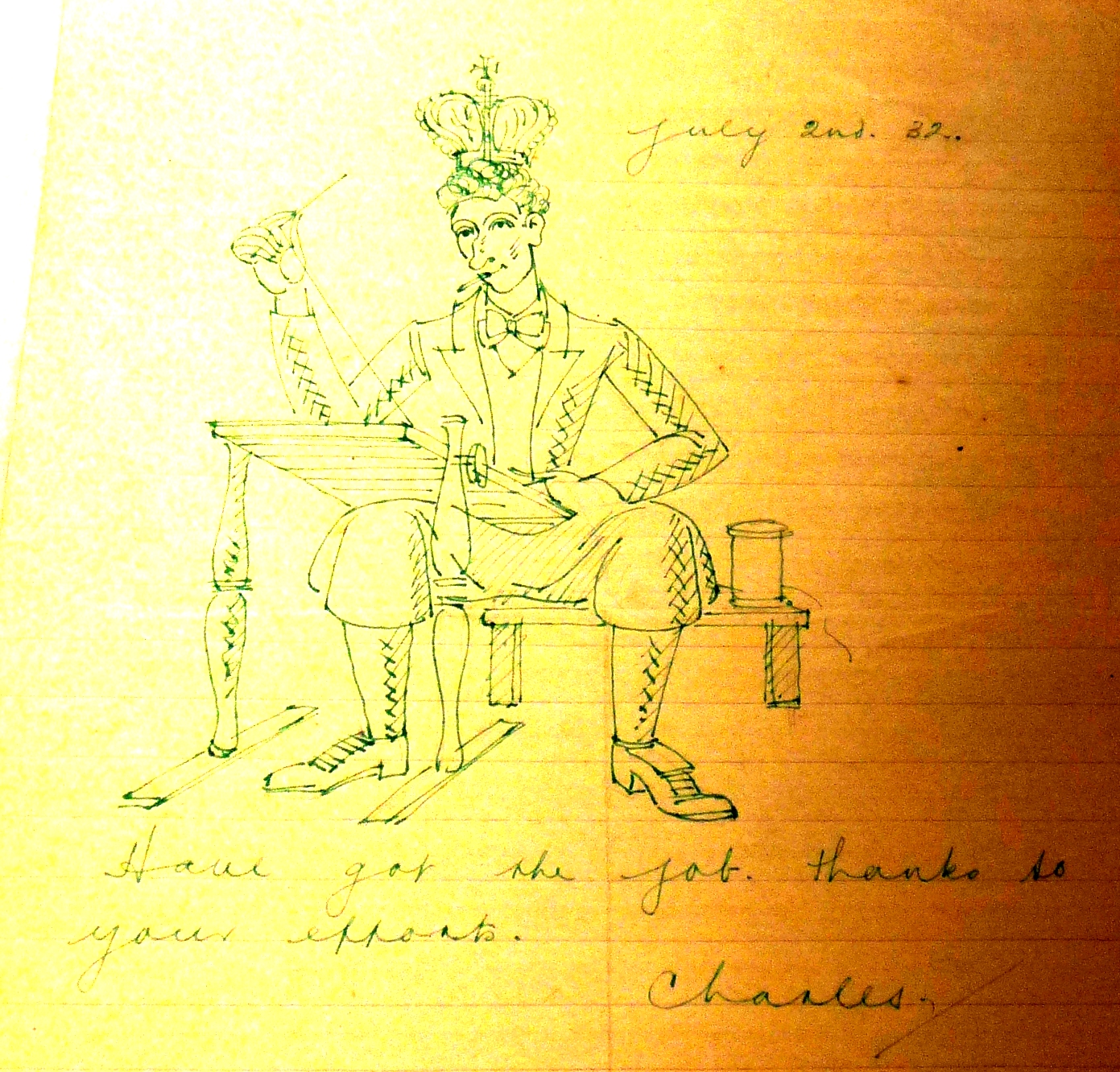
 Undated

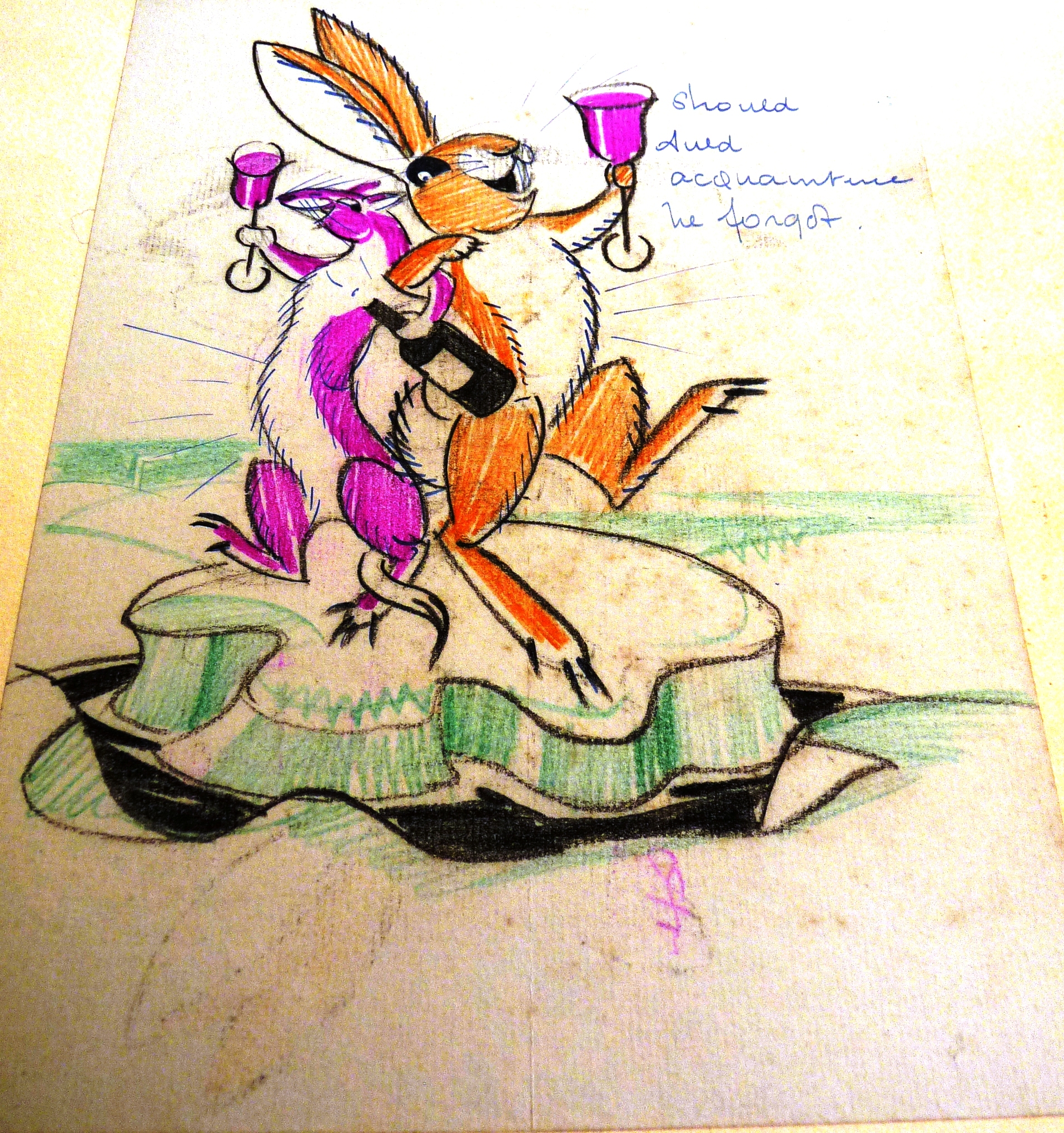 ‘Should auld acquaintance be forgot . . .’ Blackheath 1930s


 Undated


 AT WAIKIKI, HAWAII

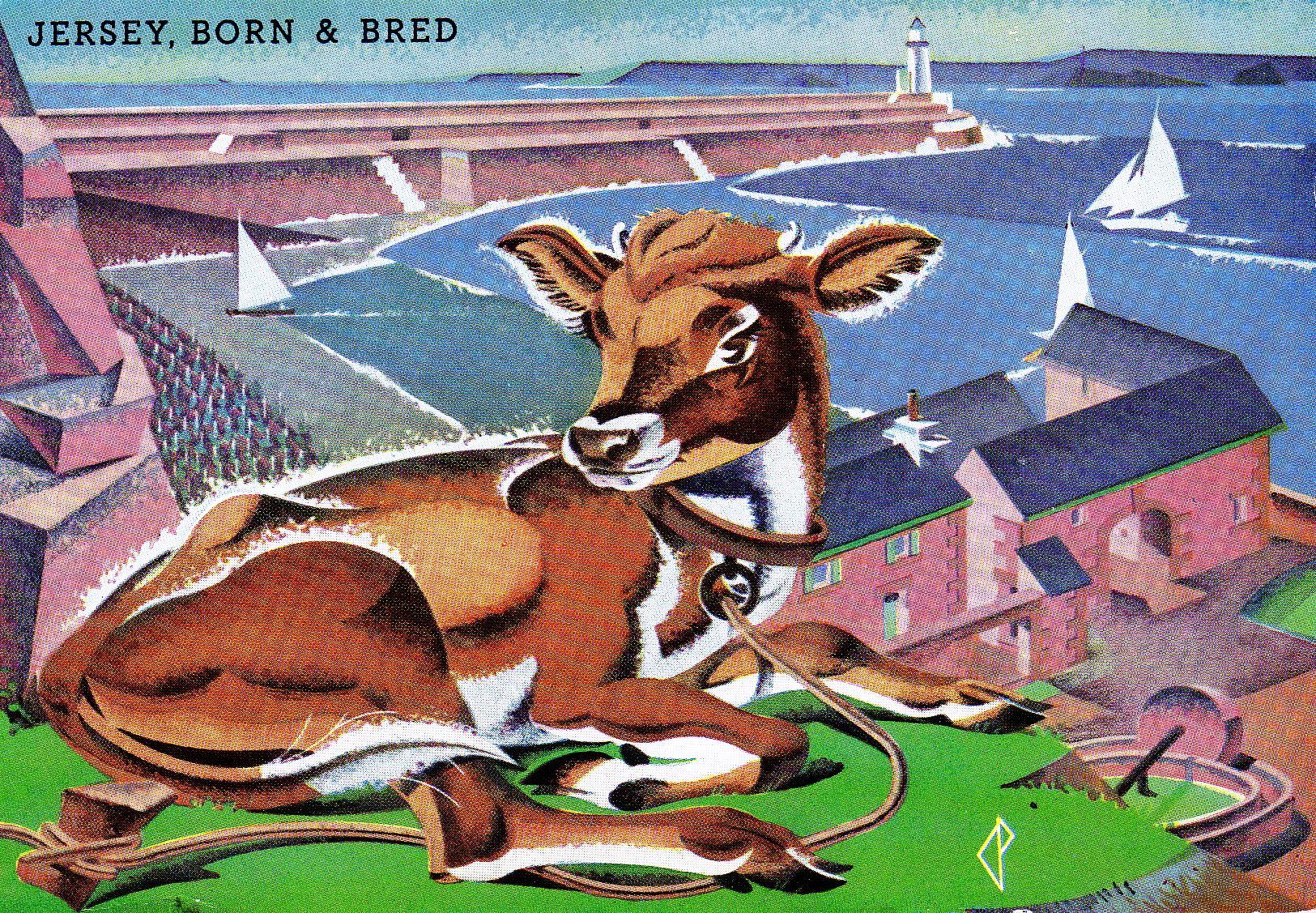
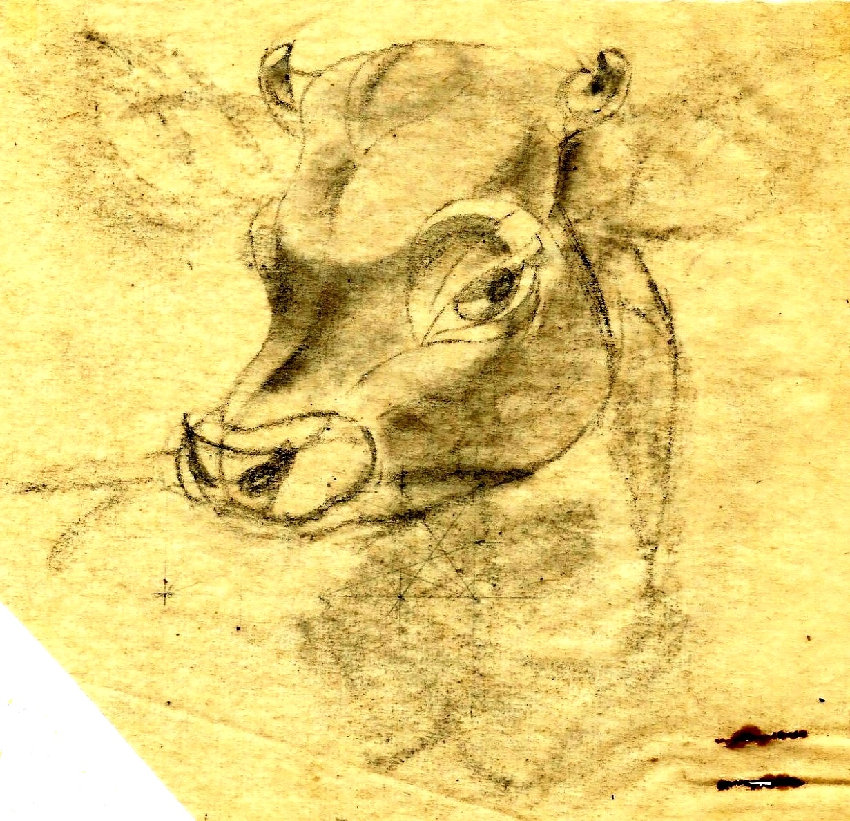
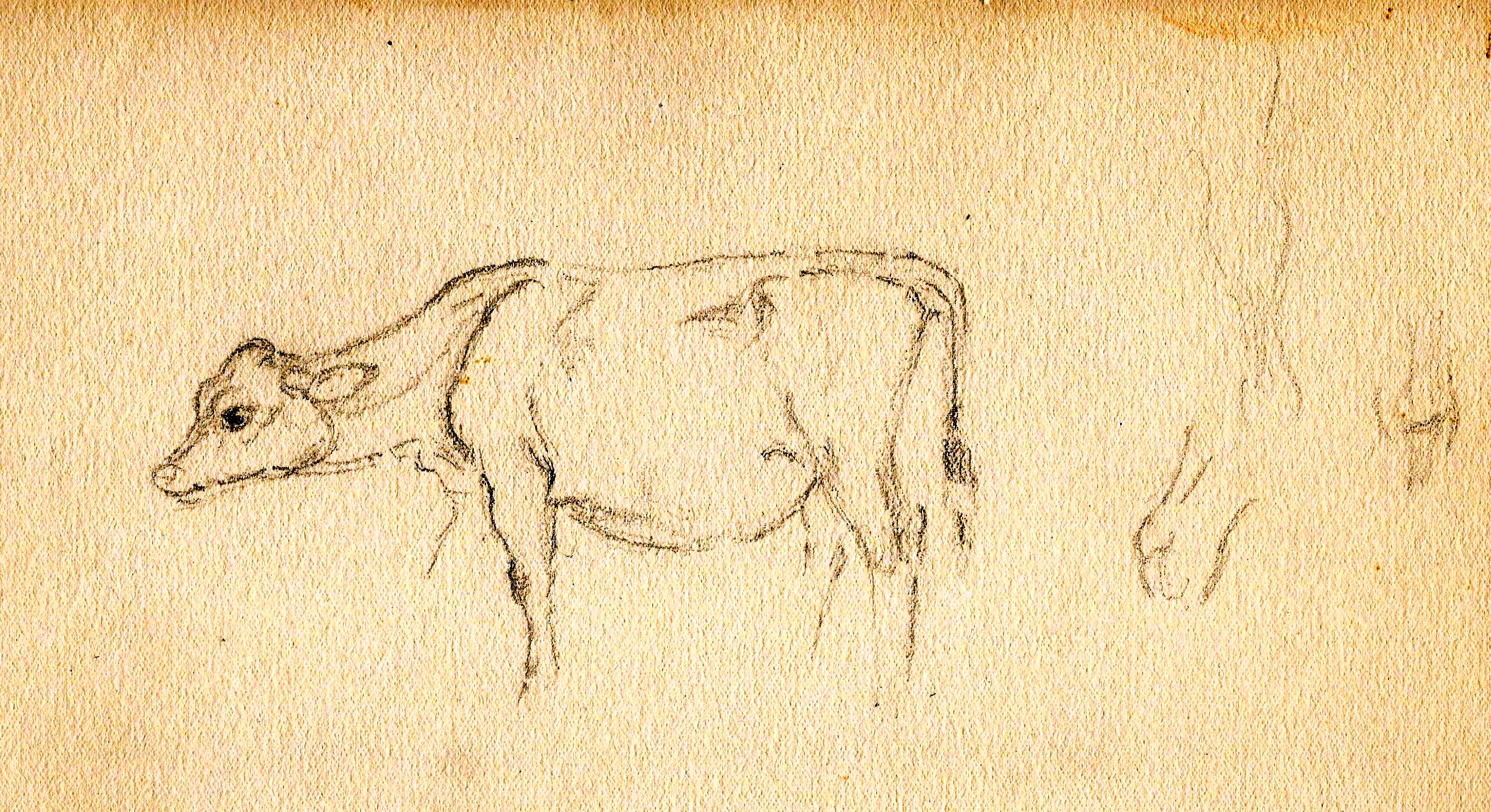
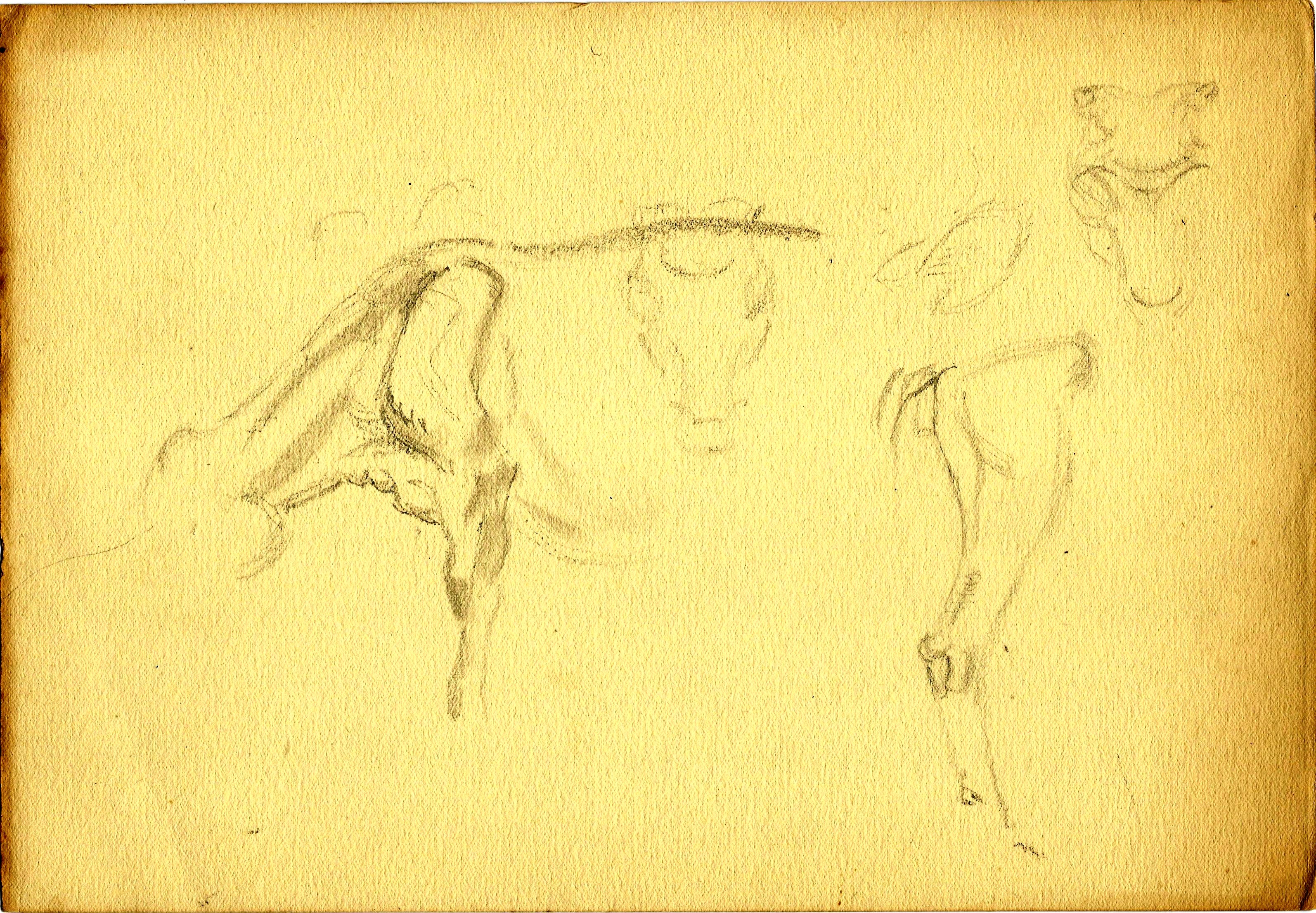
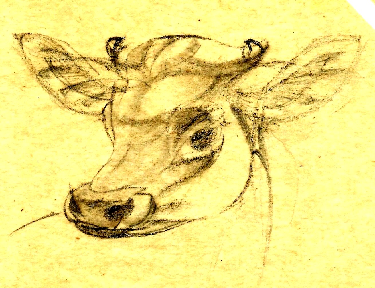 Pencil studies for ‘Jersey born and bred’
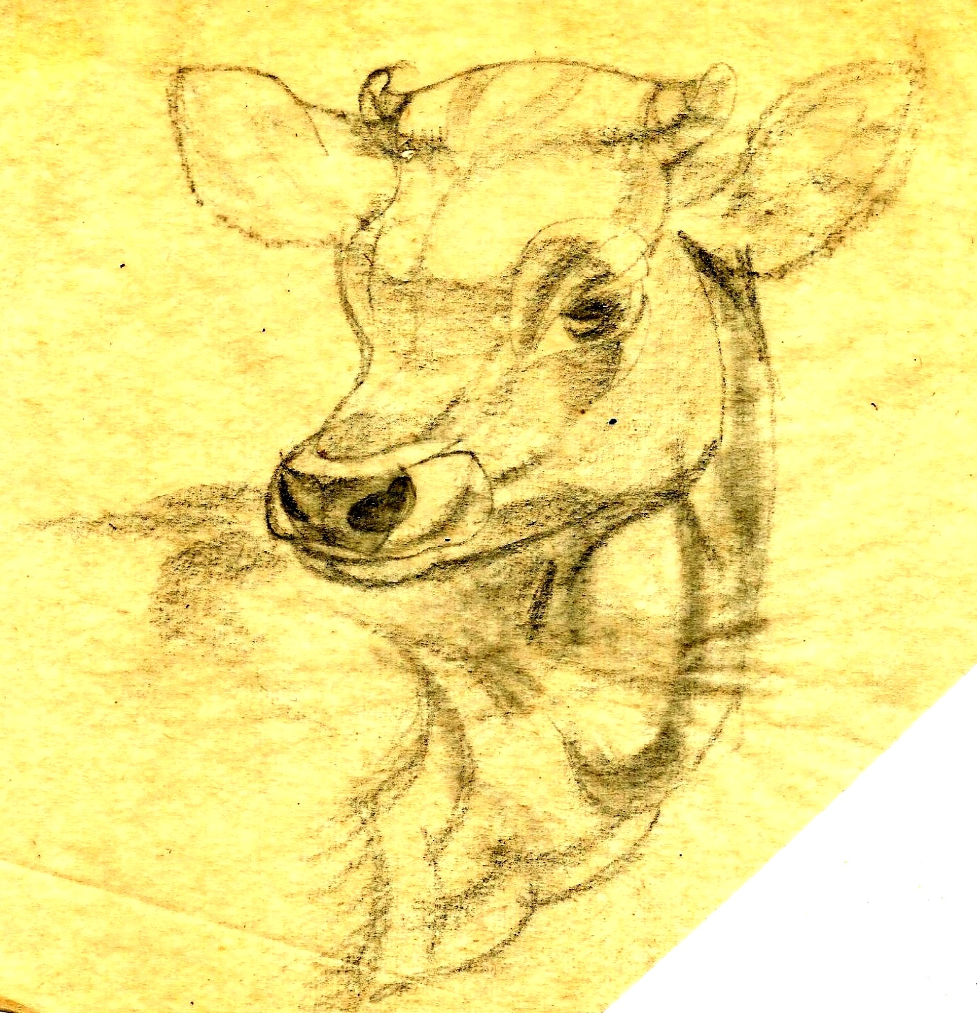
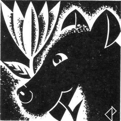
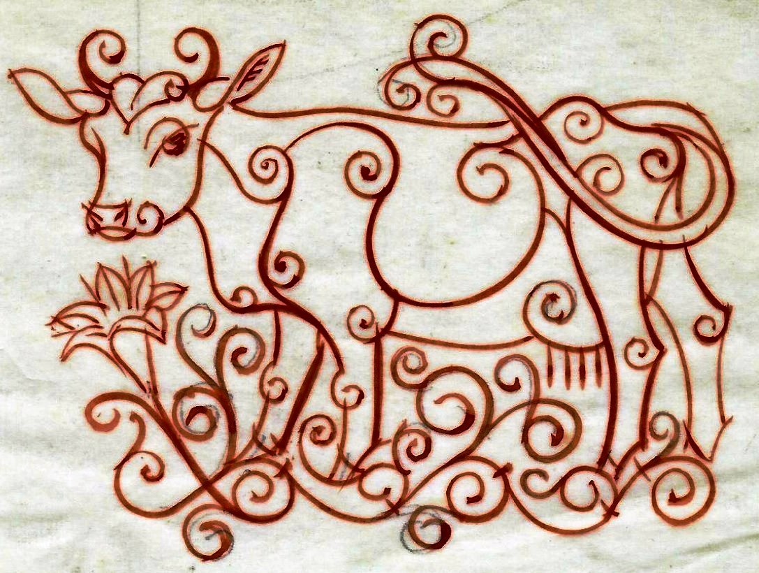 This stylised Jersey cow is of unknown date and purpose. Possibly for an advertisement.
 Gatehouse, Mont Orgueil Castle, Gorey
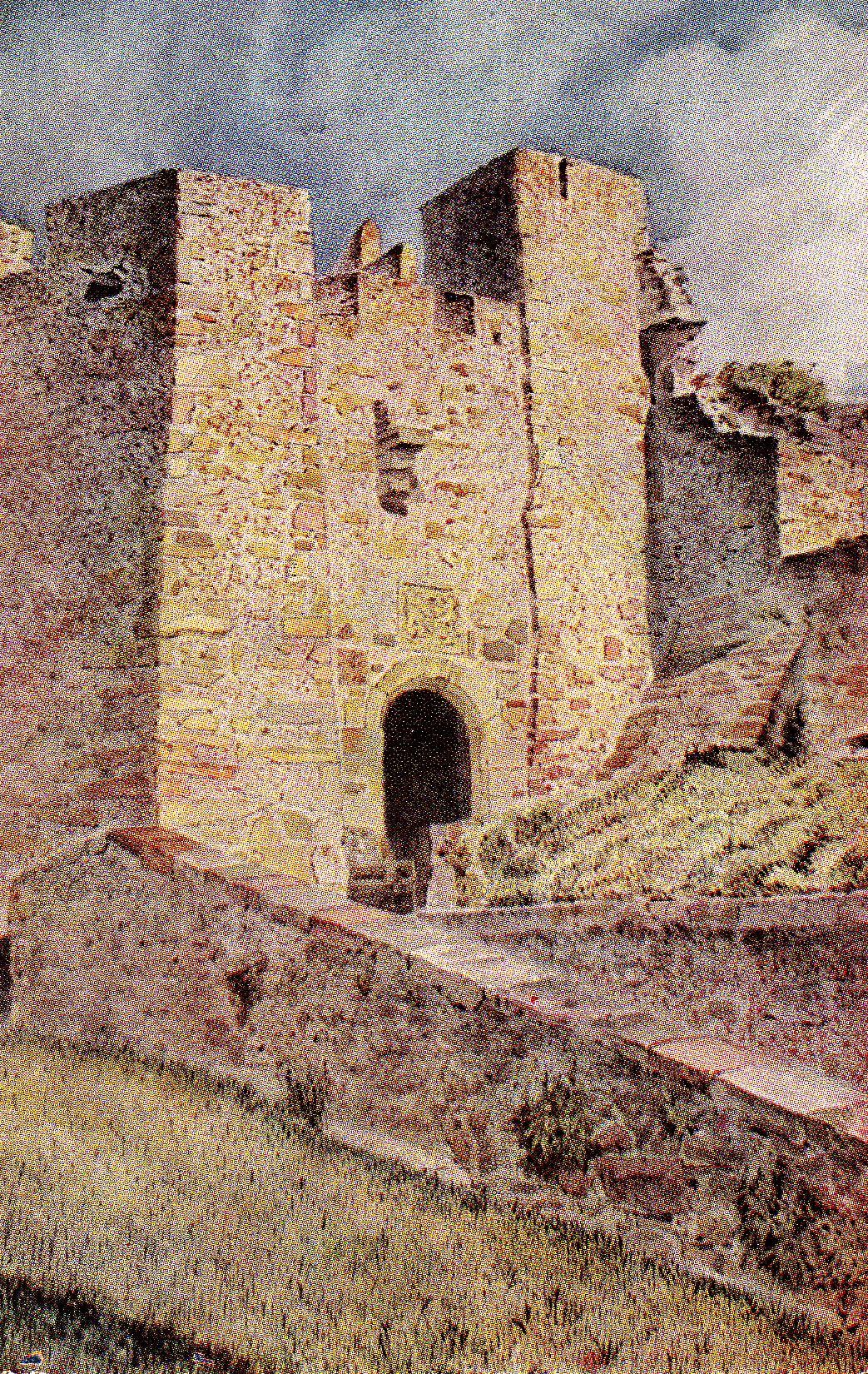 Queen Elizabeth Gate, Mont Orgueil Castle, Gorey
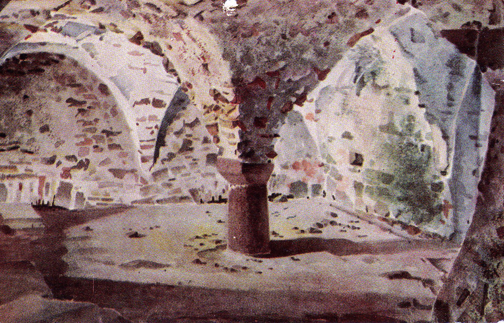 St. Mary’s Crypt, Mont Orgueil Castle, Gorey
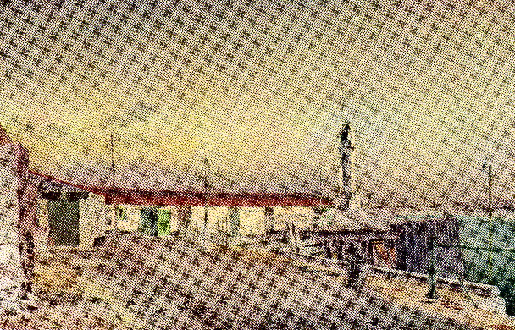 Gorey Pier and Lighthouse
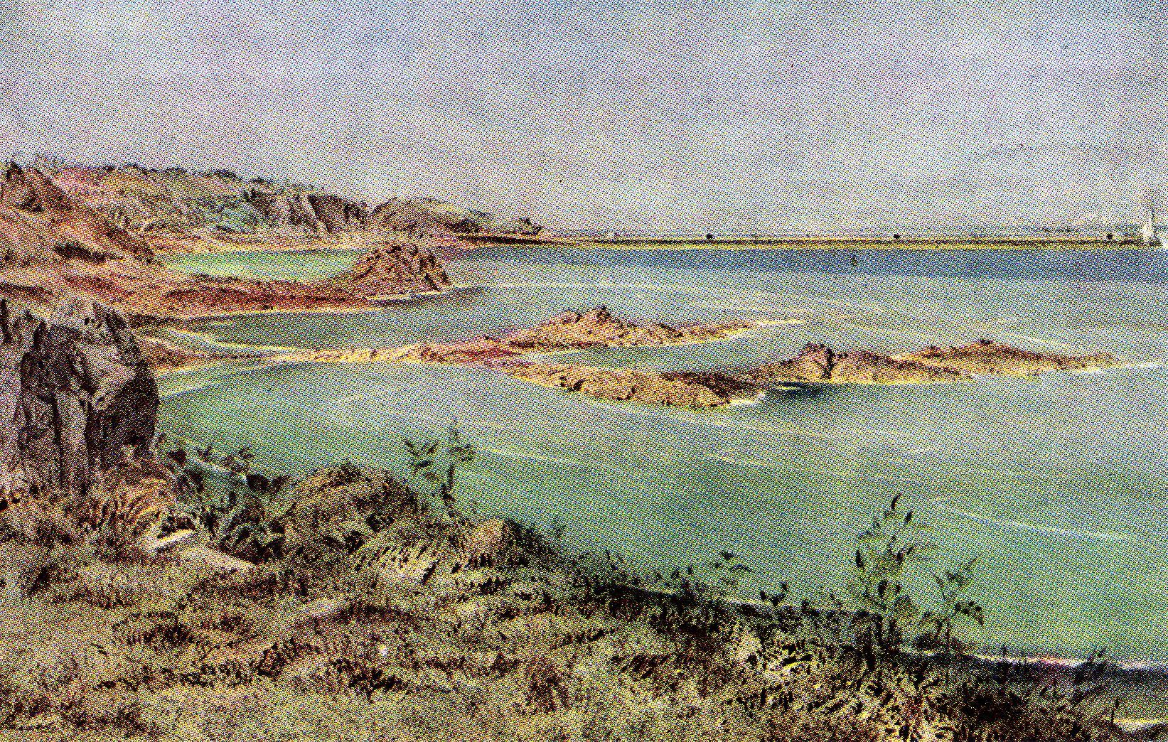 Geoffrey’s Leap and St. Catherine’s Breakwater

 Undated
 Undated
 Undated
 Undated
 Undated 1941
 Undated Undated
 Undated After 1948
 Undated

 Probably 1943.
 Undated. Probably 1943.
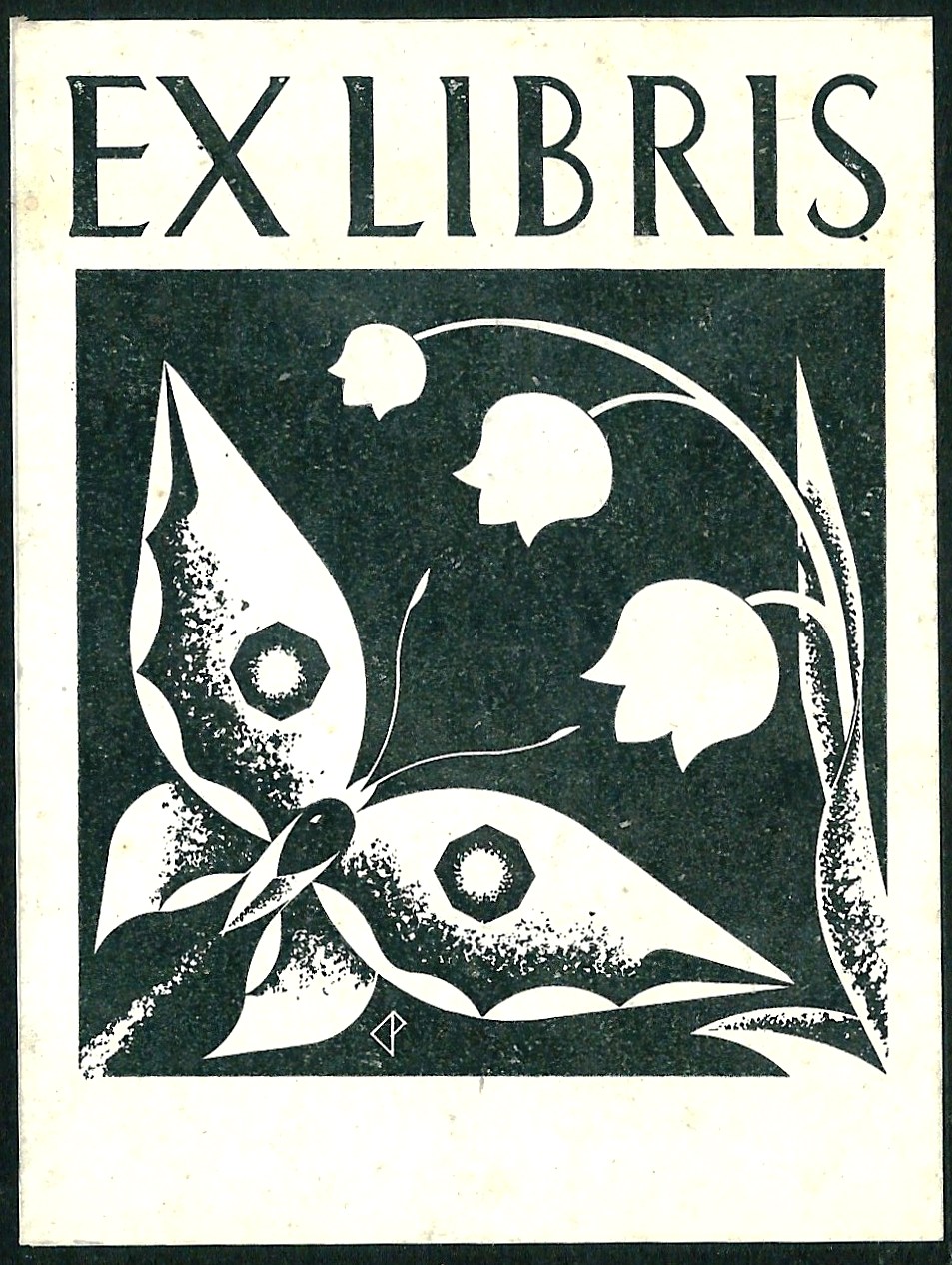

 APD (undated) EKD (undated)
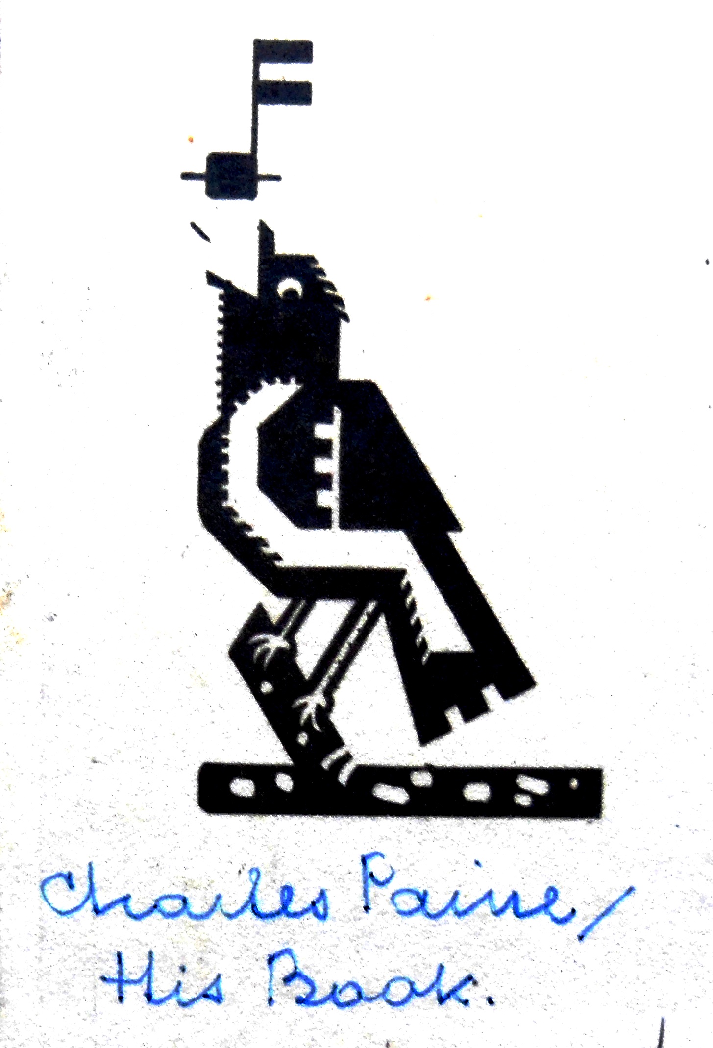 Undated


 He was attacked by the ‘scientific’ psychiatry and psychoanalysis establishment because ‘he took concepts derived from spiritual practice and existential phenomenology and applied them to an understanding of psychotherapy’. He avoided the use of psychiatric jargon and wrote in plain, accessible language which did not go down well in some professional quarters. Although shunned by the mainstream, his ideas had a profound influence on intellectuals such as, Henry Miller, Alan Watts and R. D. Laing, the eminent Scottish psychiatrist who called Howe ‘a master psychologist’. In his introduction to Howe’s Cure or Heal? Laing wrote, ‘What we have here is not a[n] Eric Graham Howe synthesis of different schools, but an original expression in the modern idiom of that which all schools seek to express in more or less rigid and desiccated ways. But the expression here is supple and fresh.’
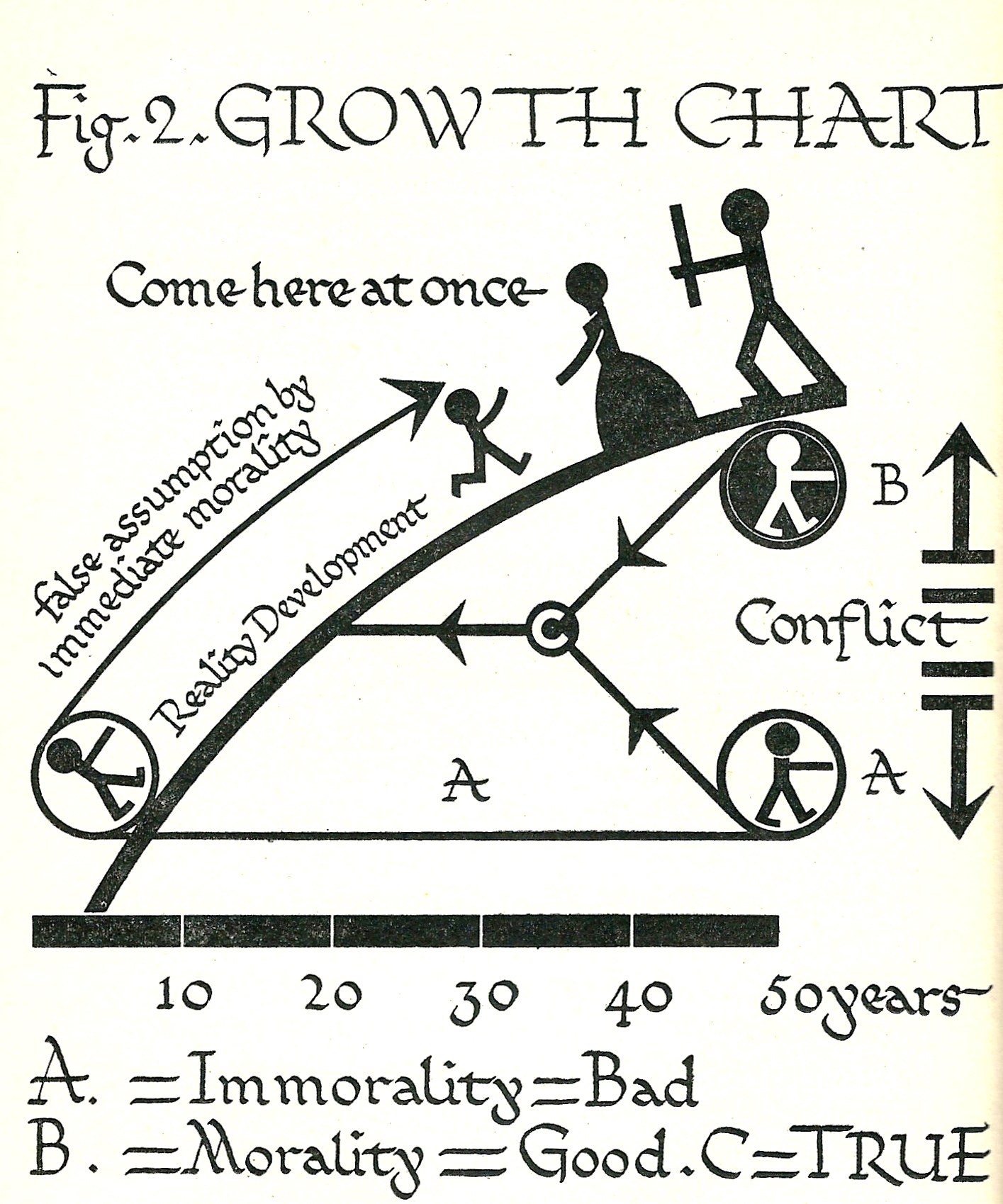


 Chp. 13 Citizenship Chp. 14 Precis


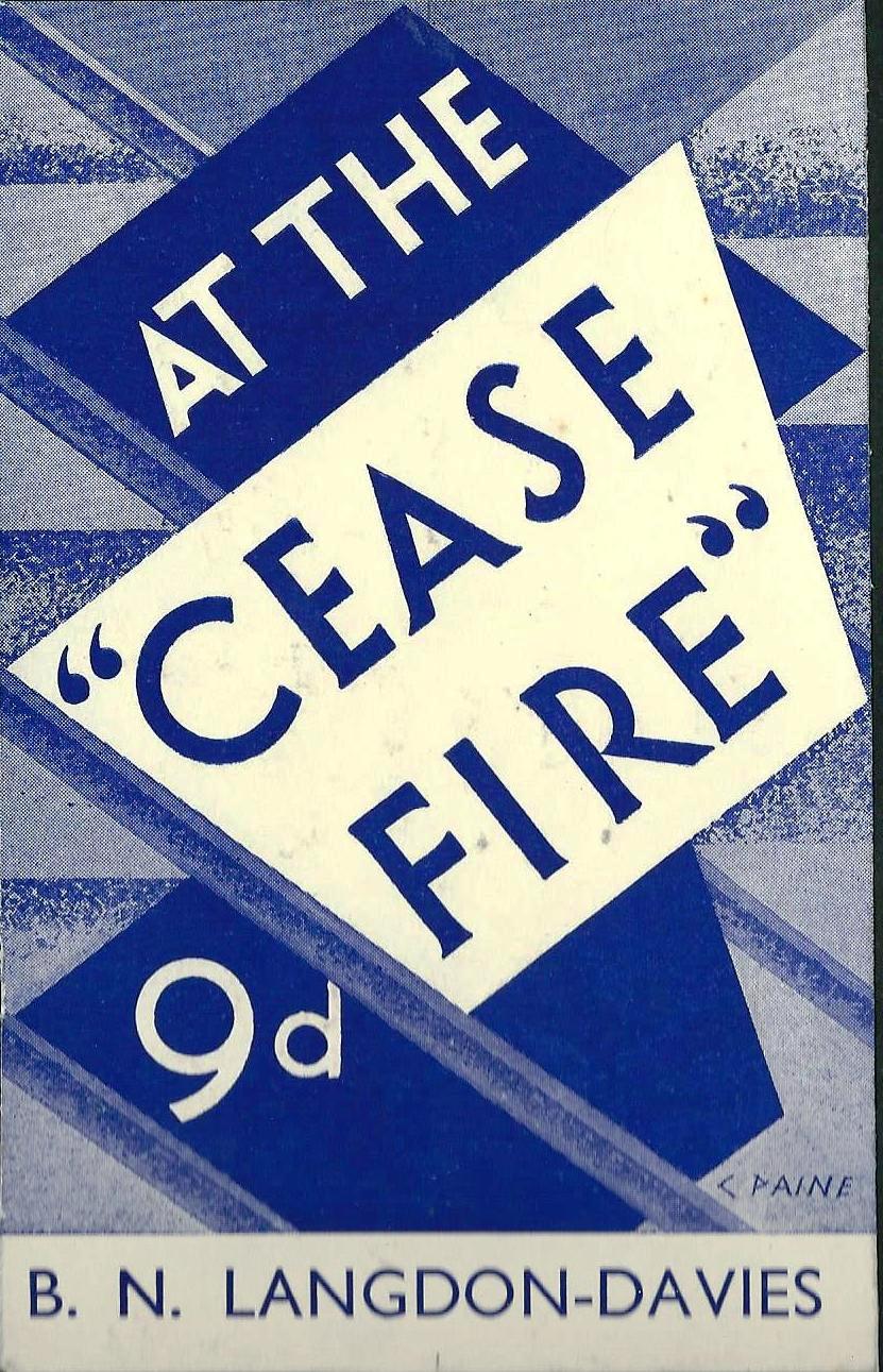 1941 Bernard Noel Langdon-Davies (1876-1952) socialist and pacifist.
 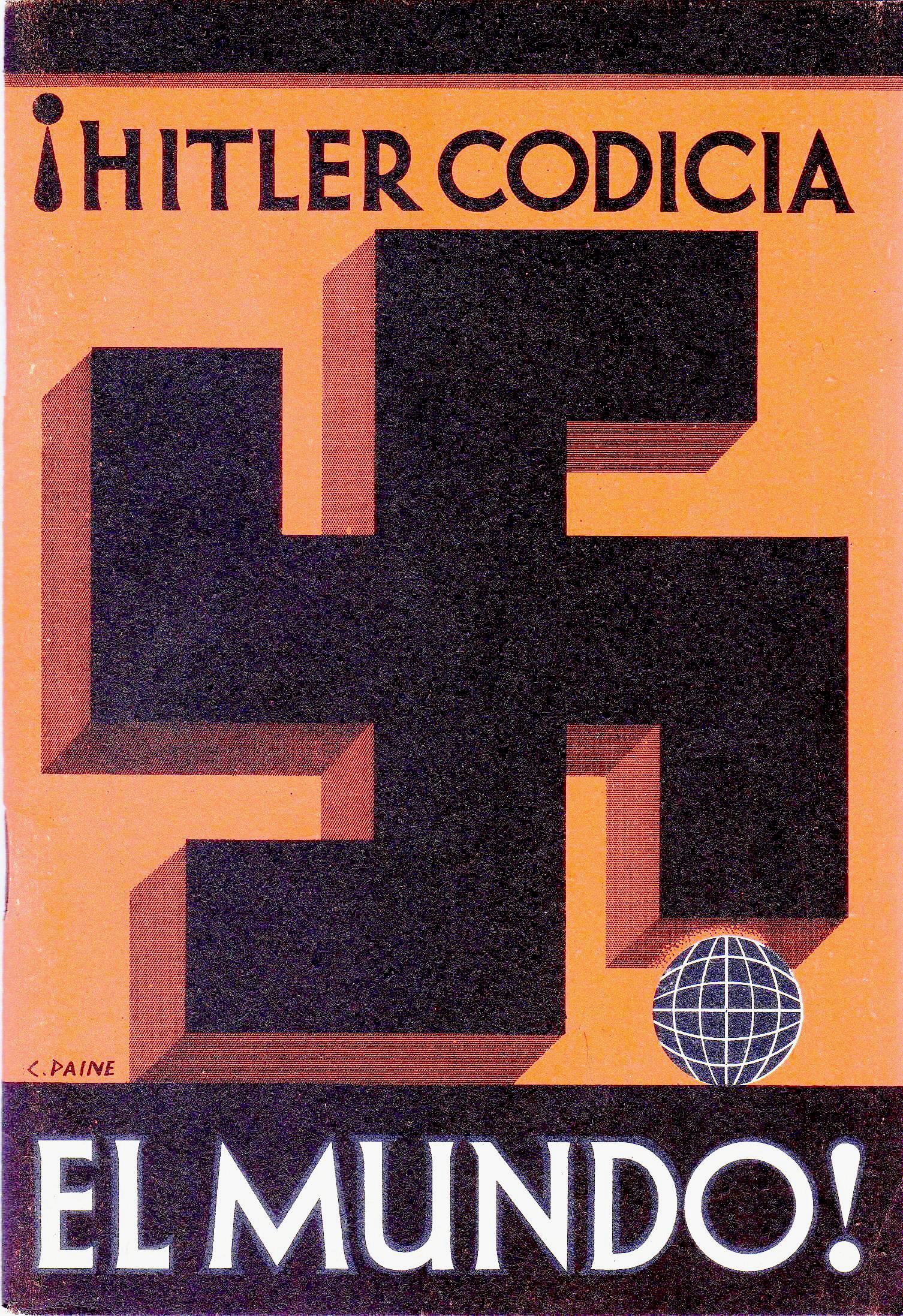 1941
1941 Possibly created in 1917 when Paine was conscripted into the Admiralty Inspection Section during his time at the RCA.


 January- shooting.
 February – sowing
 March – winds
 April – showers
 May – paradise This picture recalls the well-known quatrain from Fitzgerald’s translation of the Rubaiyat of Omar Khayyam.
 June – proposal
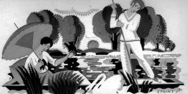 July – punting
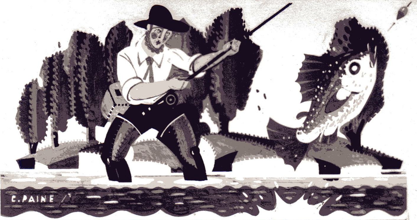 August – fishing
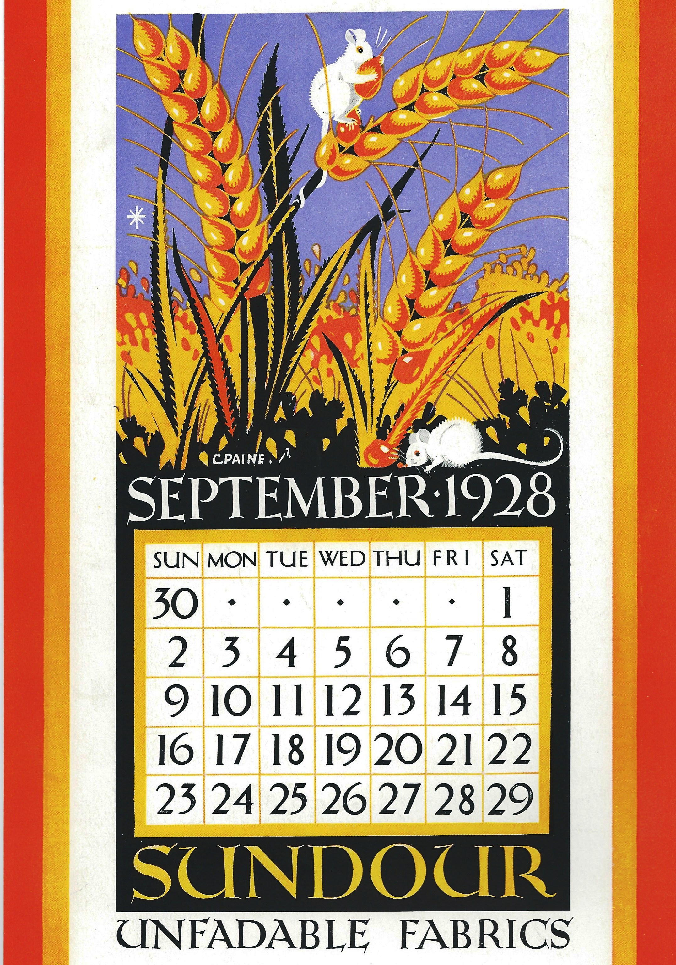
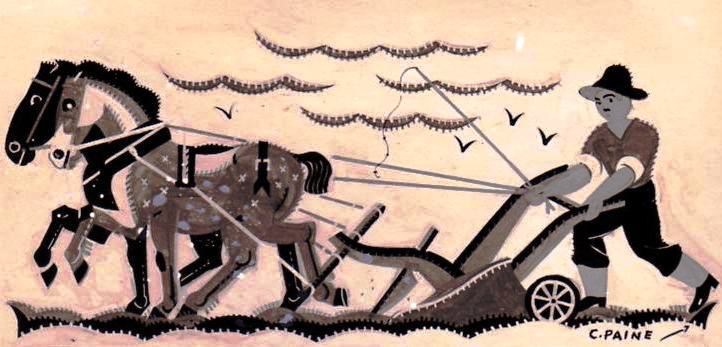 September – ploughing
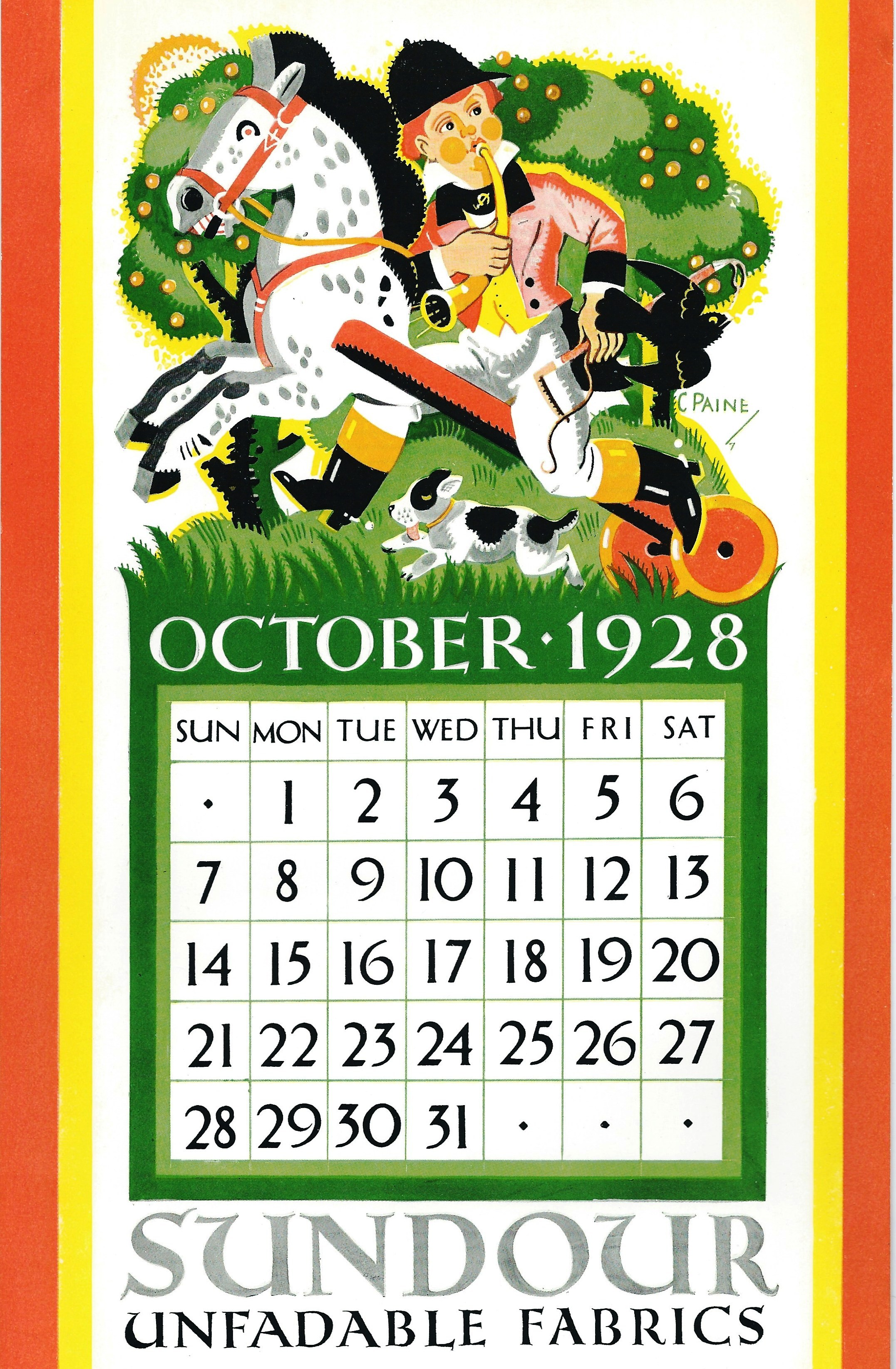
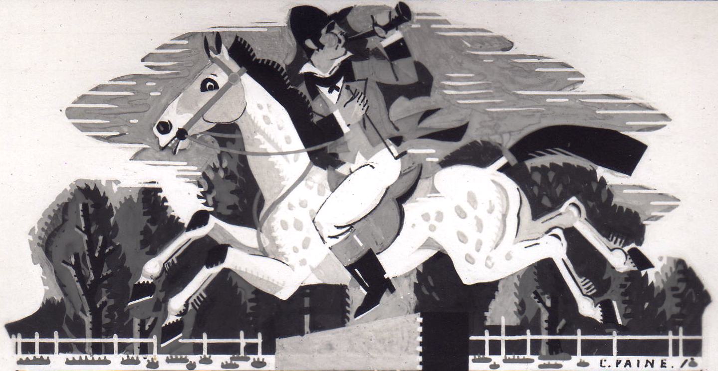 October – hunting
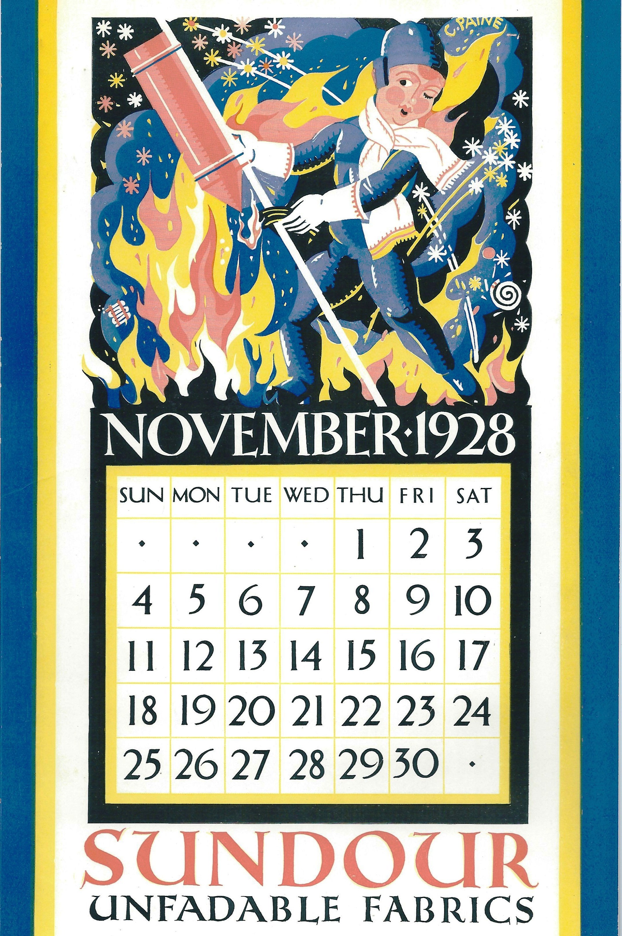
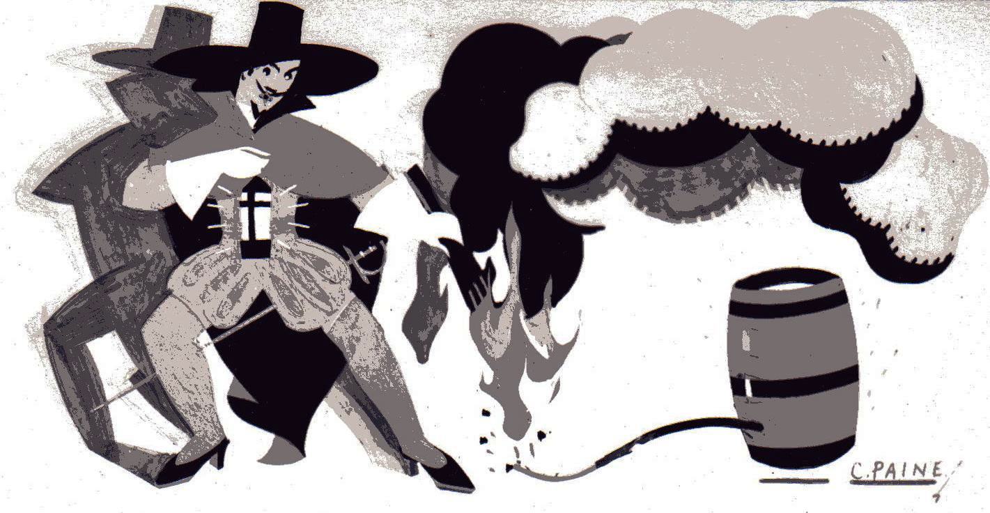 November – Guy Fawkes
 December – pantomime

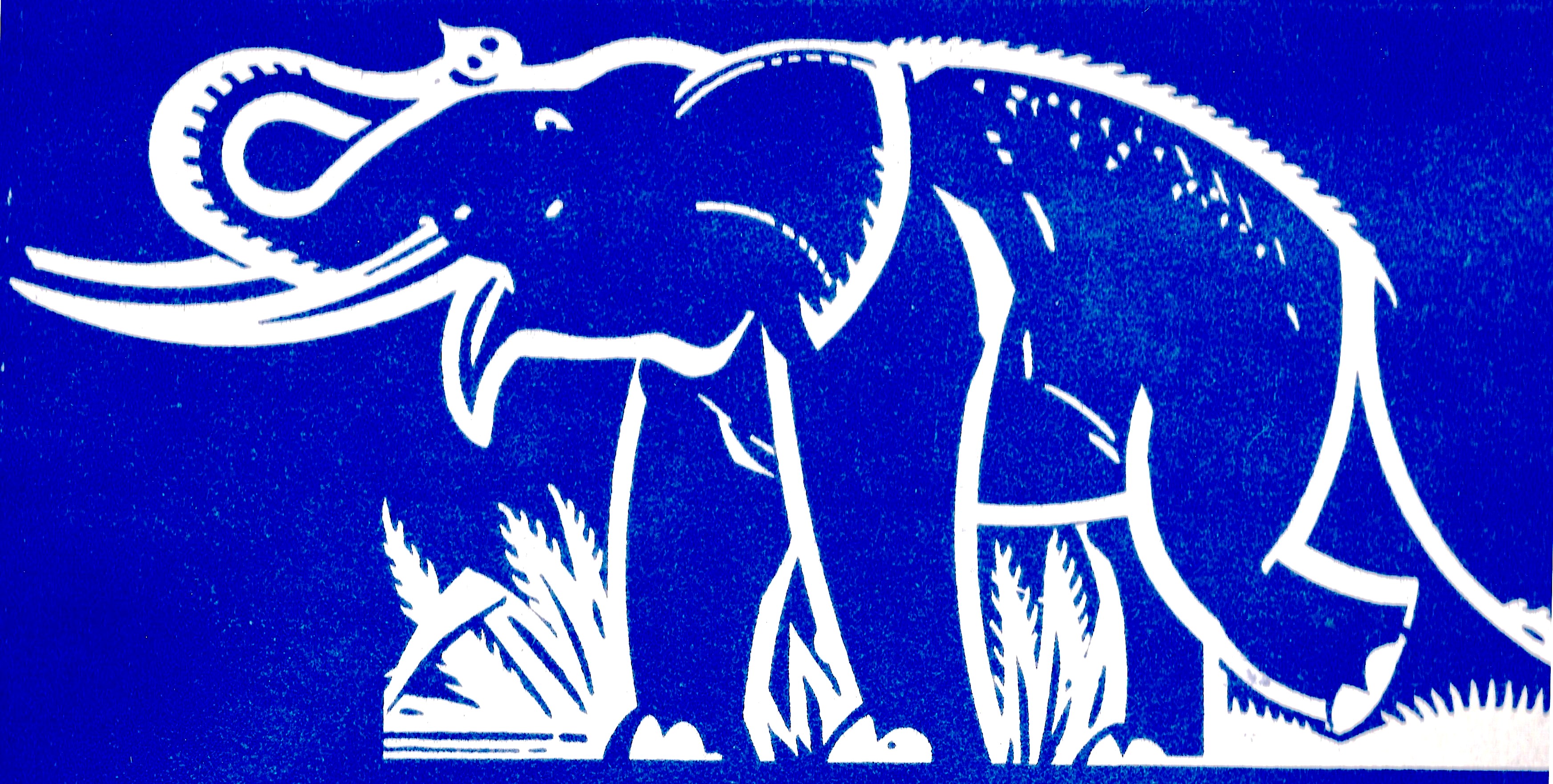 India Elephant
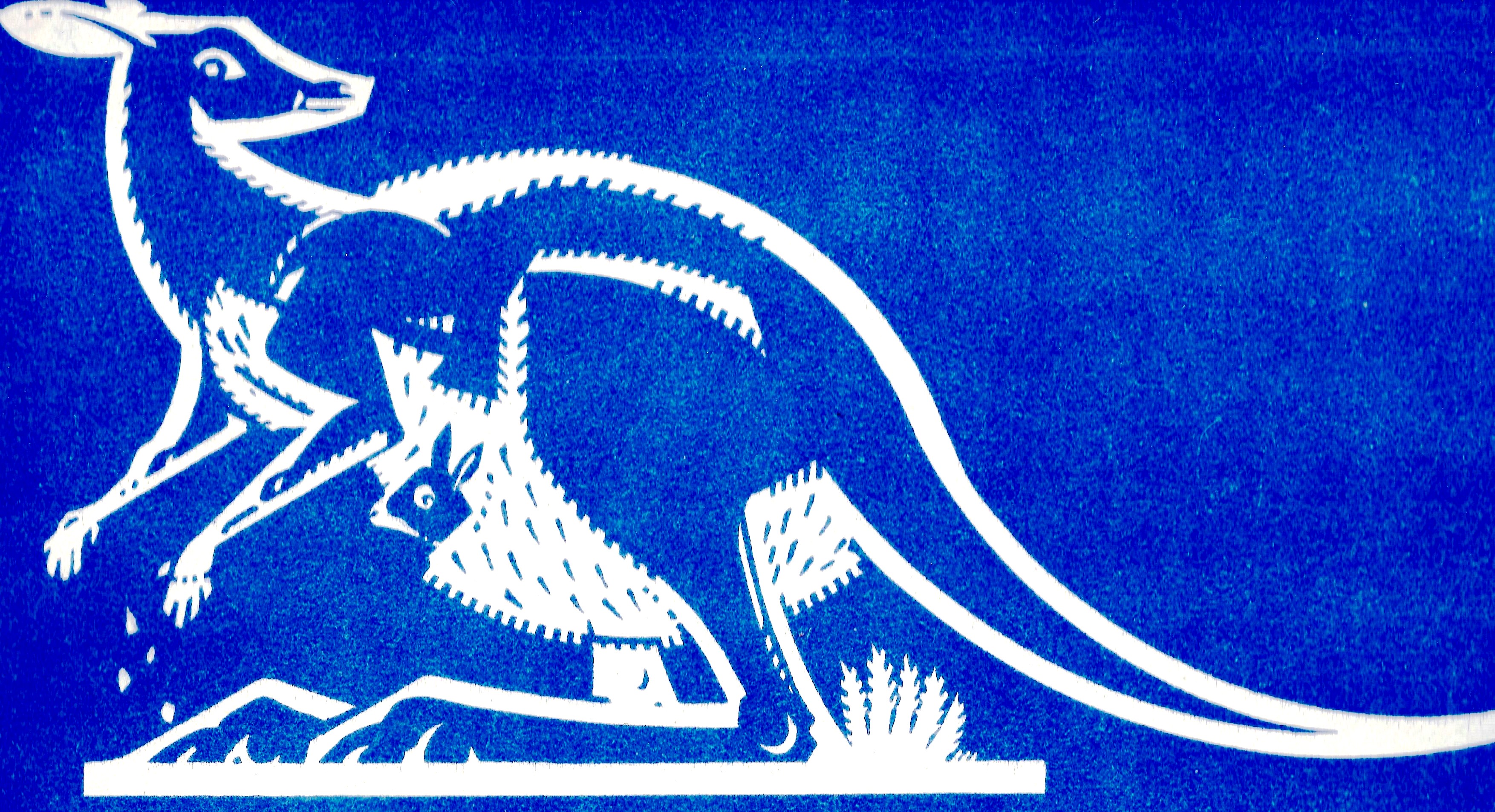 Australia Kangaroo with nervous Joey
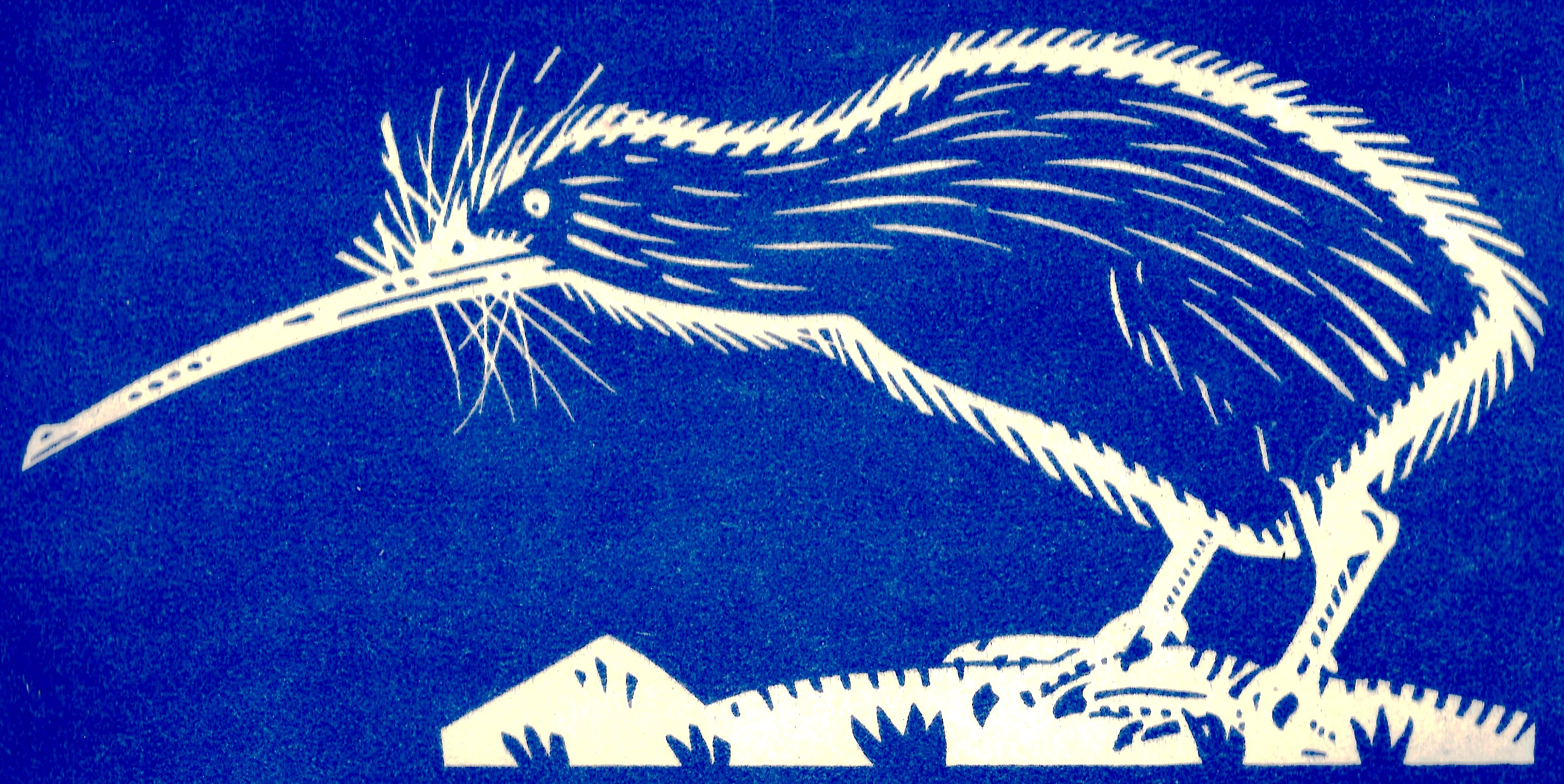 New Zealand Kiwi
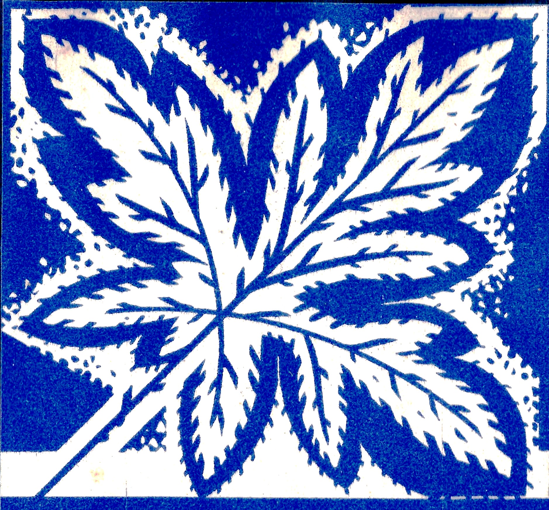 Canada Maple Leaf
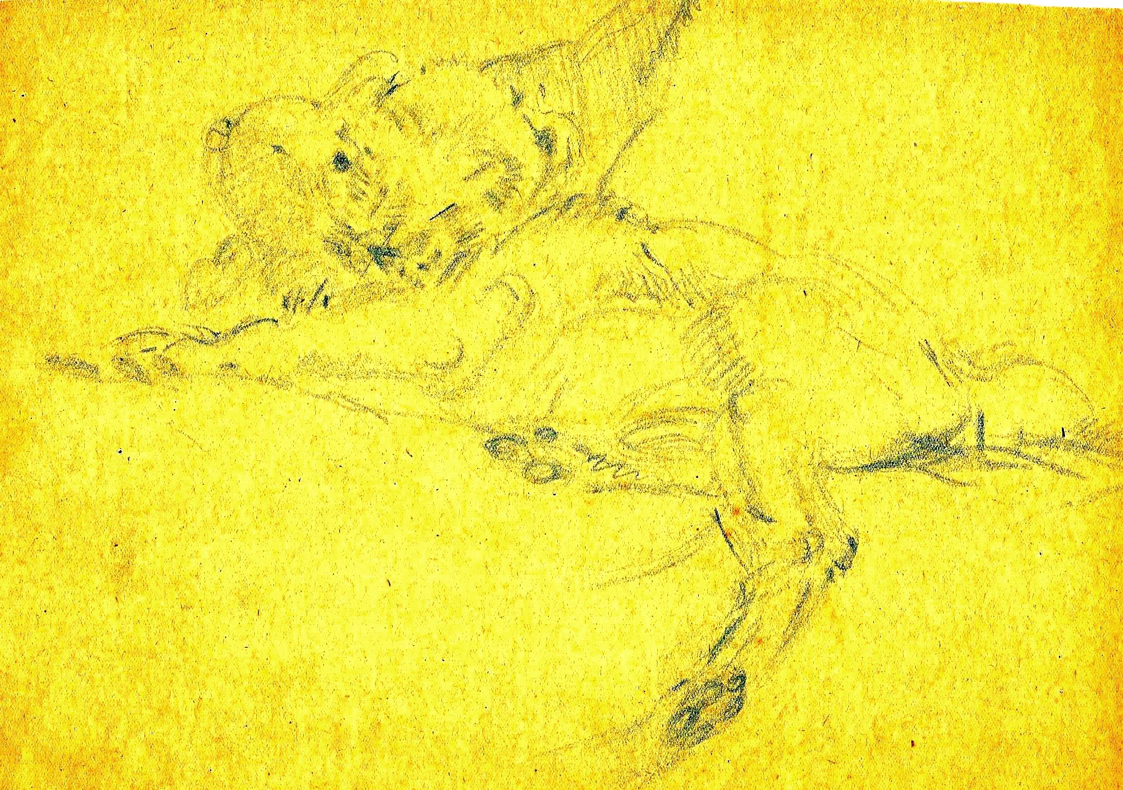
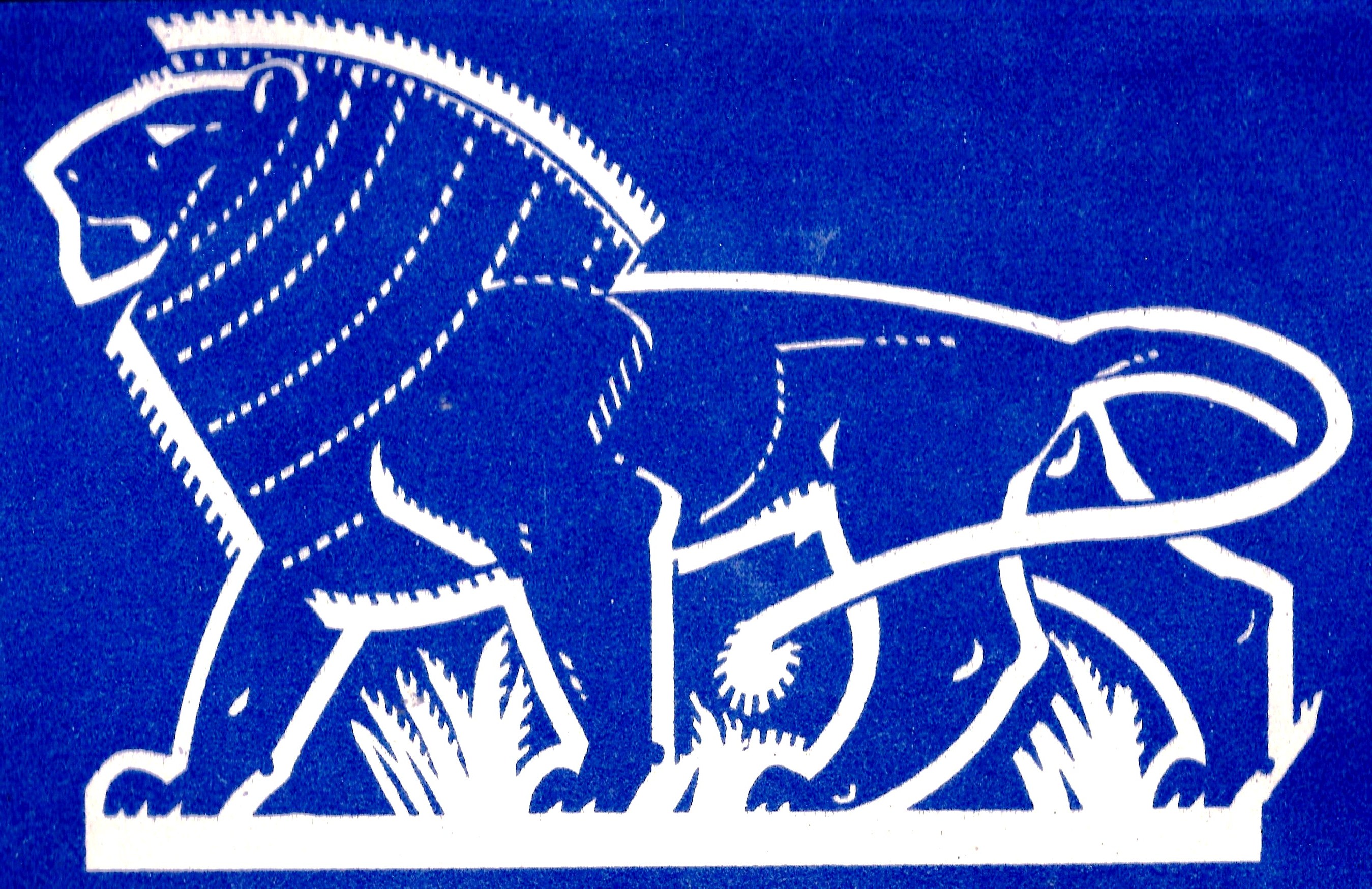 Kenya Lion
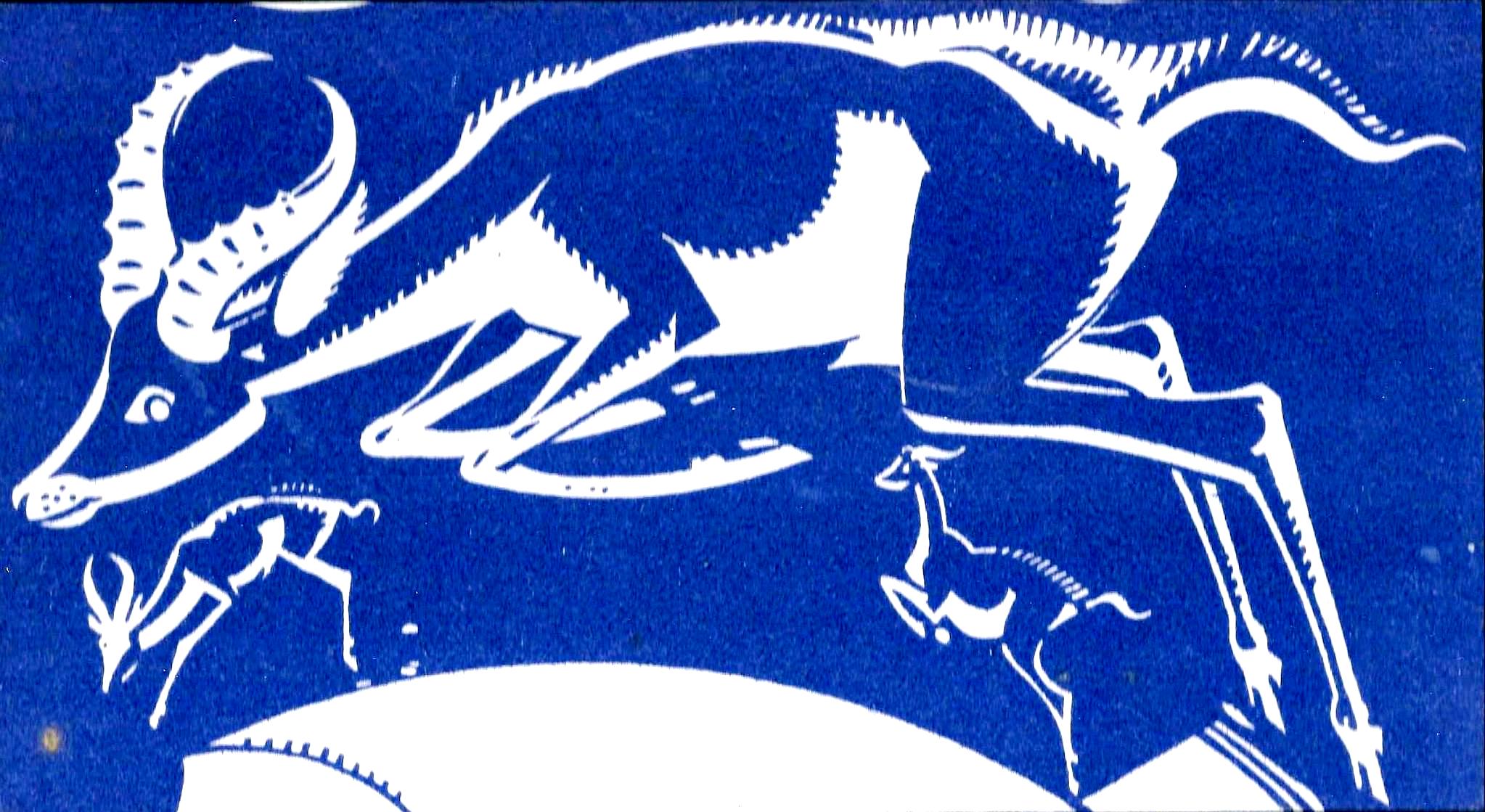 South Africa Impala
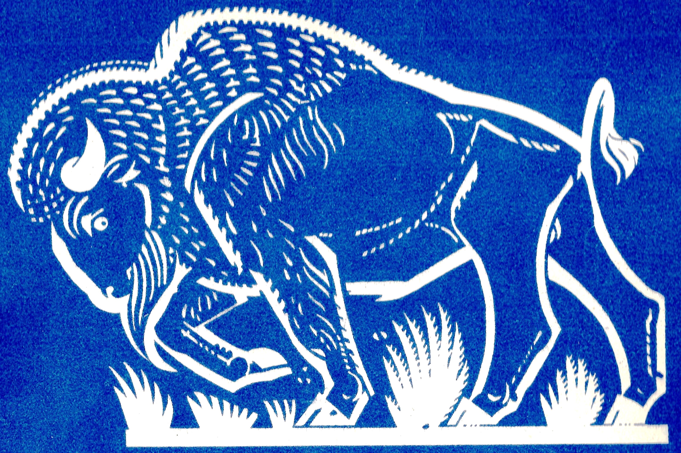 The Buffalo or Bison is a symbol of the United States and of the native Americans. It is possible though unlikely that Paine was a die-hard empire loyalist dreaming of the day when the American colonies would resume their allegiance to the British Crown. The bison also symbolises Canada but we already have the Maple Leaf.
 I am unable to identify this plant. Suggestions welcome.
 I am unable to identify this leaf. Suggestions welcome.
 Undated
 Undated
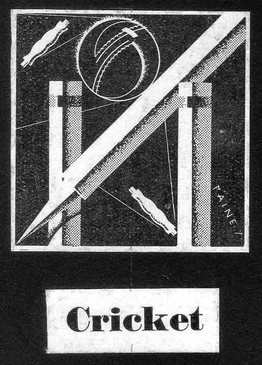
 Cricket Netball
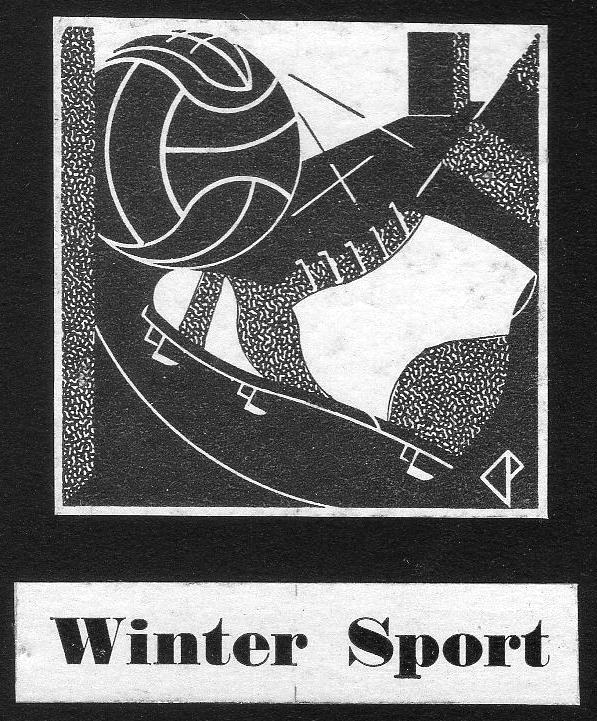
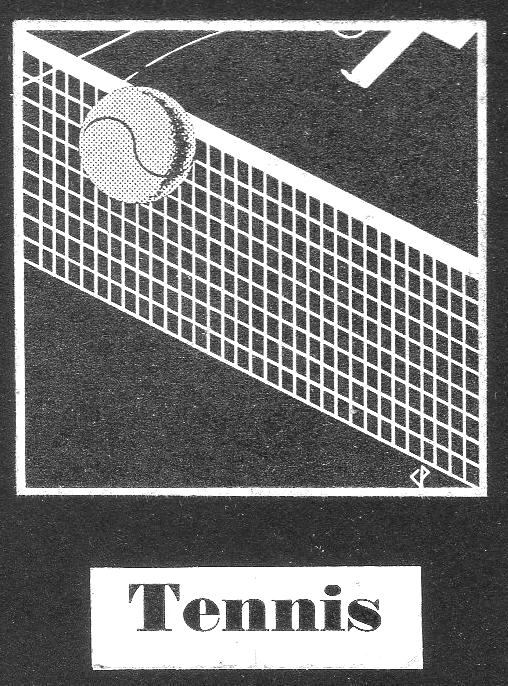
 Winter Sport Tennis
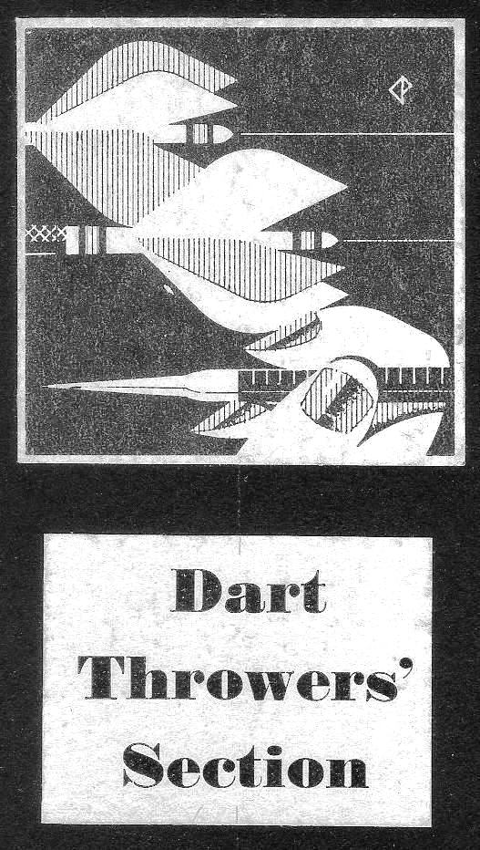
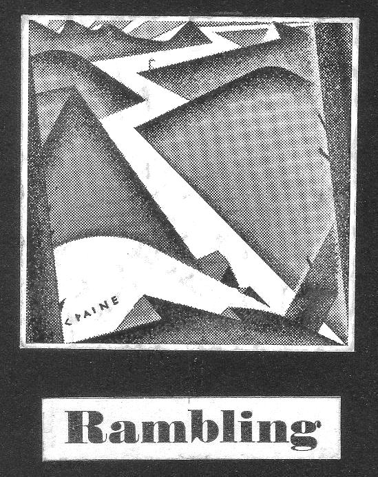
 Rambling Darts
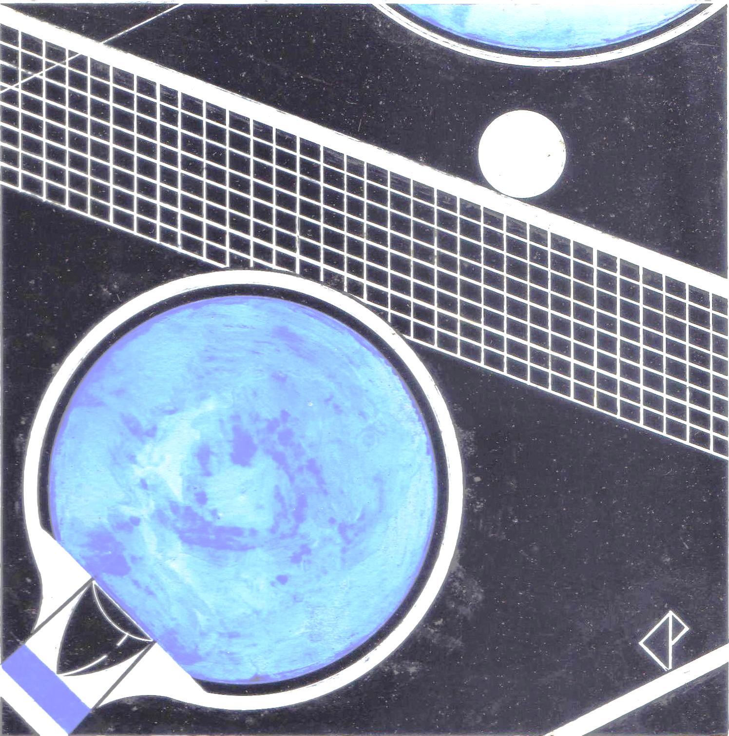
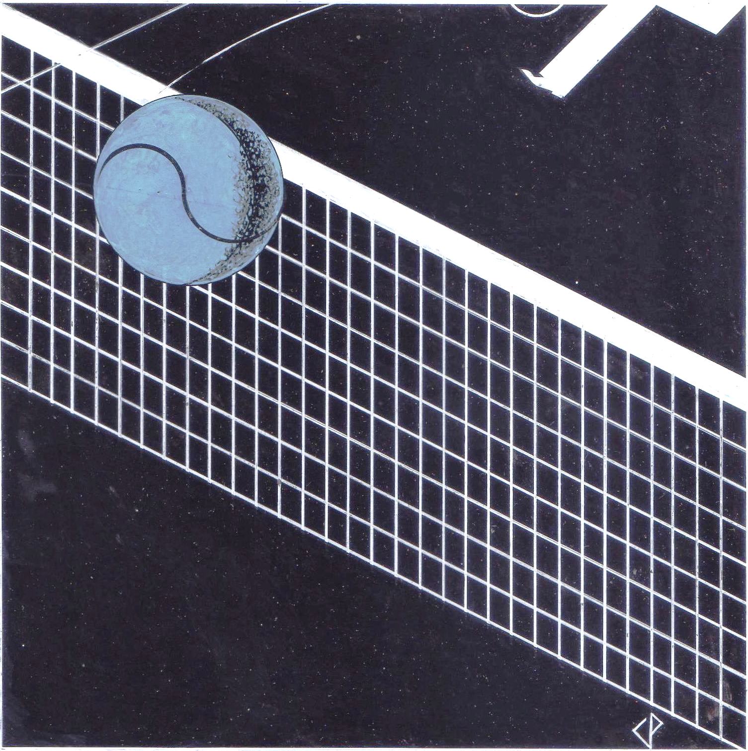
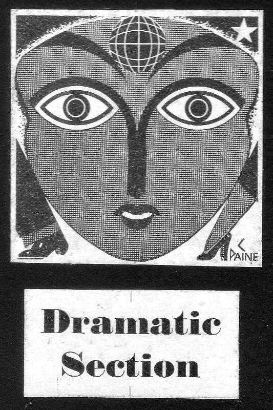
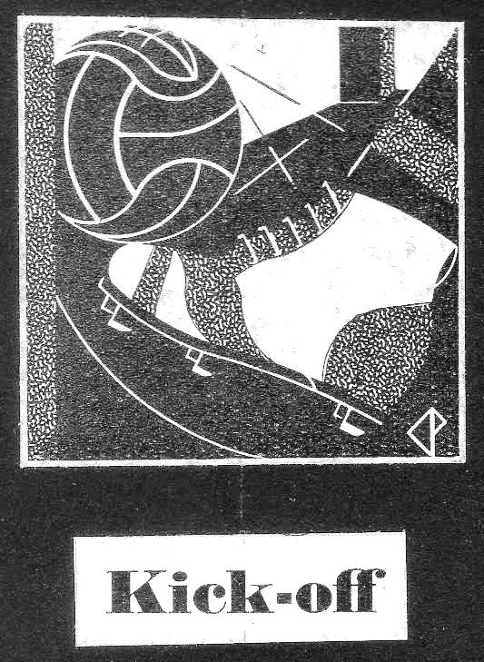
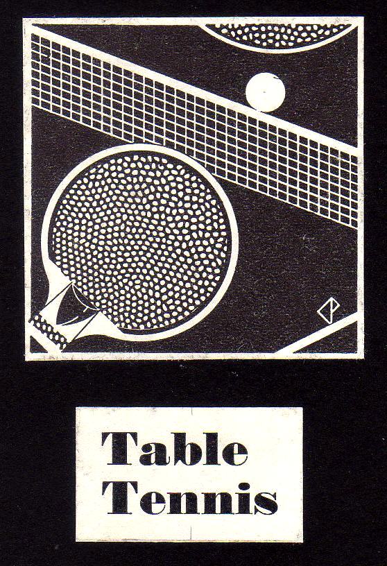
 Table Tennis Drama
 The boys are marching.
 Undated
 Undated. Probably 1946.
 Probably post 1947
 Undated


 Undated. Probably 1929.
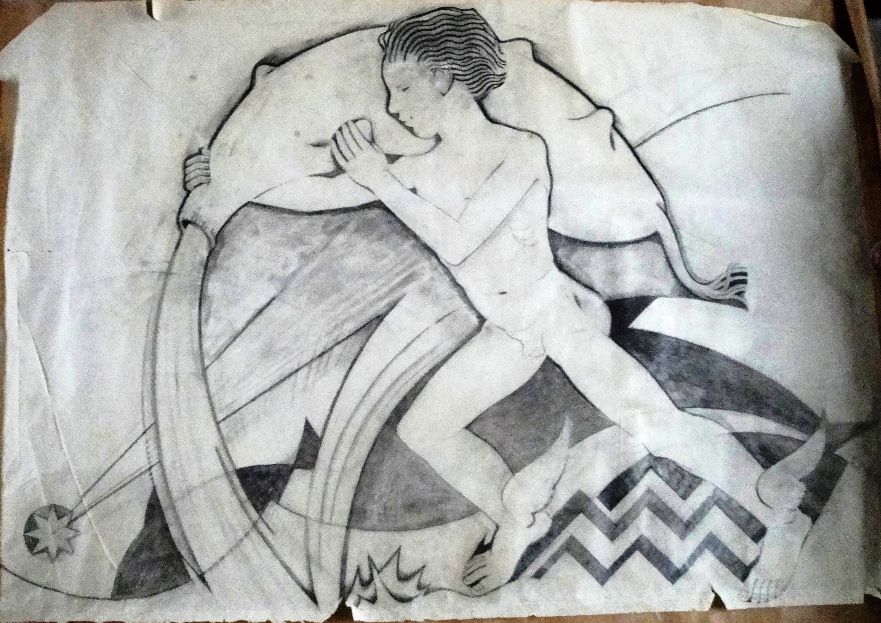 Aquarius. Cartoon probably for Meridian Studios undated probably 1930.
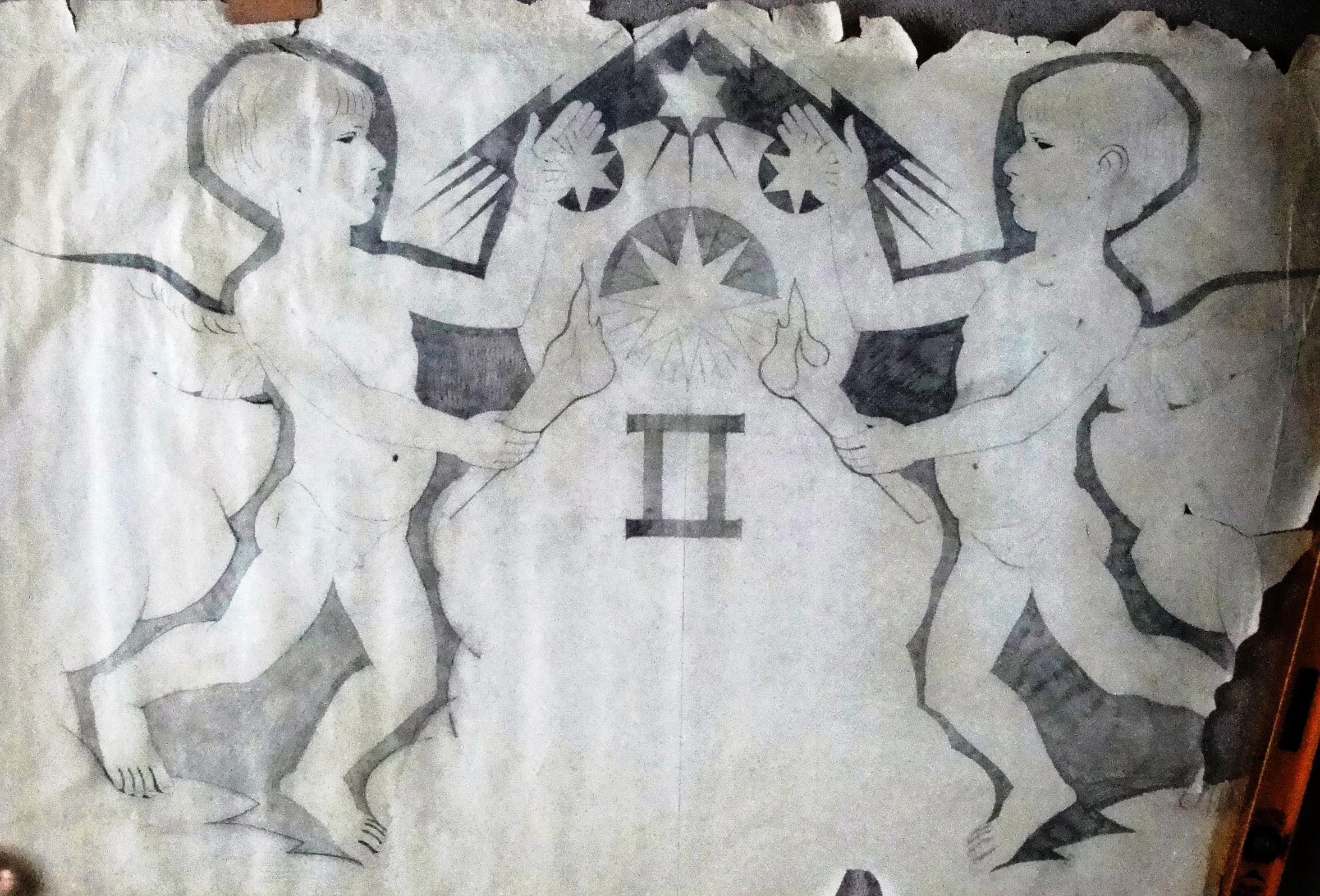 Gemini. Cartoon probably for Meridian Studios undated probably 1930.
 Page 1


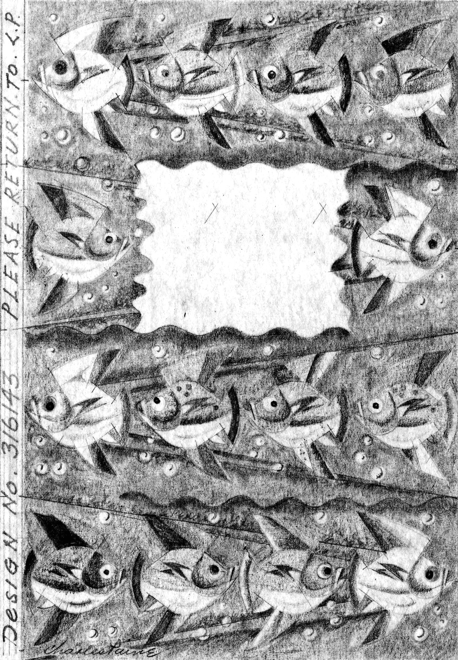
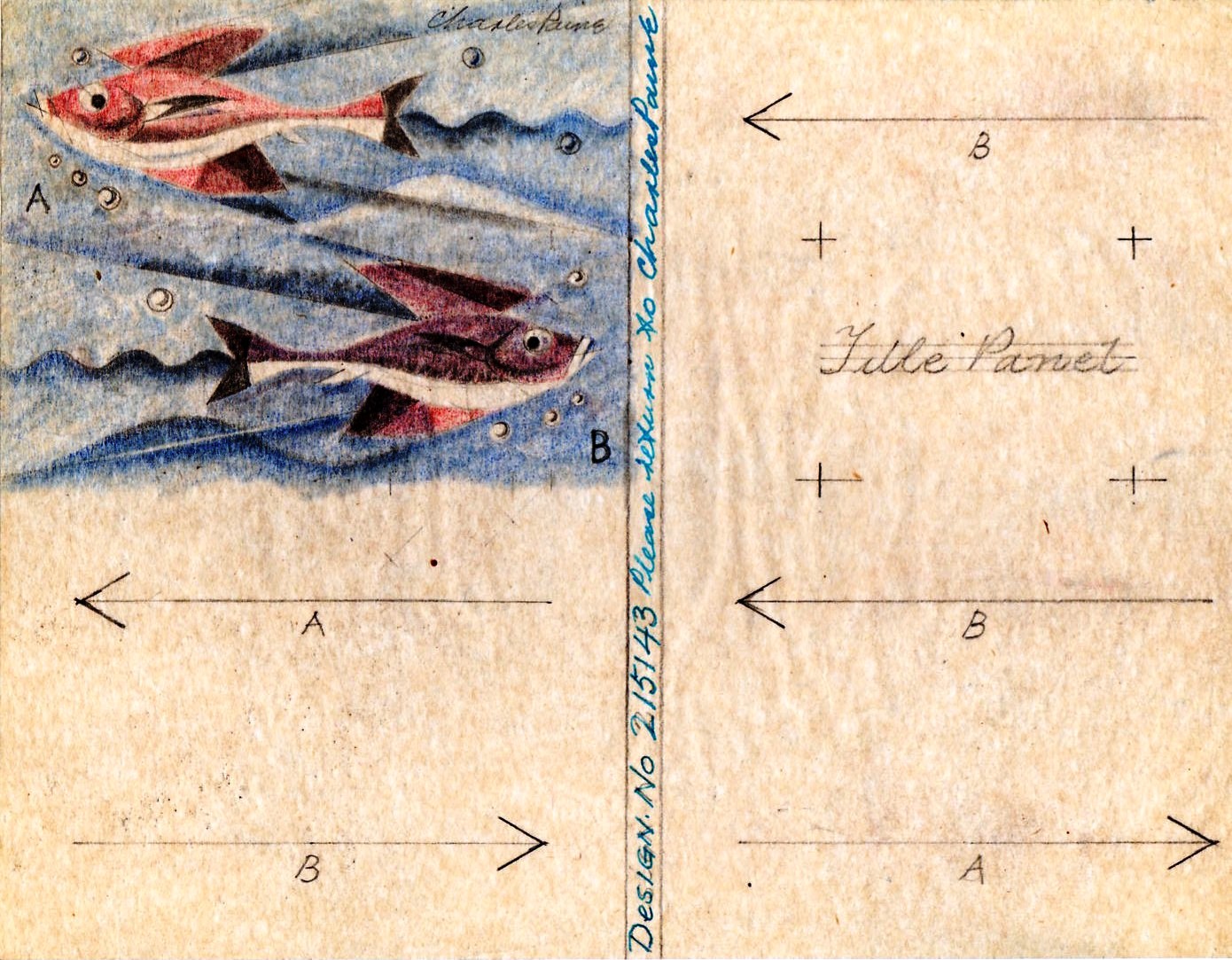
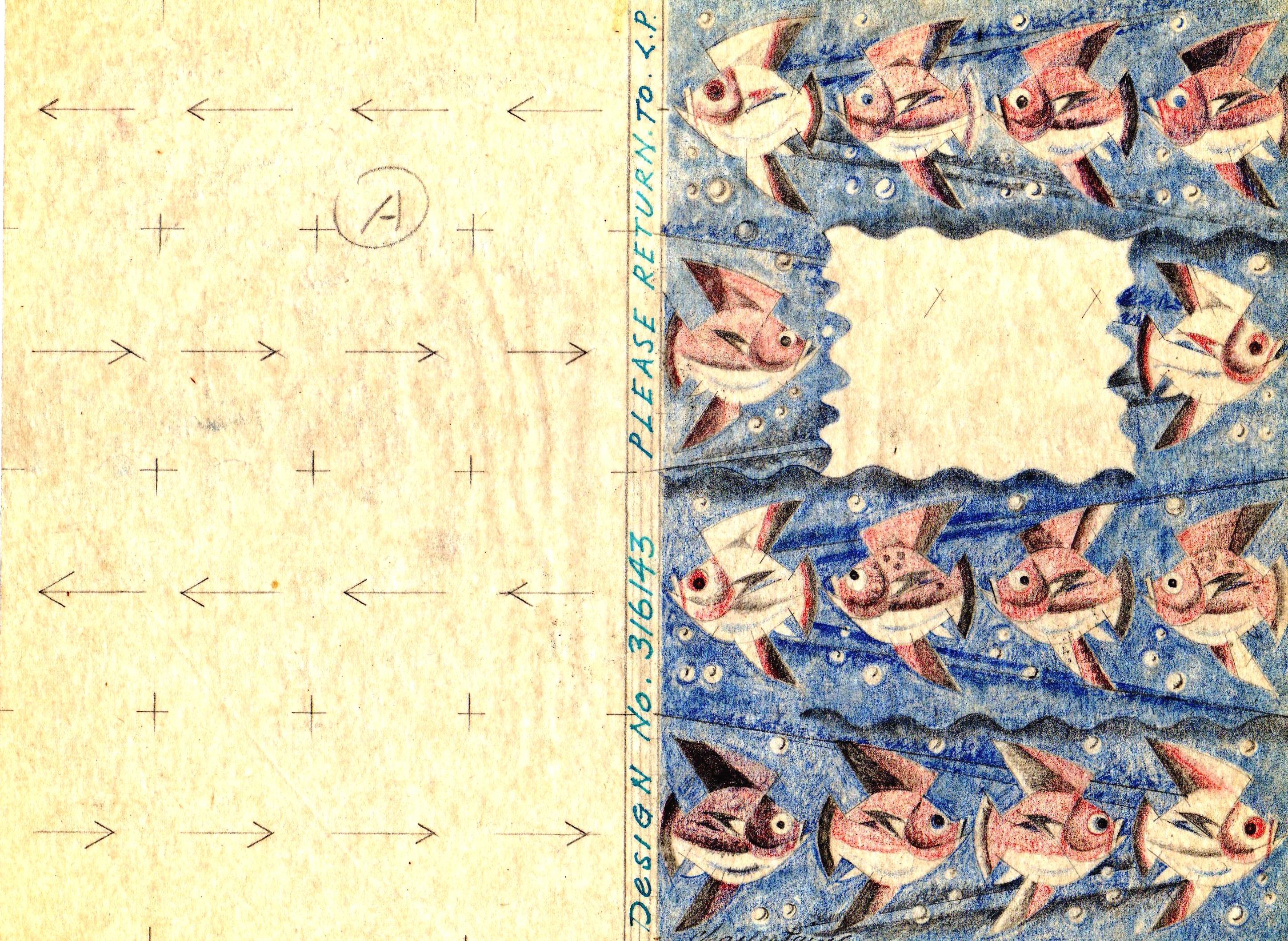
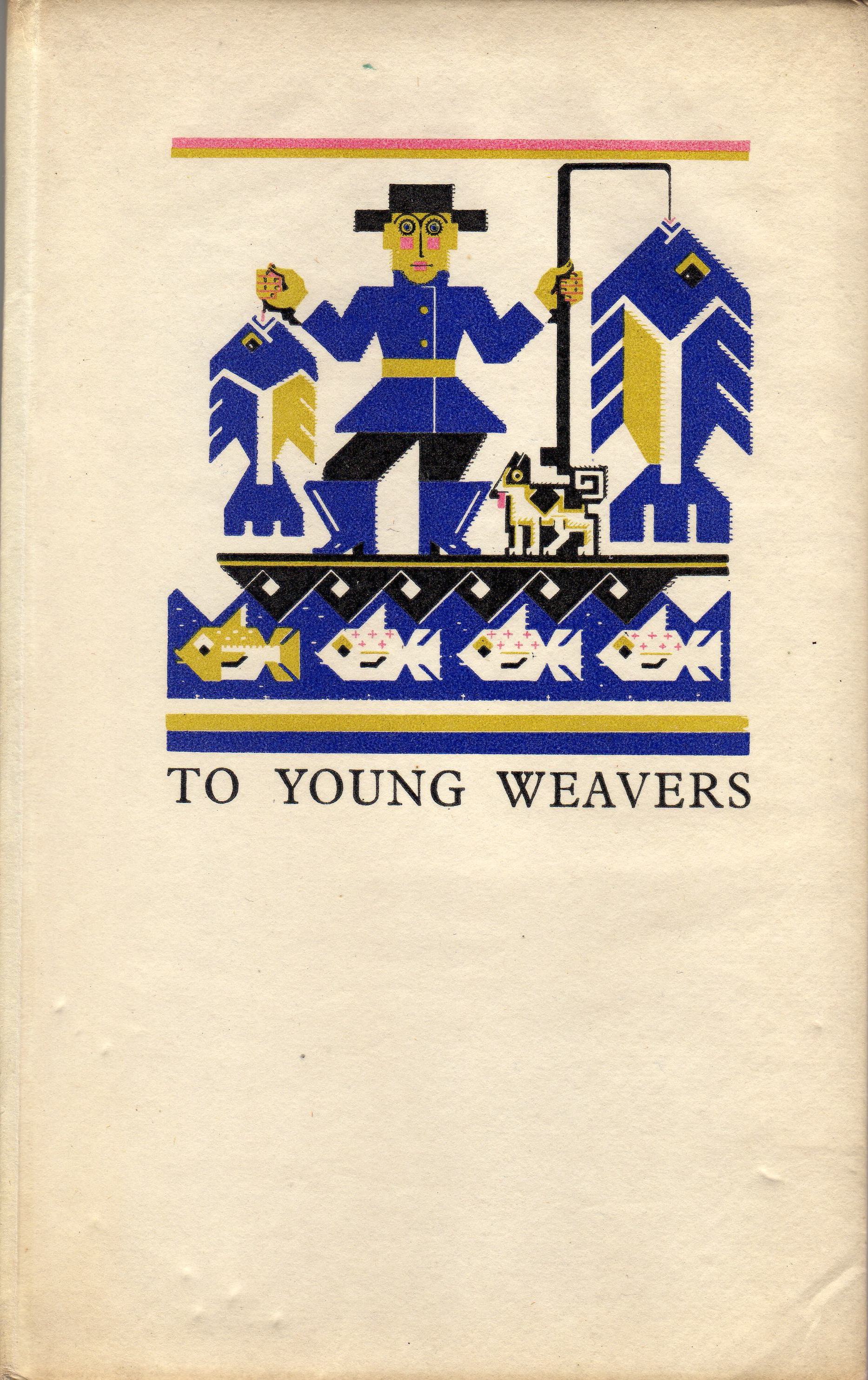
 Decorations in To Young Weavers.


 I have only one design for October
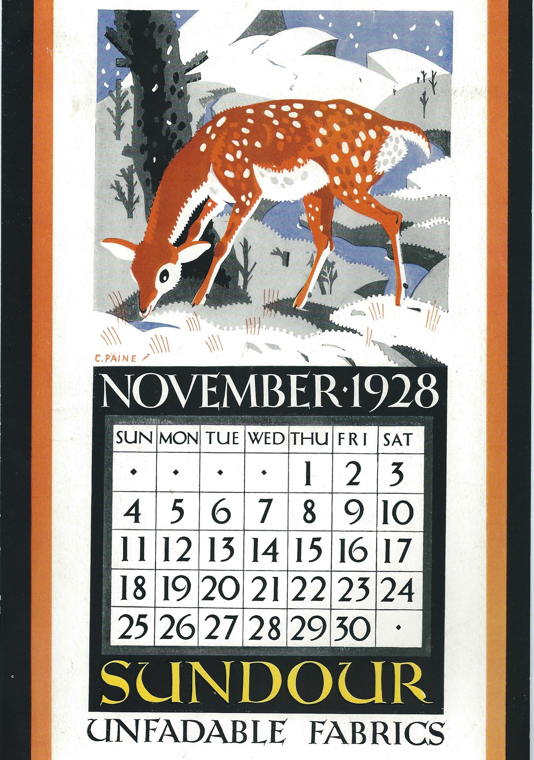
 Undated.
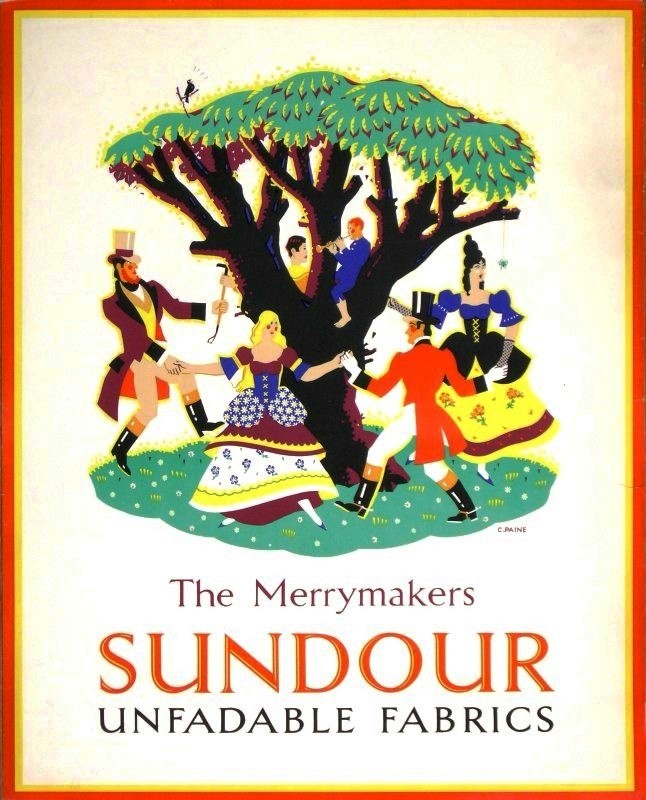 1926 or before. On a high twig a blackbird sings lustily along with the flute and one of the dancers definitely doesn’t like spiders.
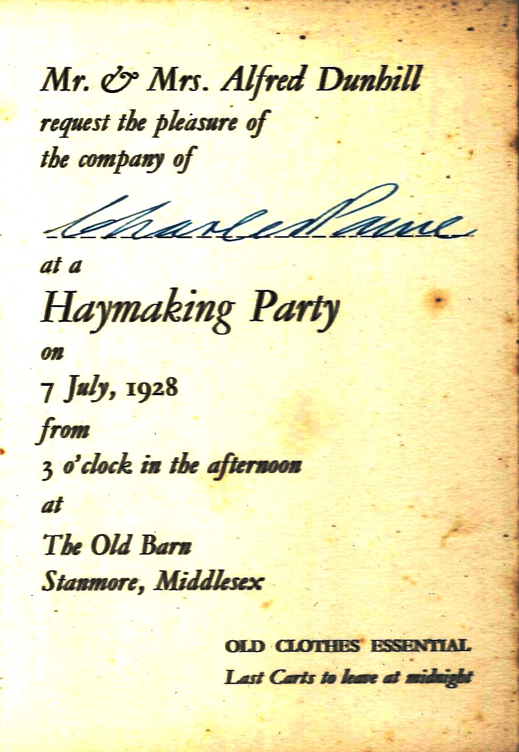
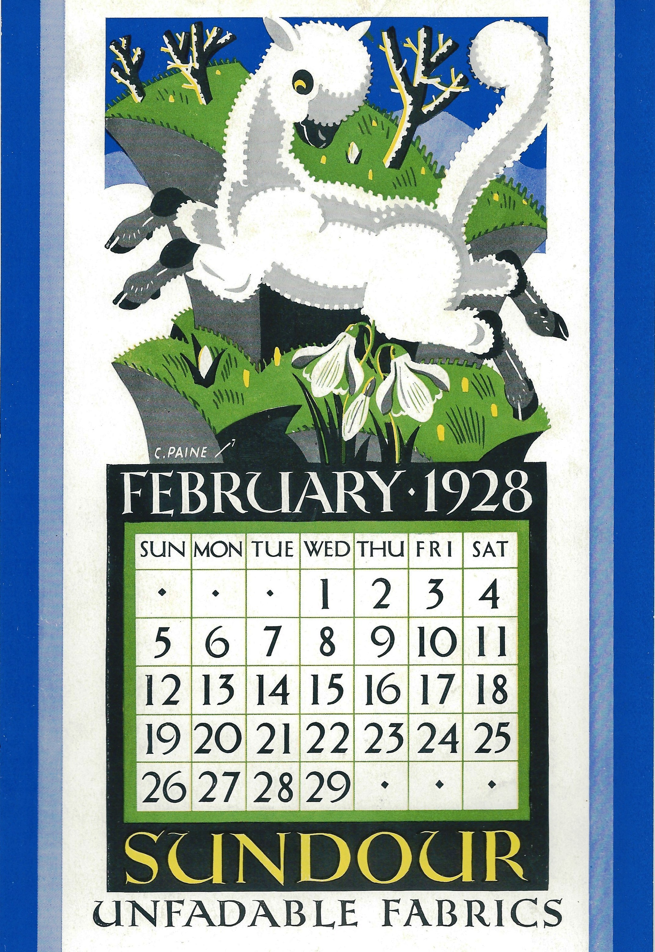
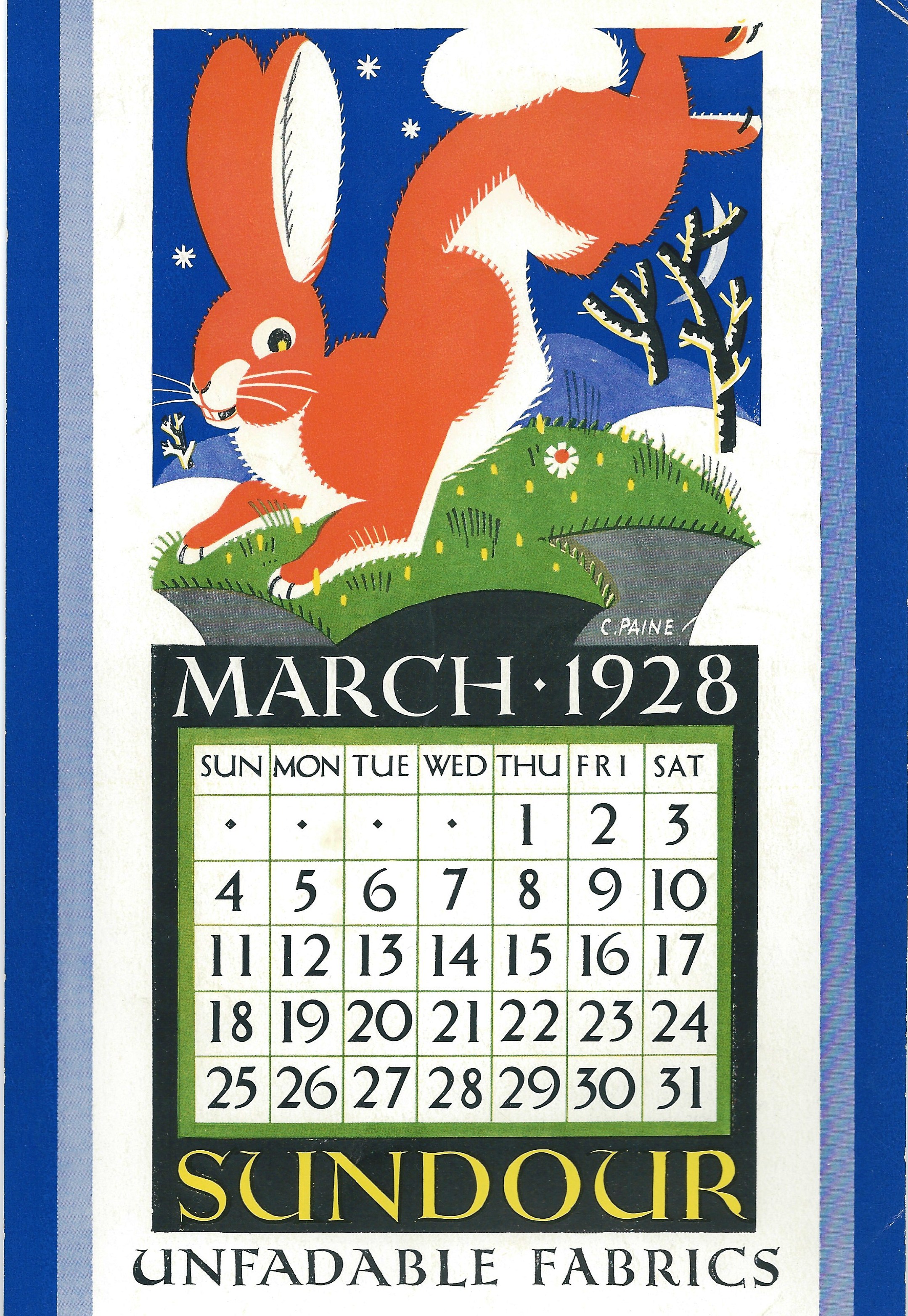
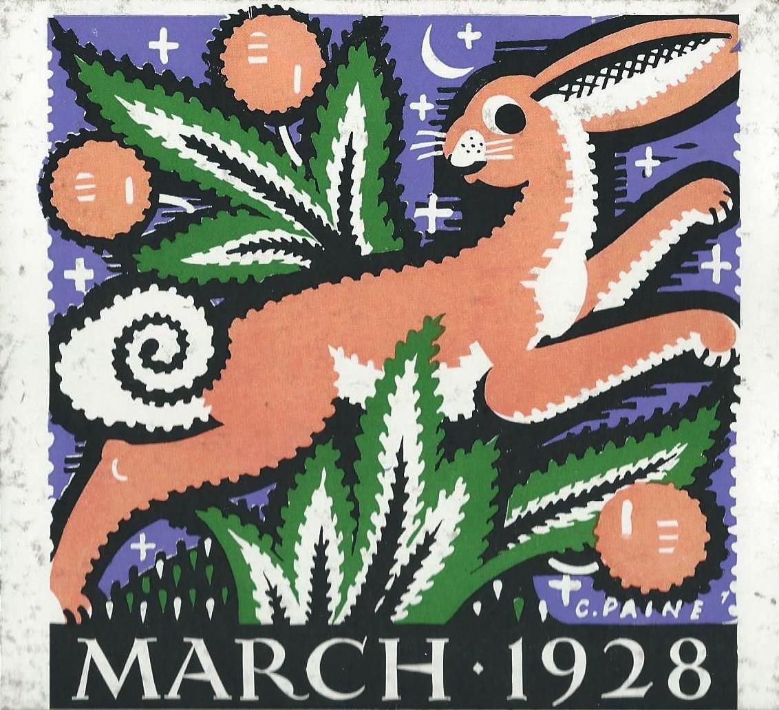
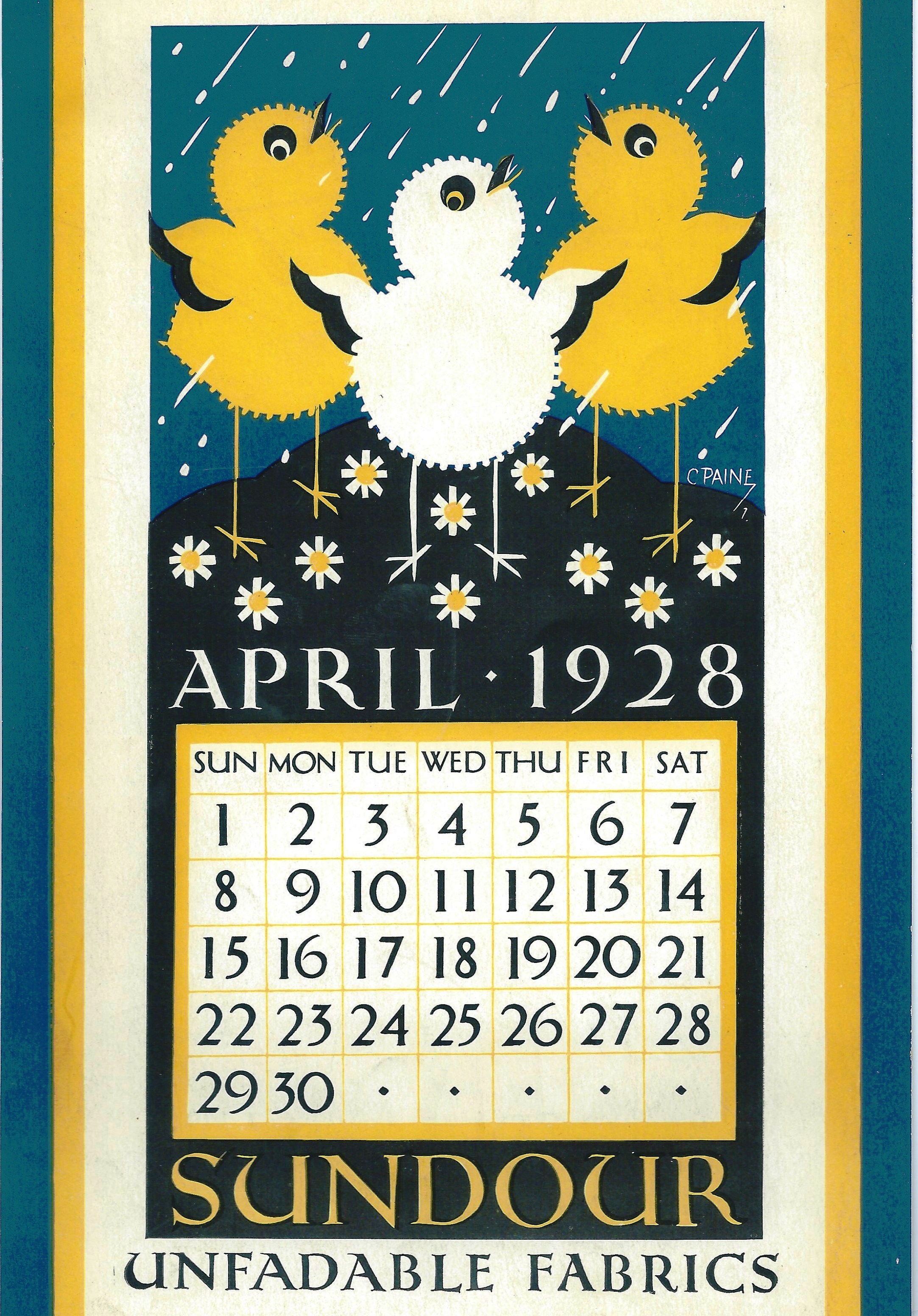
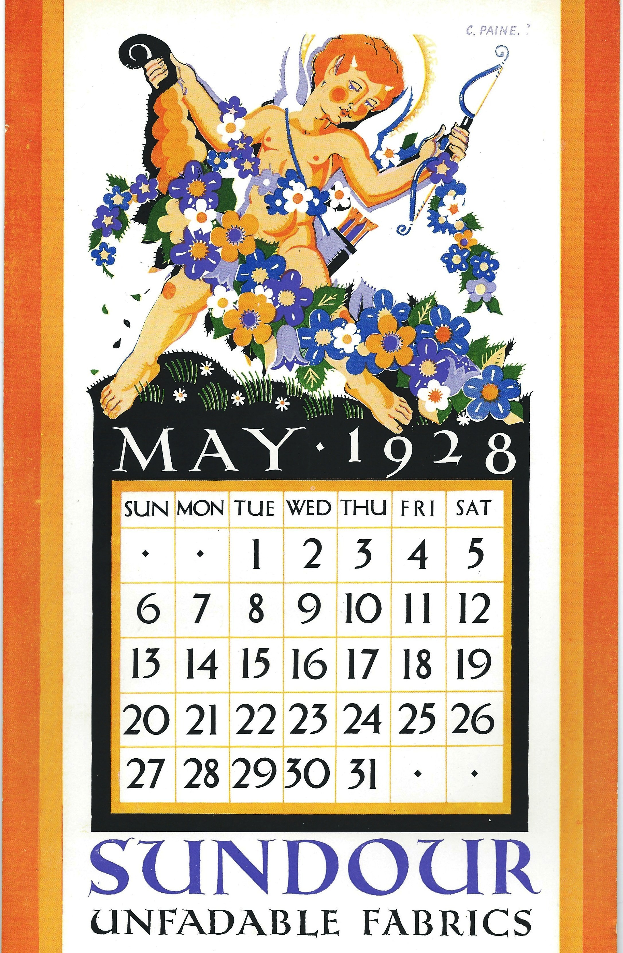
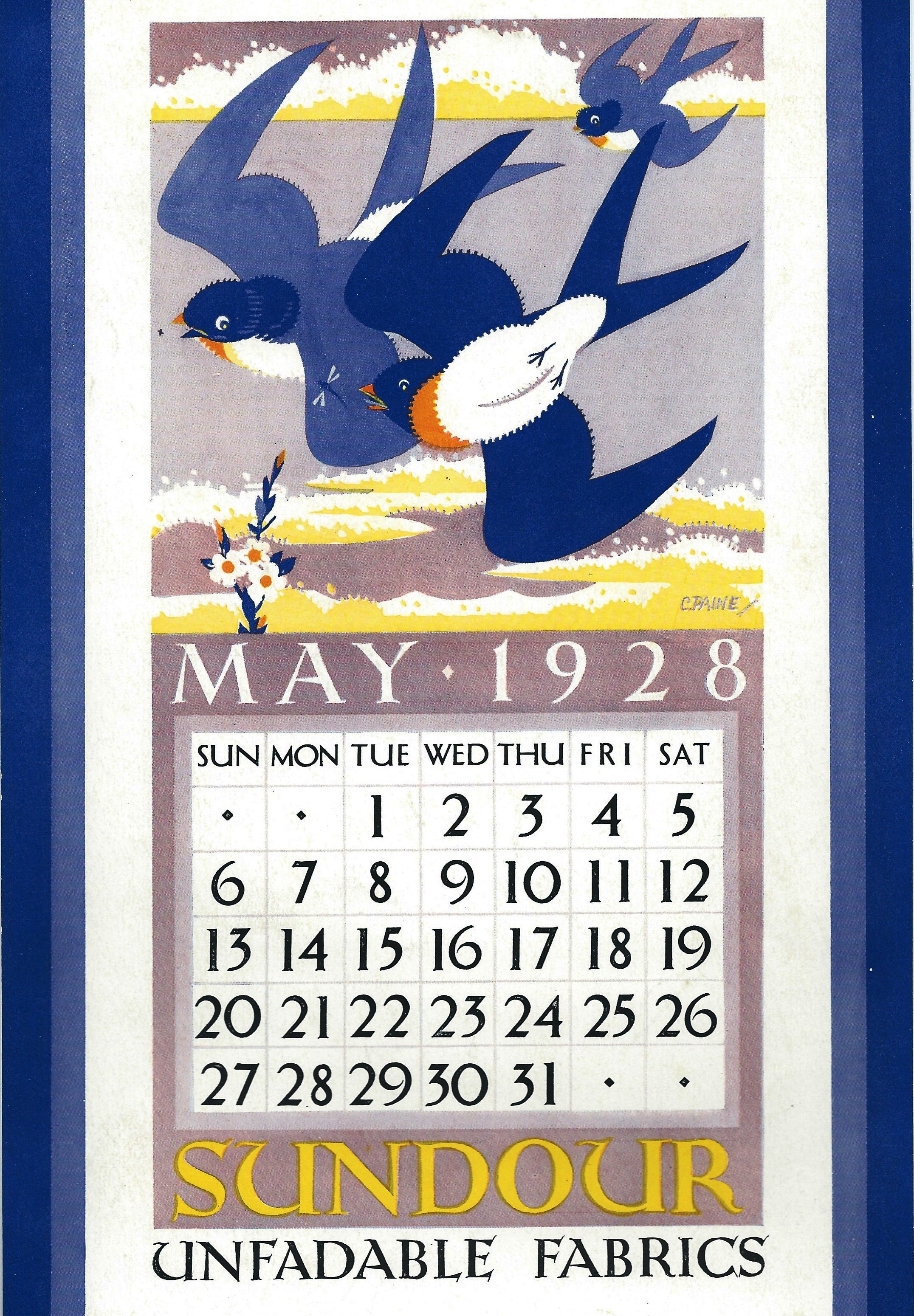
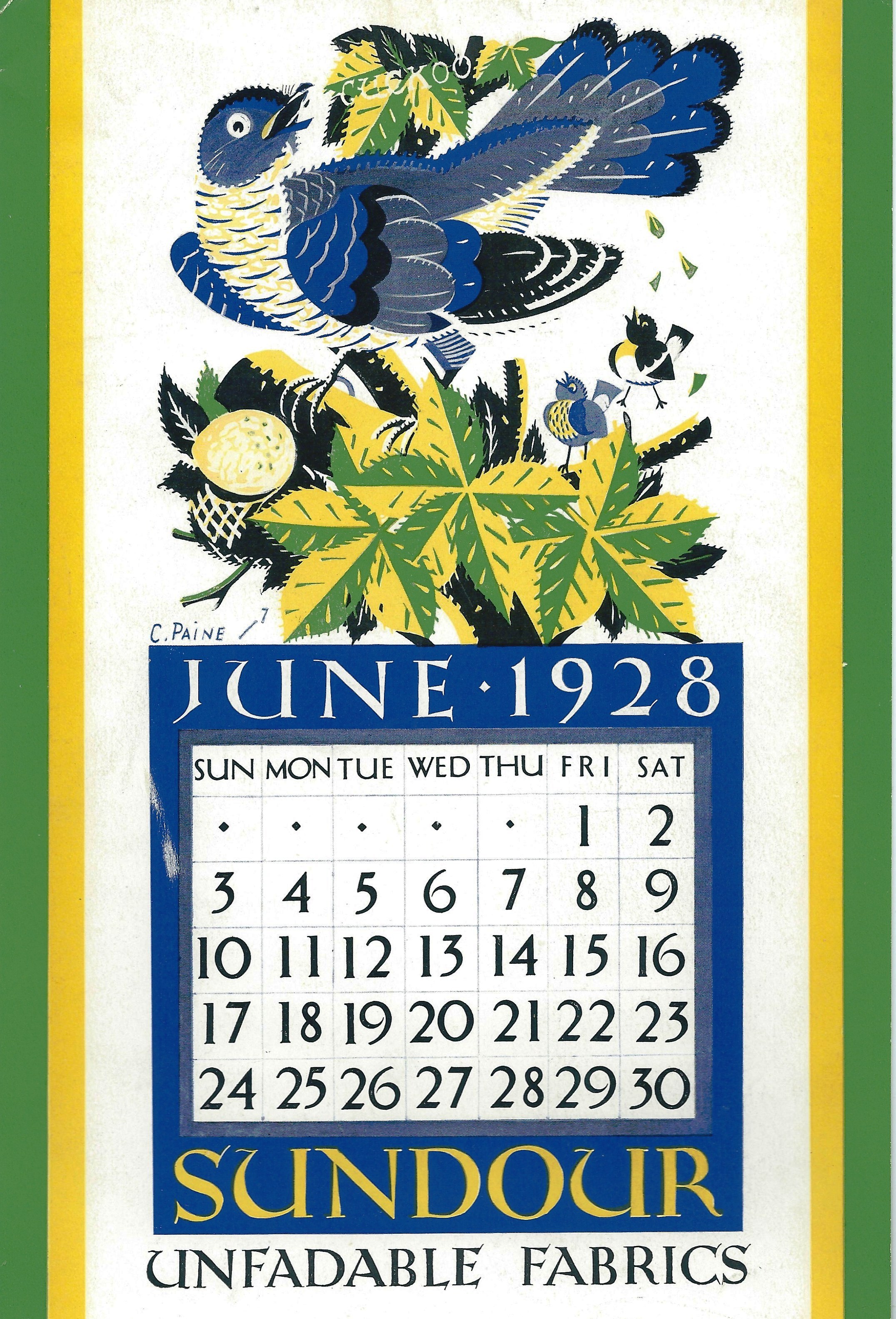
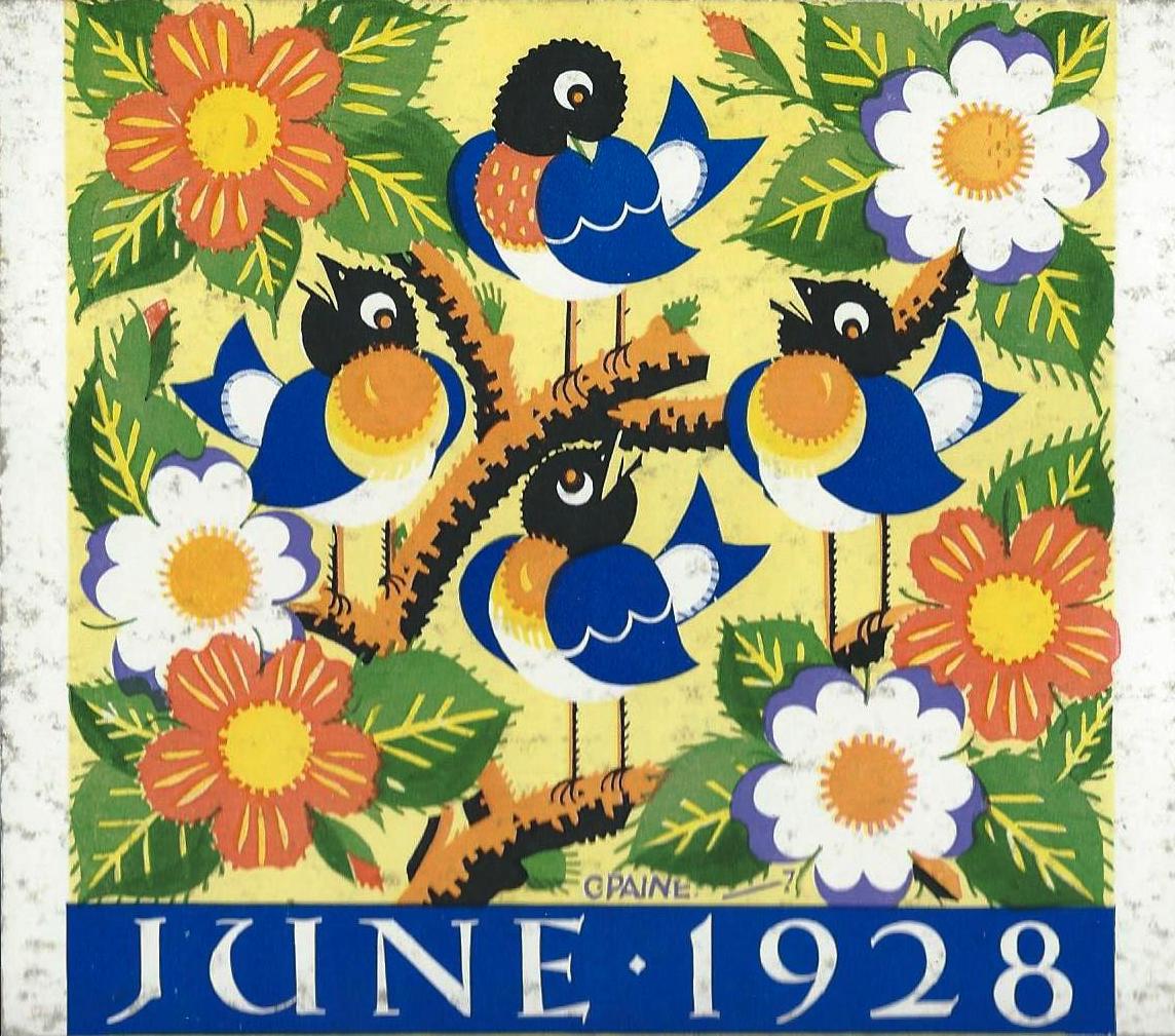
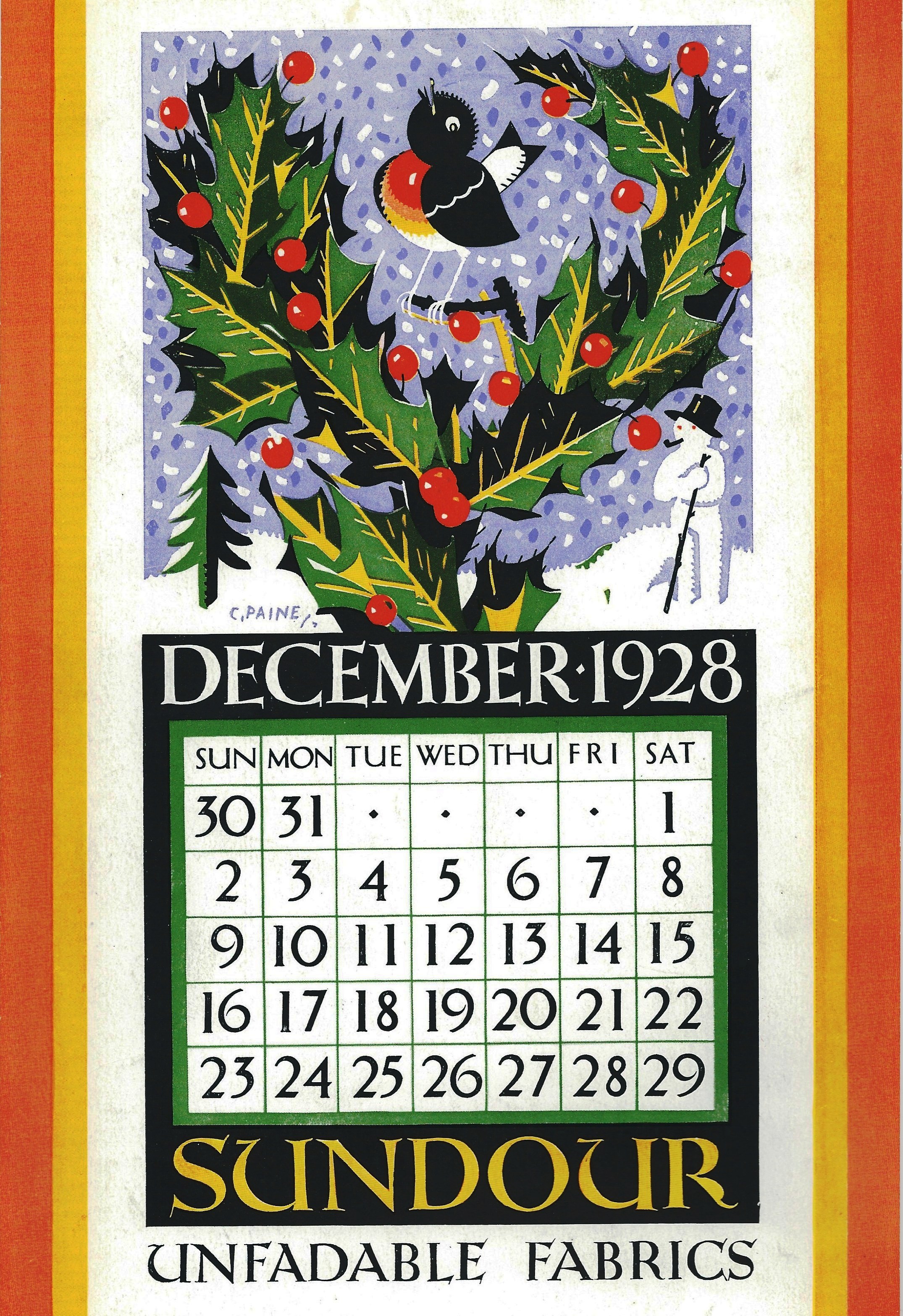
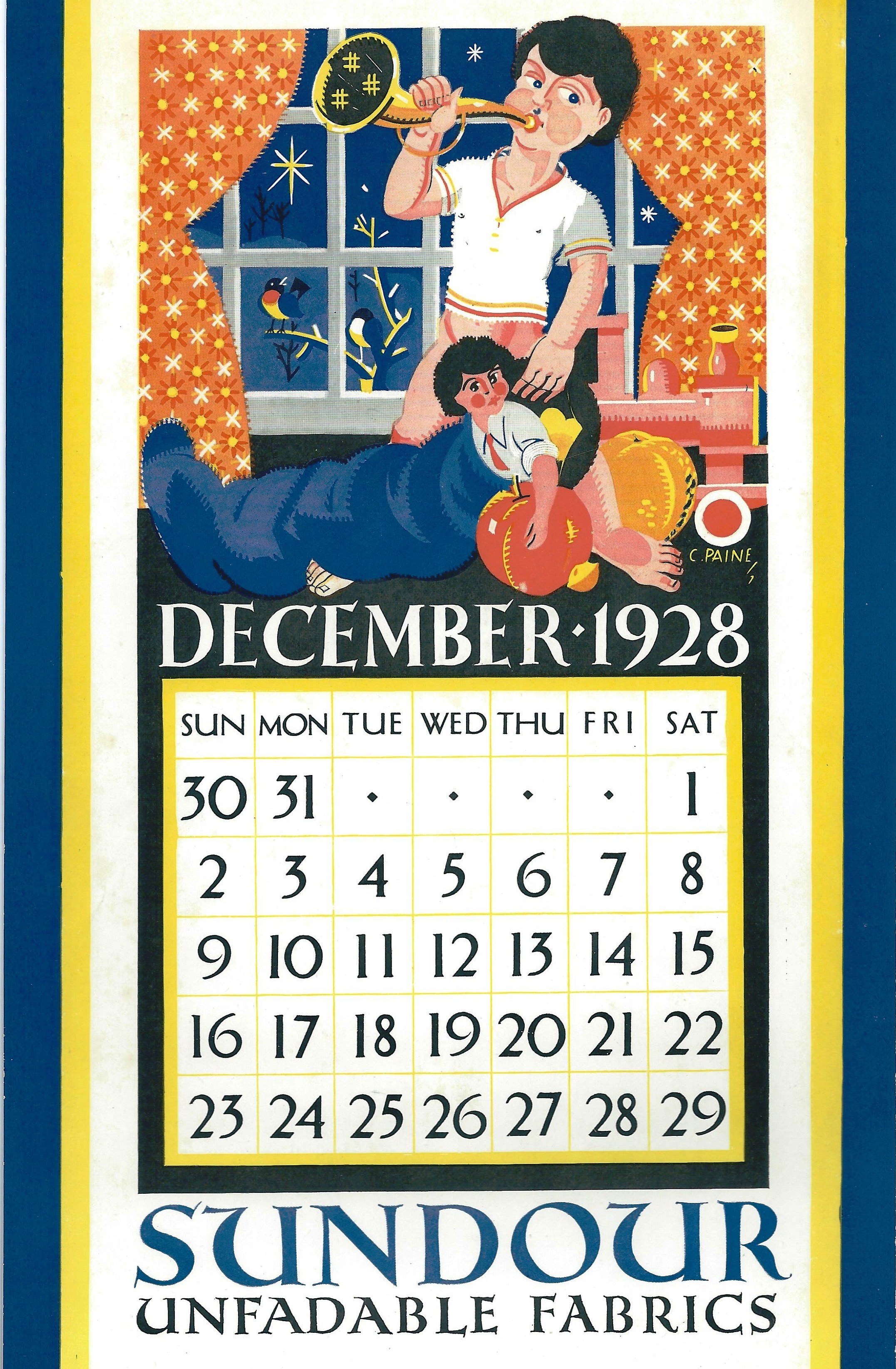
 1928
1928
 Undated
 Probably 1927
 1924
1924
 1923 or earlier
 Undated
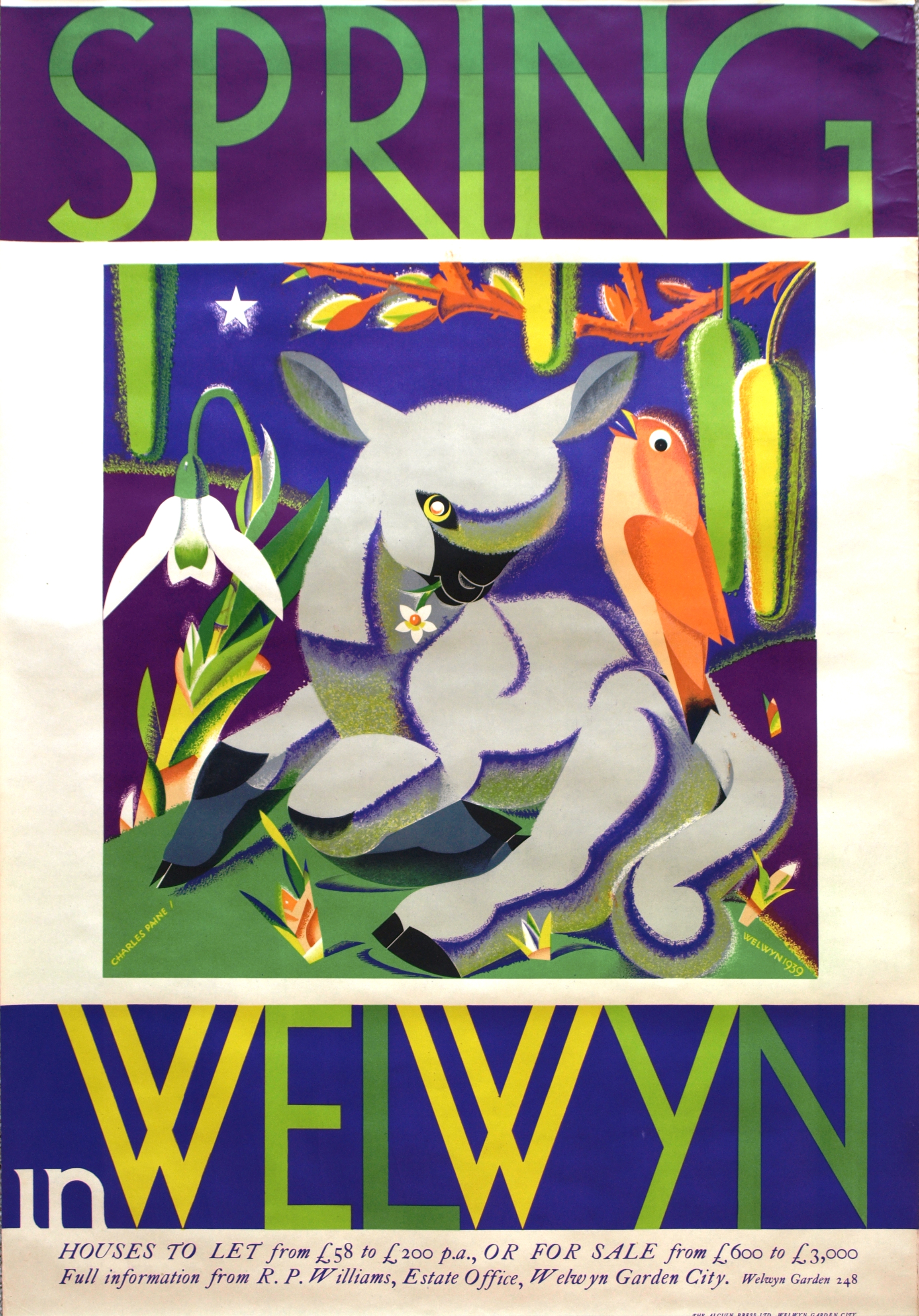 1939
1939 1939
1939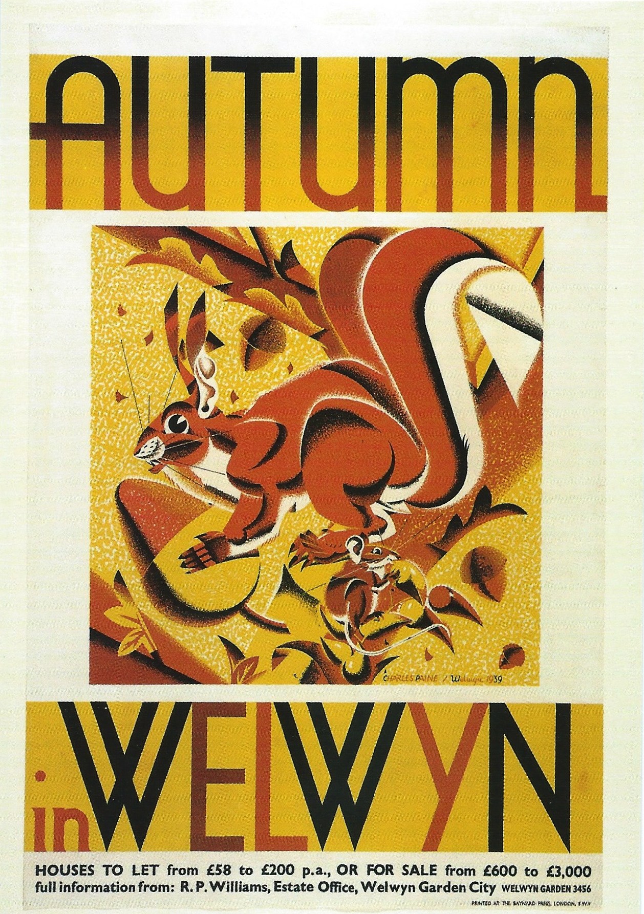 1939
1939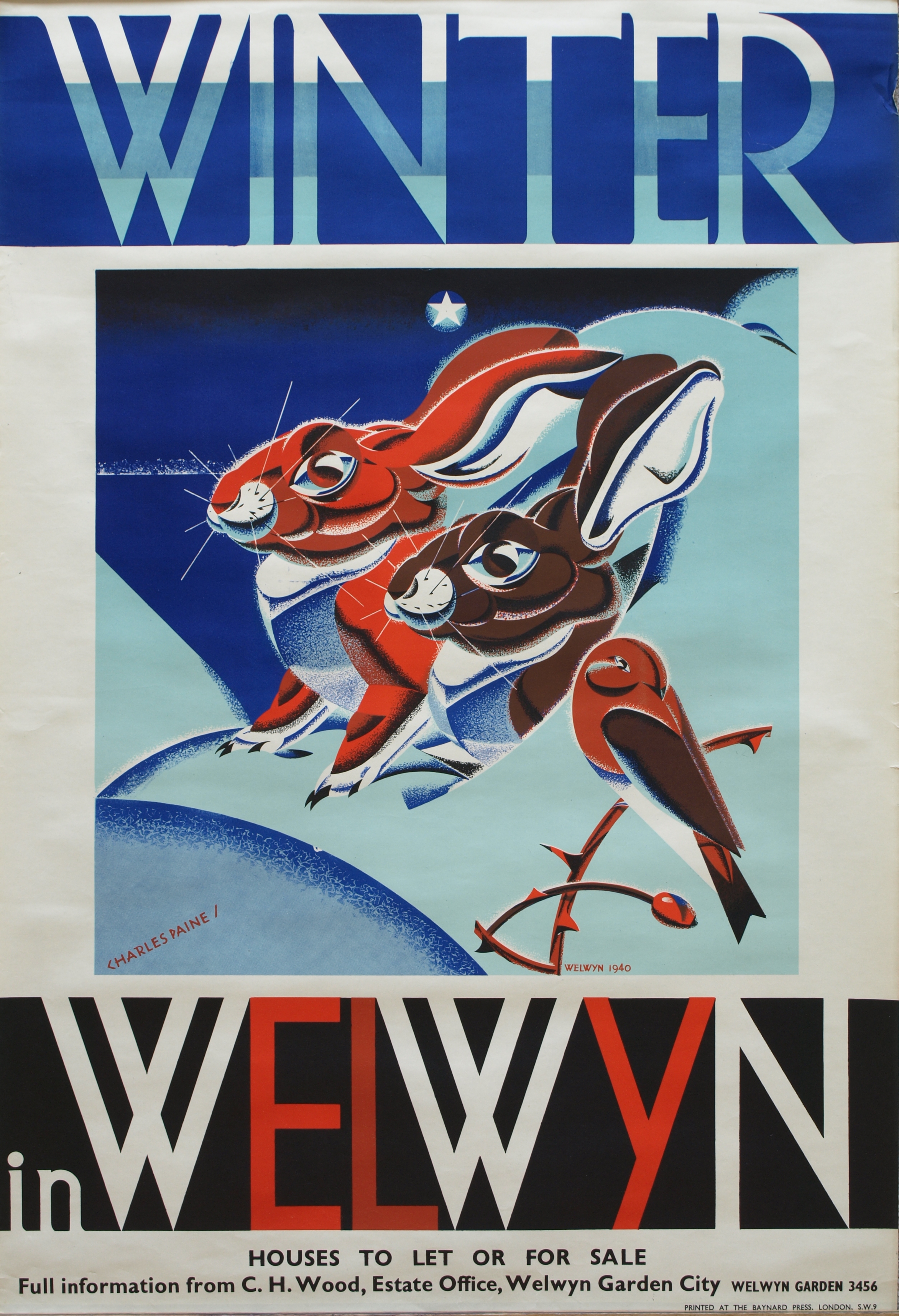 1940
1940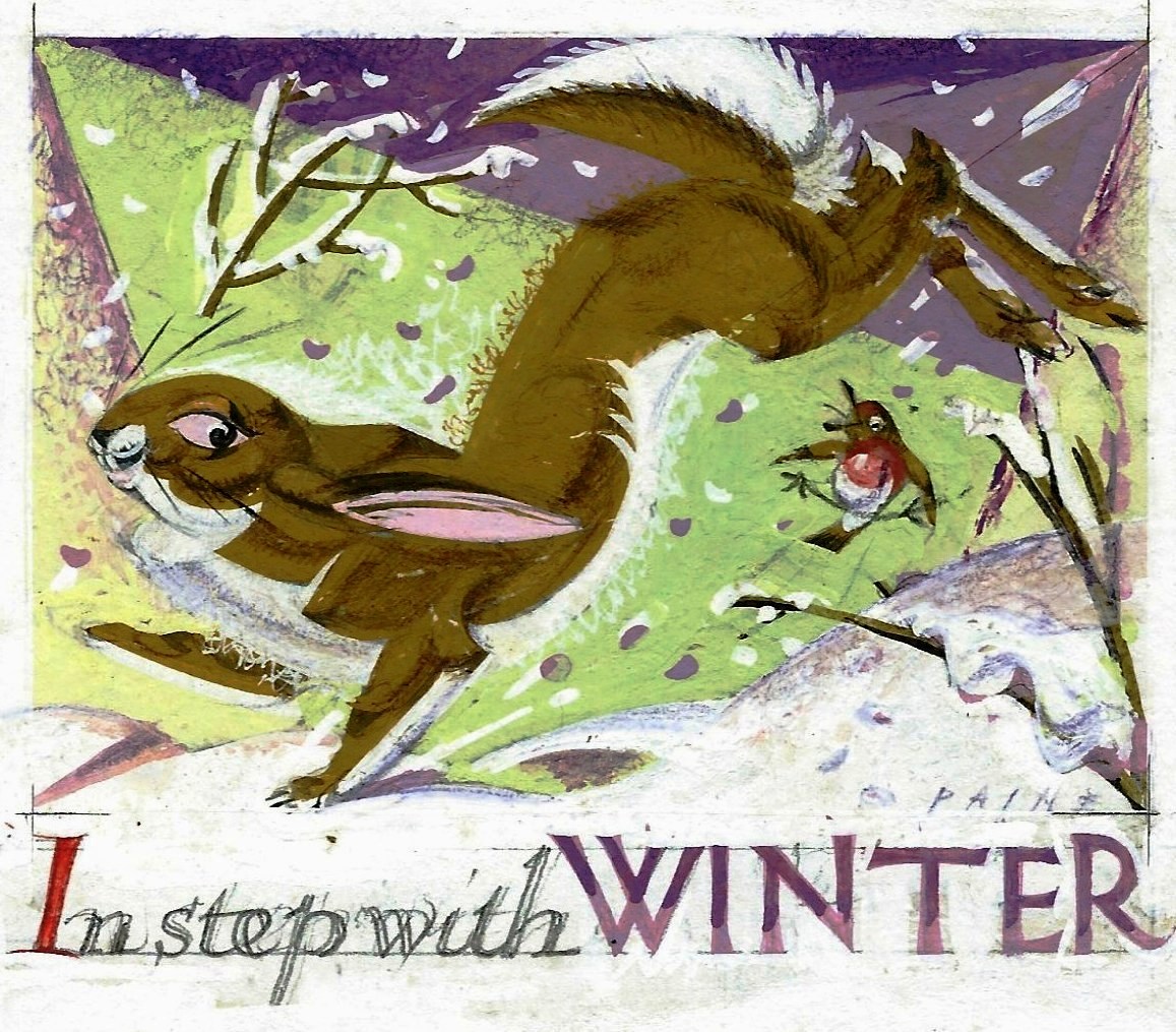
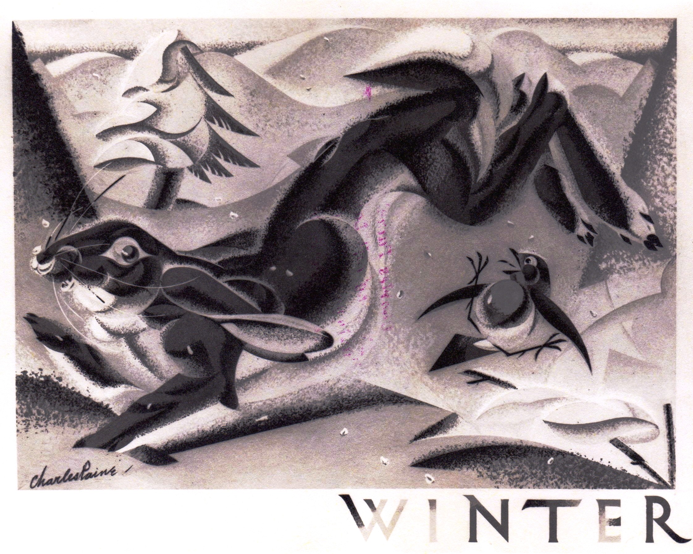 I have only this b/w photo of the finished poster but no doubt the colours are much the same as in the study.
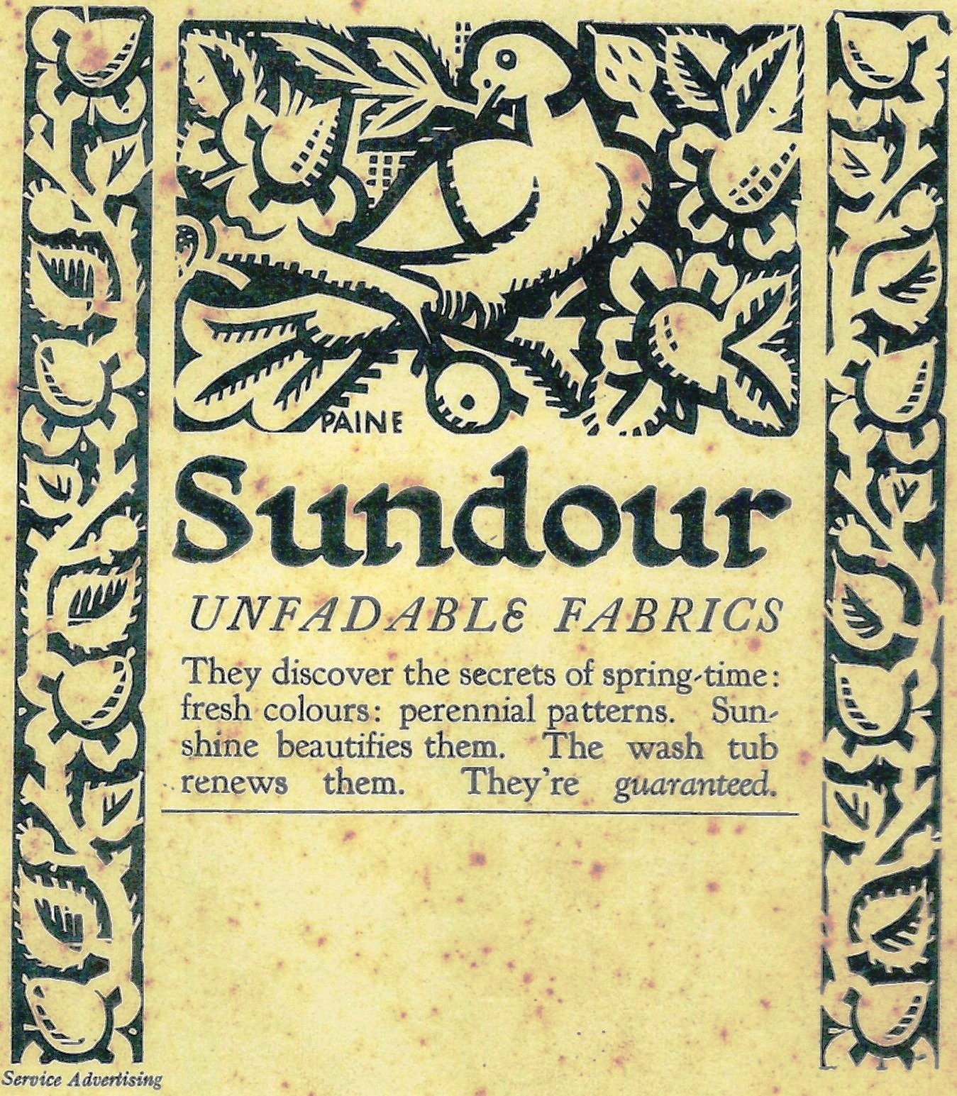
 Study for a poster.
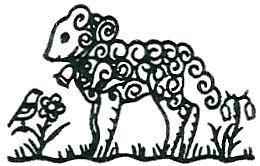
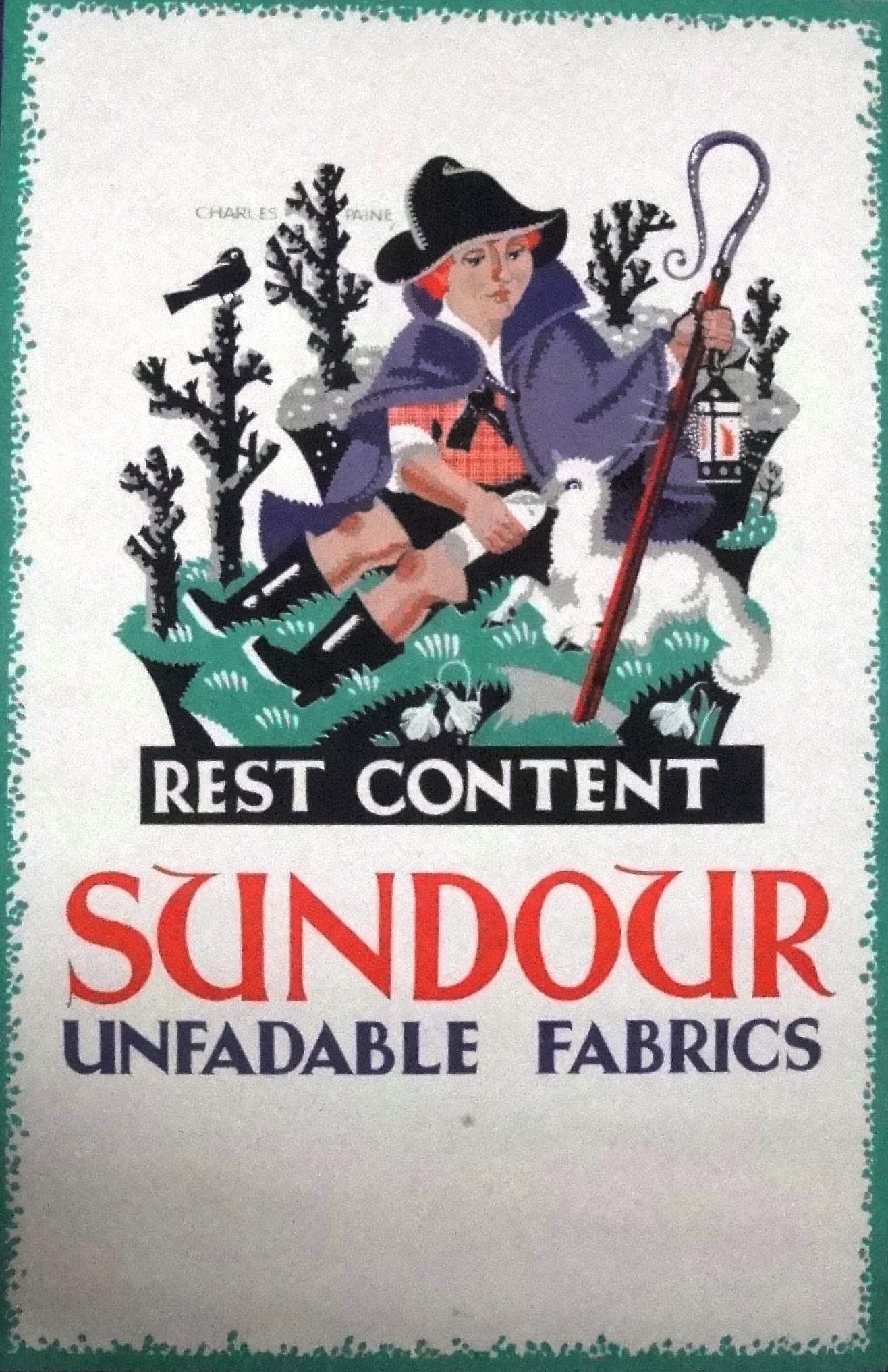
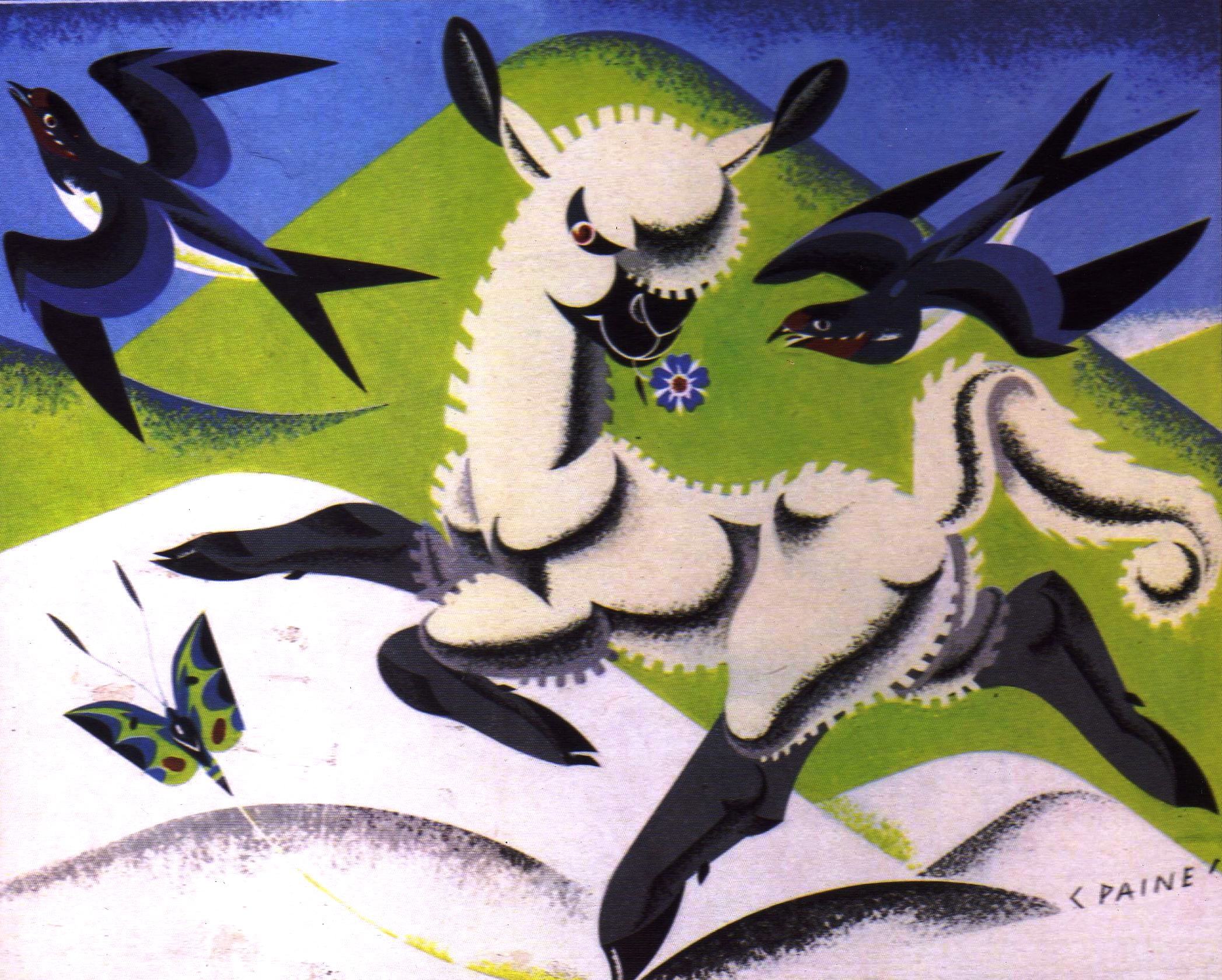 This lamb bears a distinct resemblance to the wicked lamb in the Spring poster. It looks as if he might be about to lose his periwinkle to a swallow.
 ‘Dame Adrian Bird’ Undated Undated
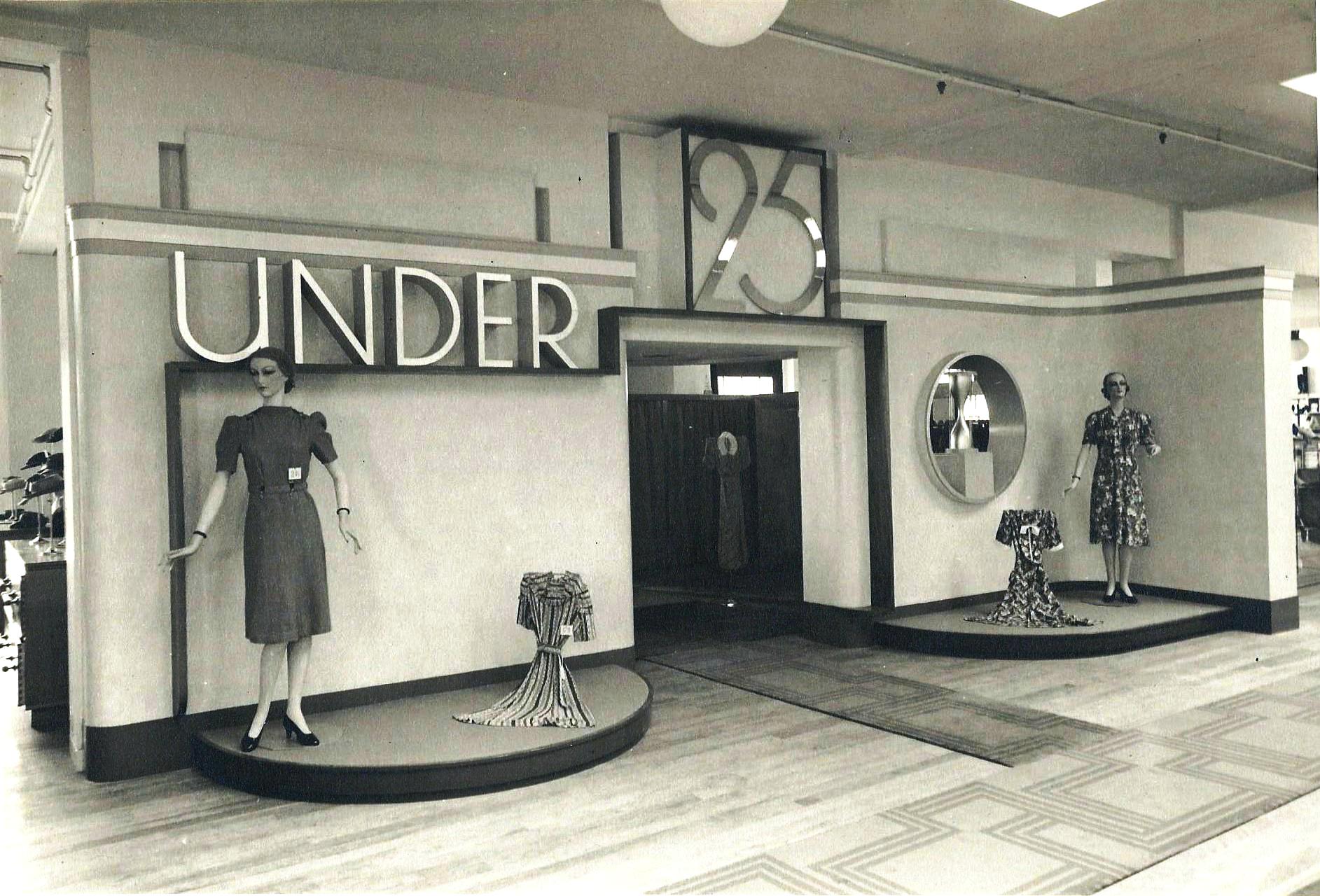
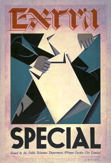 1939 (See also ‘Welwyn Stores’)
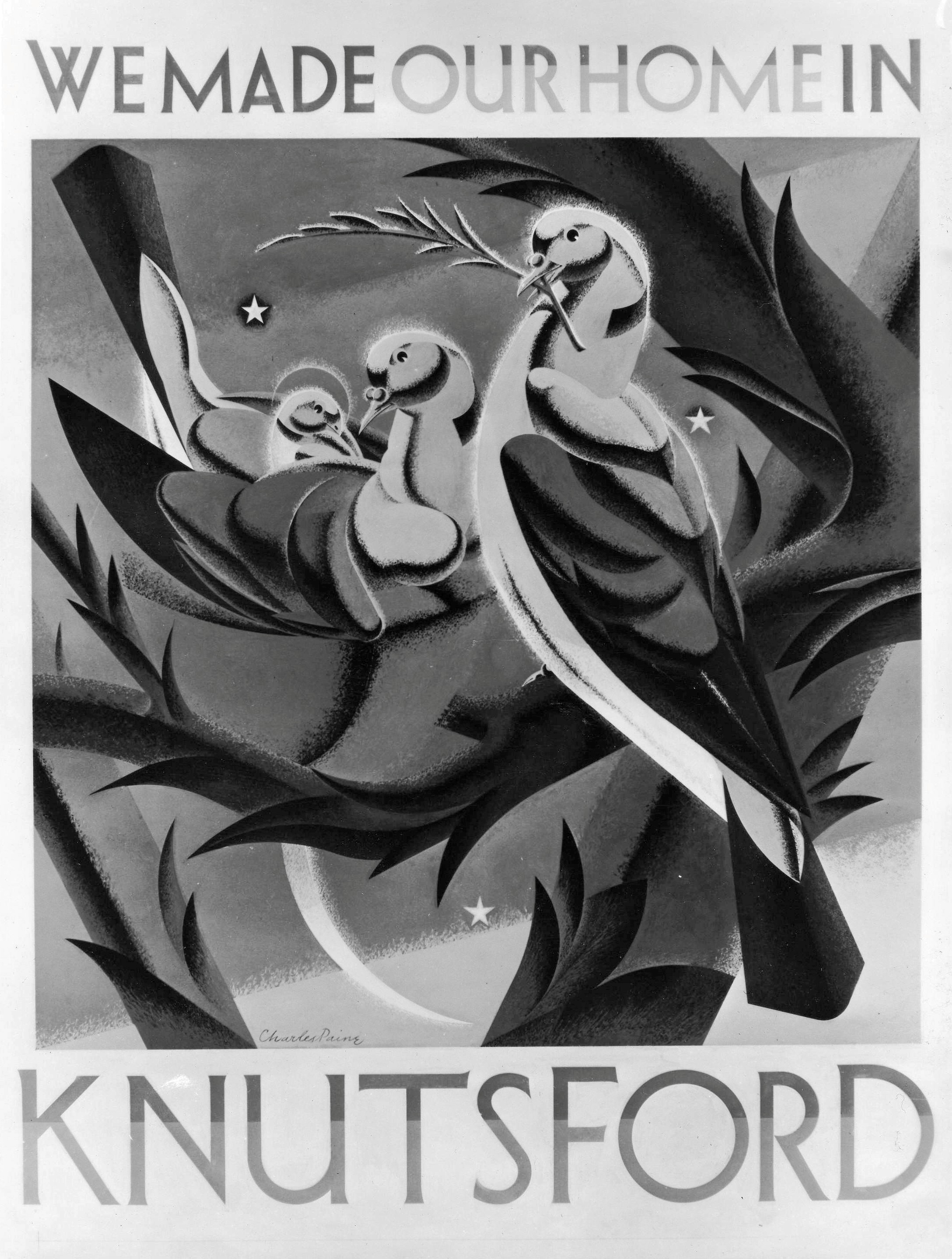 Undated
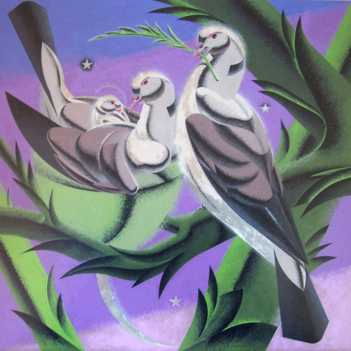 Art work for the Knutsford poster in acrylic. The stars often appear in Paine’s work.
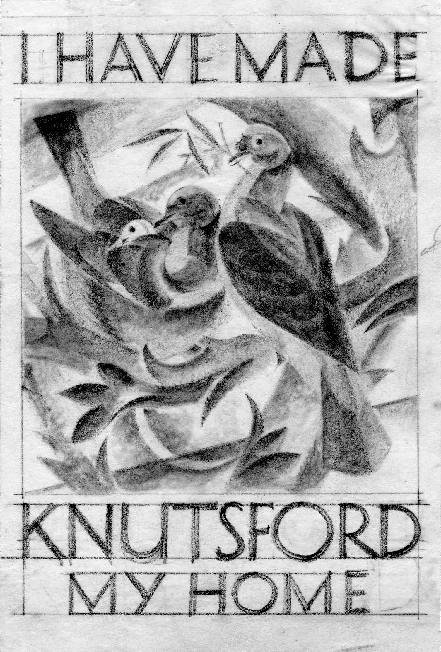 Pencil study for Knutsford poster.
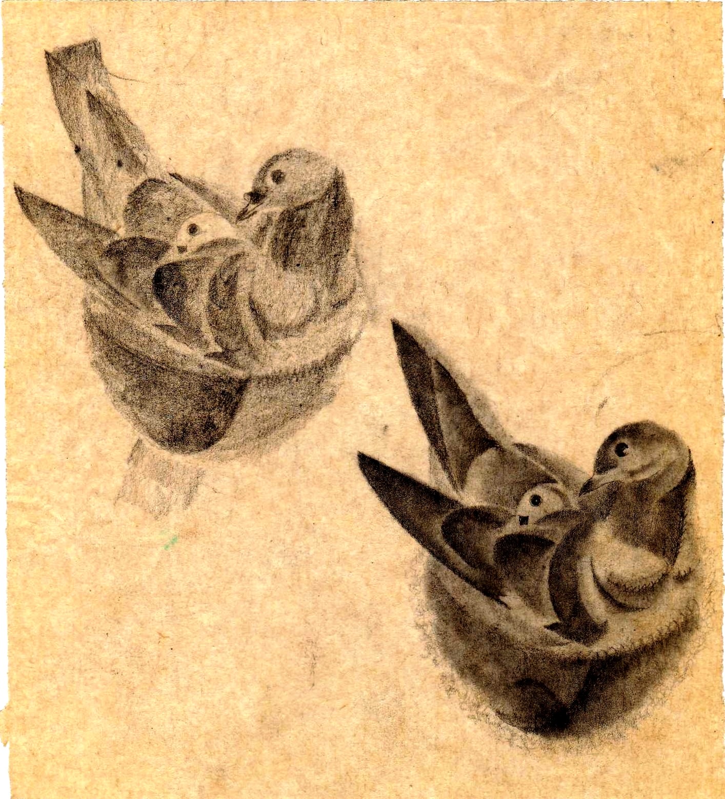
 Pencil studies for Knutsford poster.
 1940
1940

 1925
1925
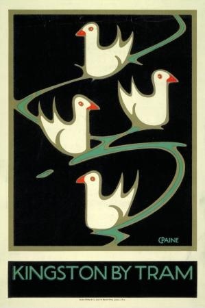
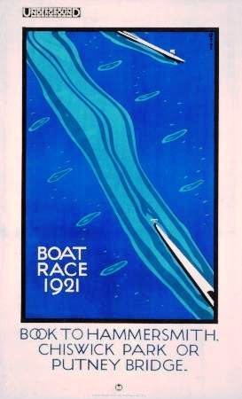
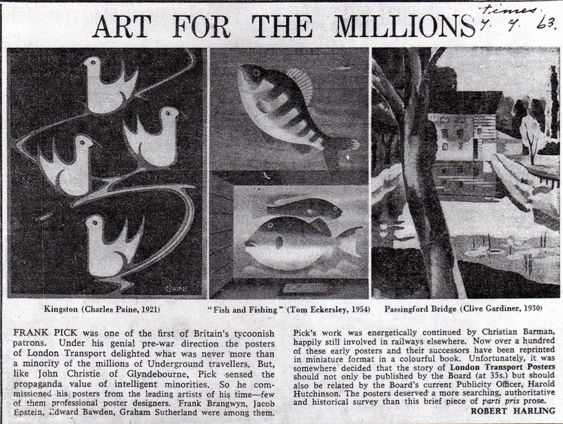
 1921 1921
 1922 1922
 1922 1922
 1922 1925
 Date unknown 1929
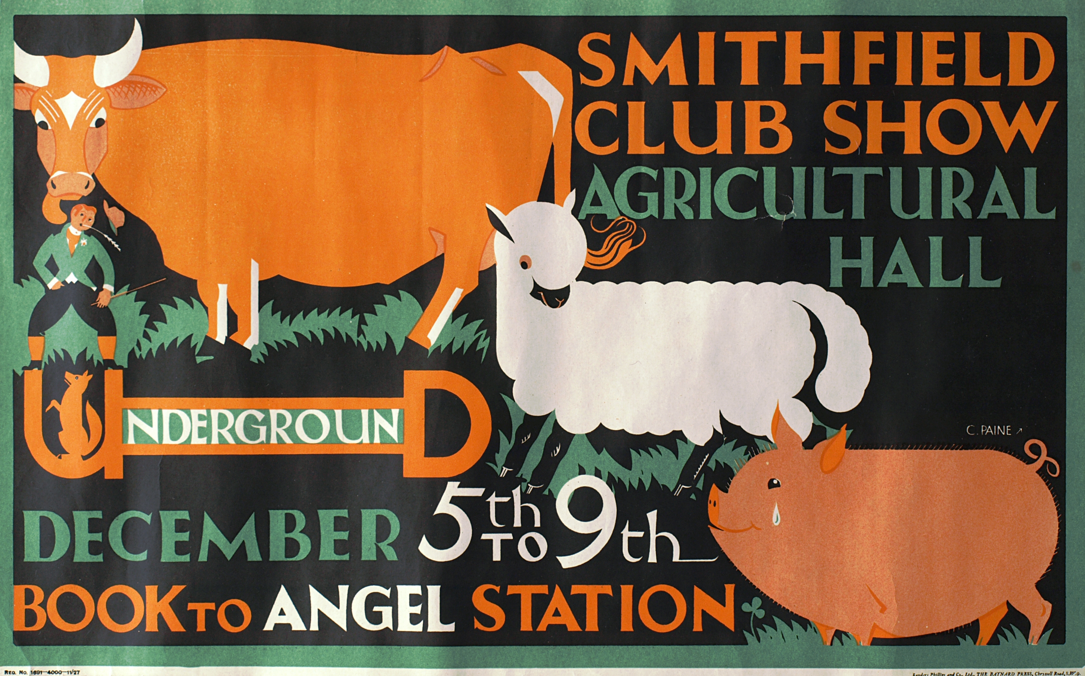 1927
1927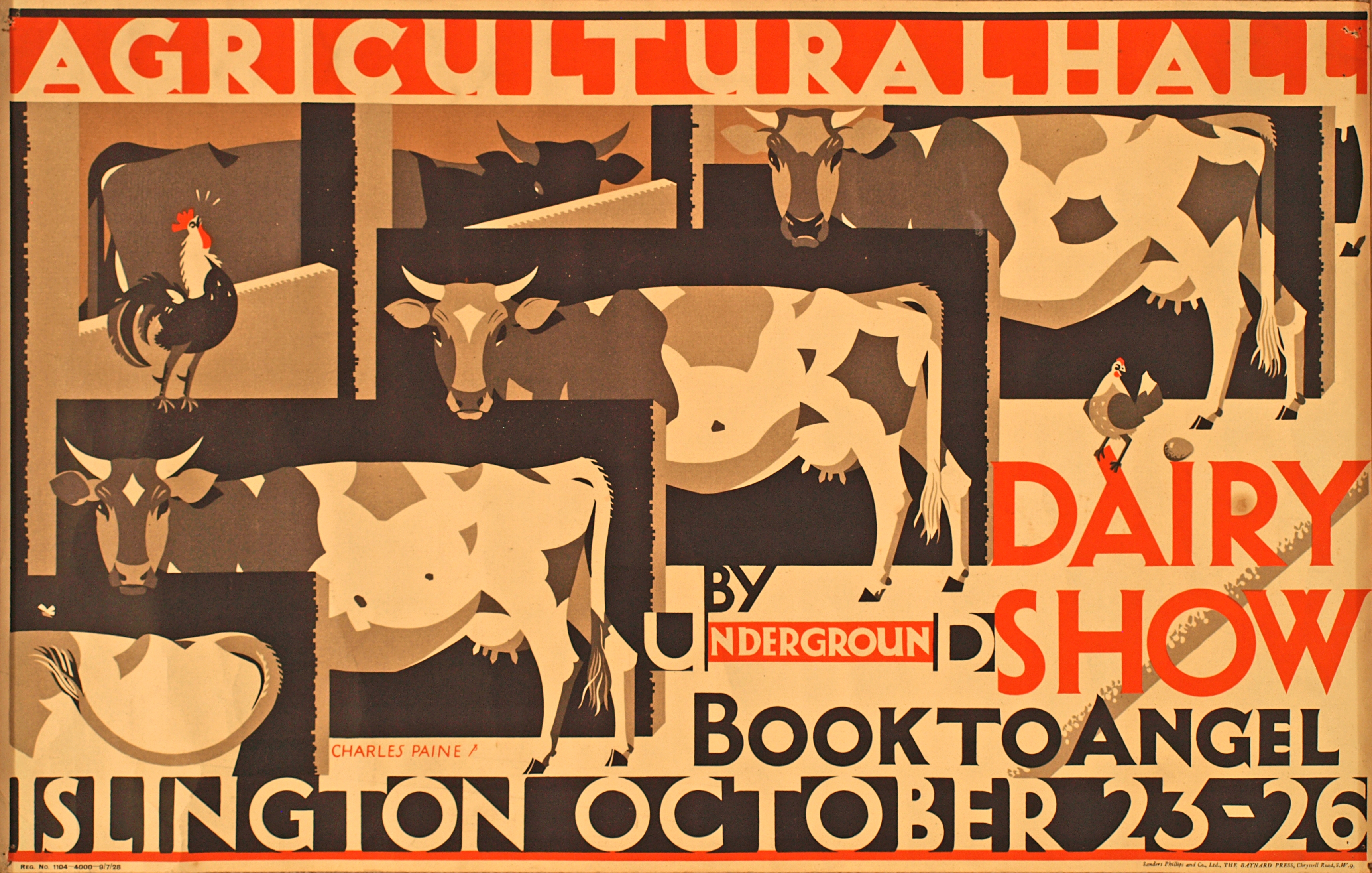
 1926 1927
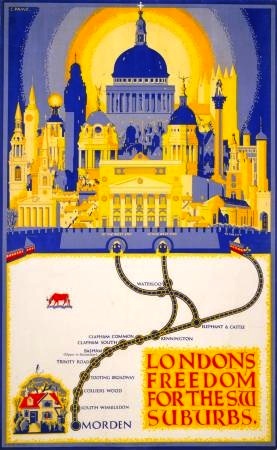
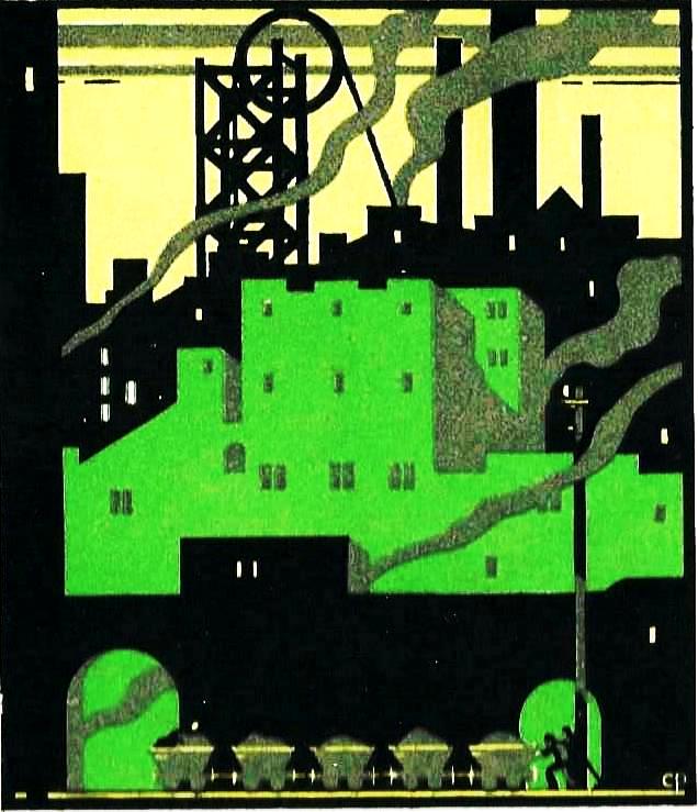
 1926 The style of London’s Freedom for the Suburbs is unlike that of any other poster by Paine that I know of.
 1928
1928
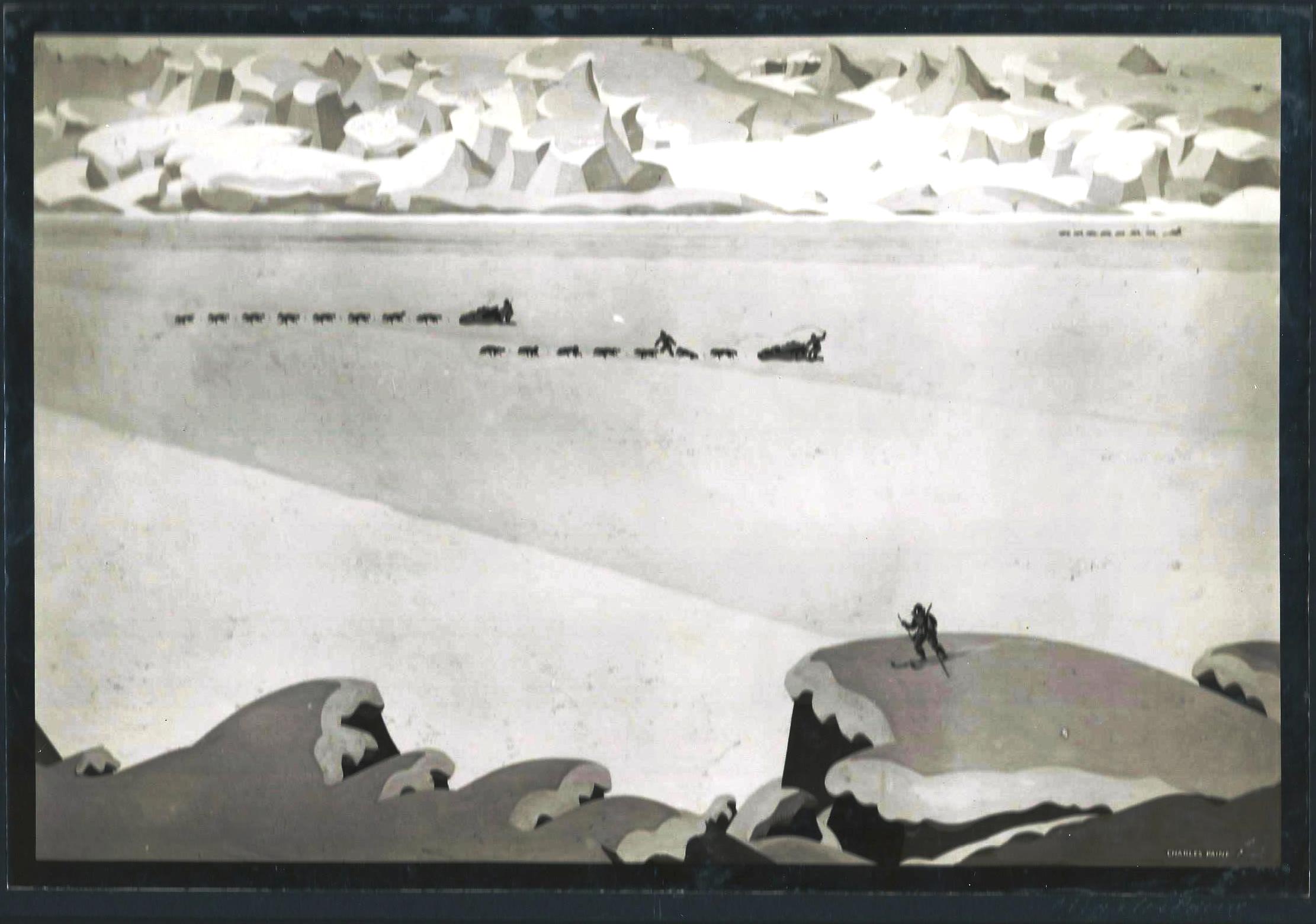 Fur Traders 1926. Signed faintly in bottom right hand corner of margin ‘Charles Paine’.
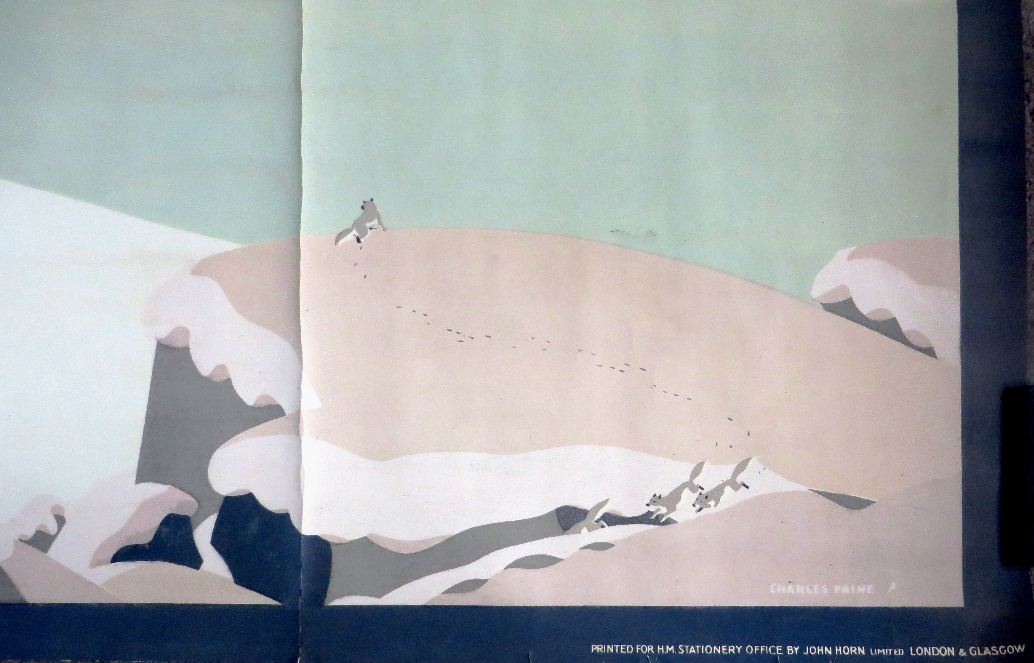 This version has Arctic foxes instead of the lone skier.
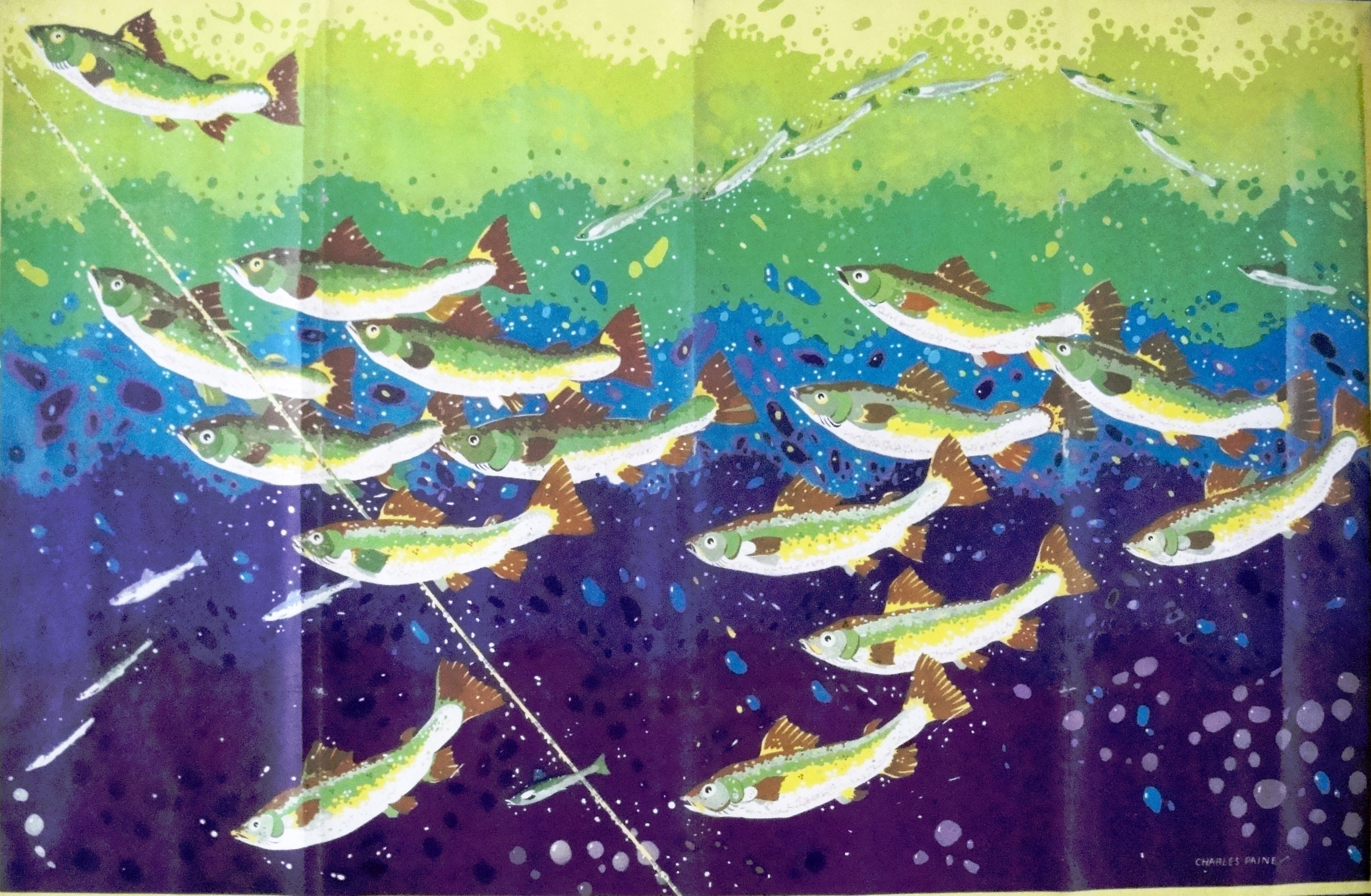 Salmon Fishing Newfoundland 1926
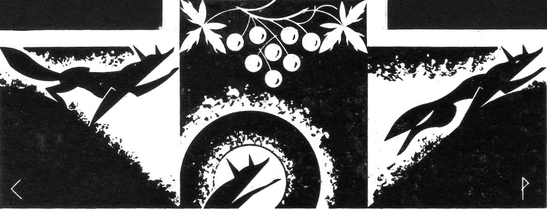
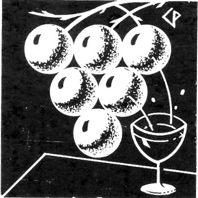
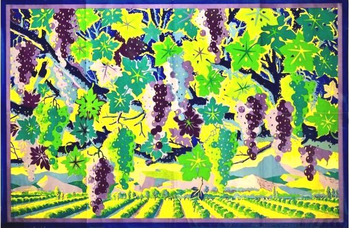 The Vines of Australia 1926


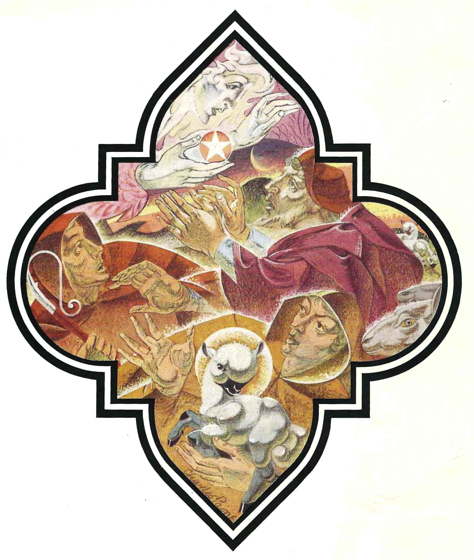


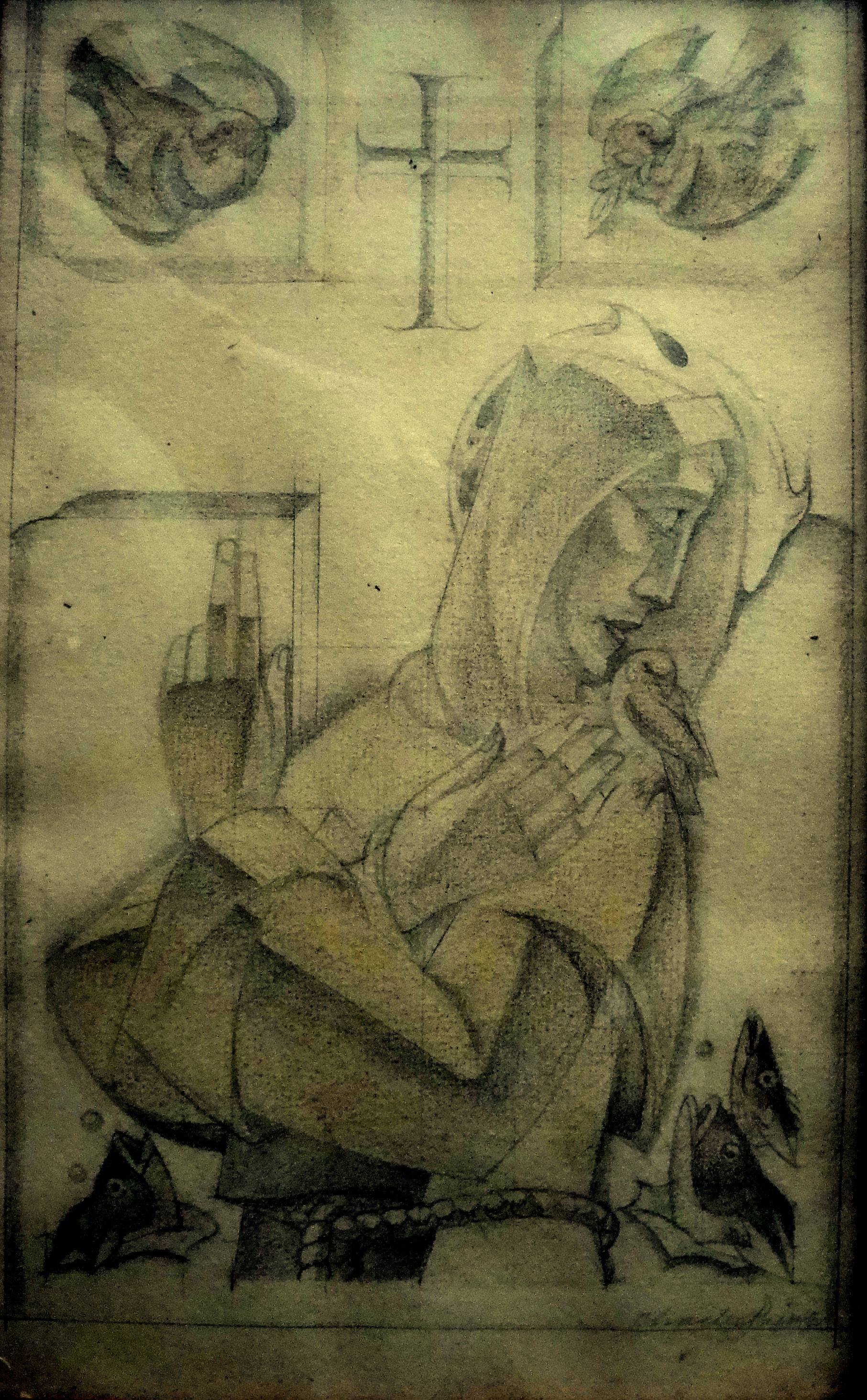
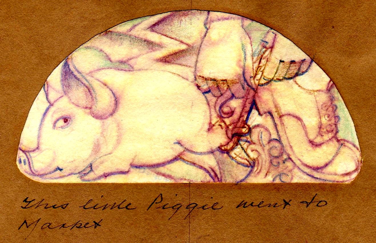
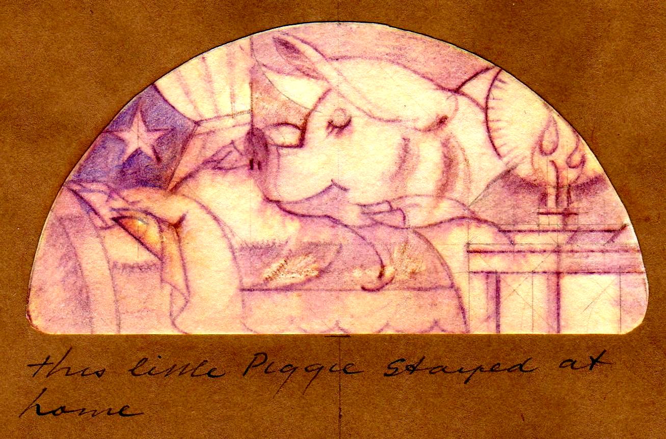
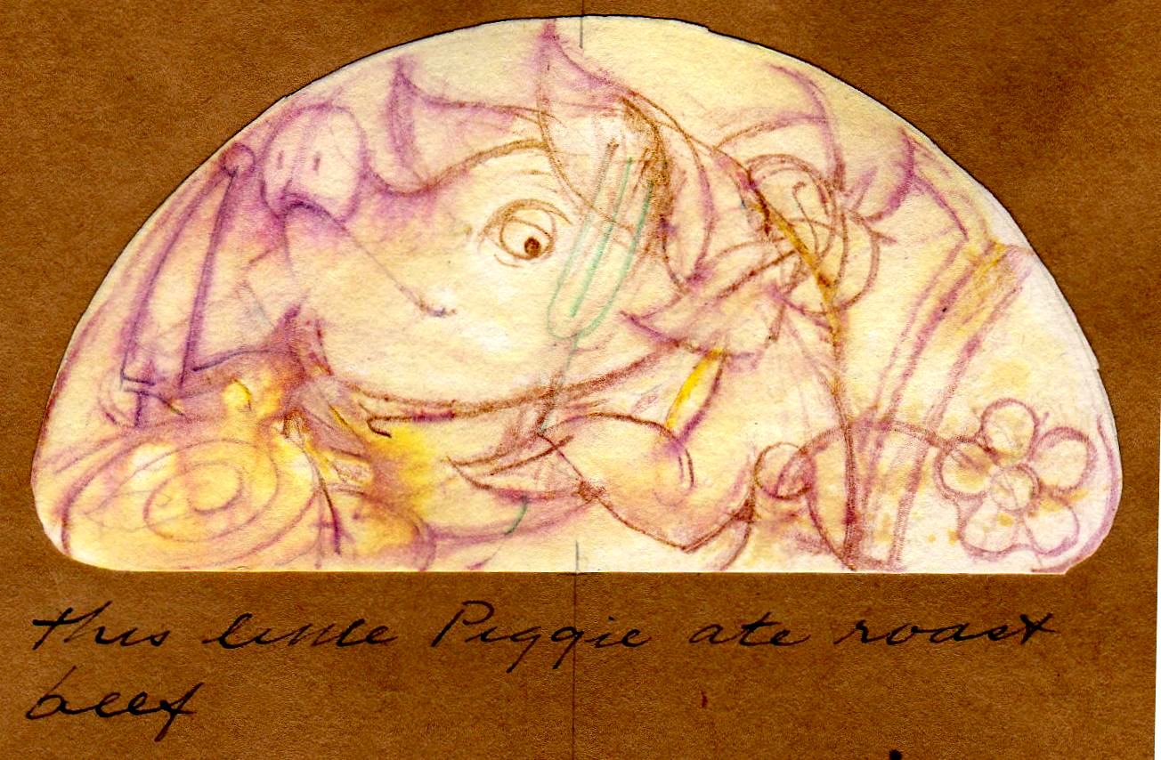
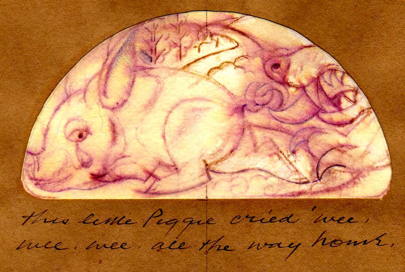
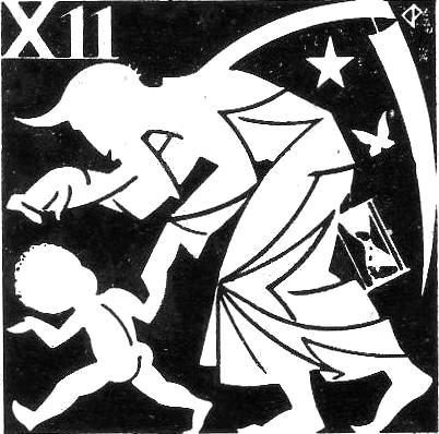
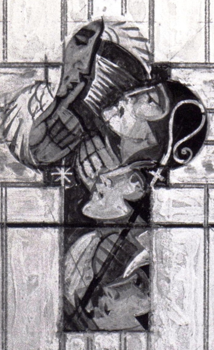
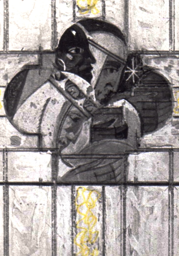
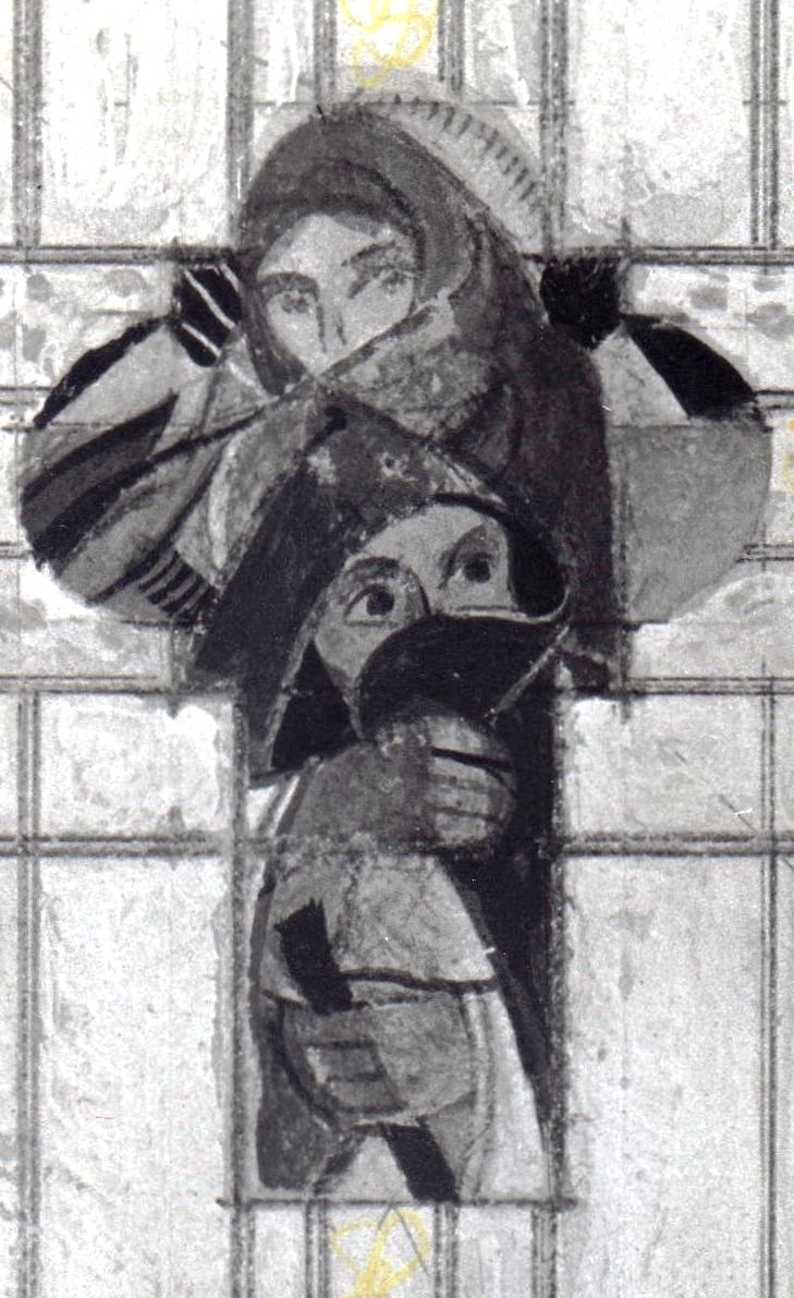
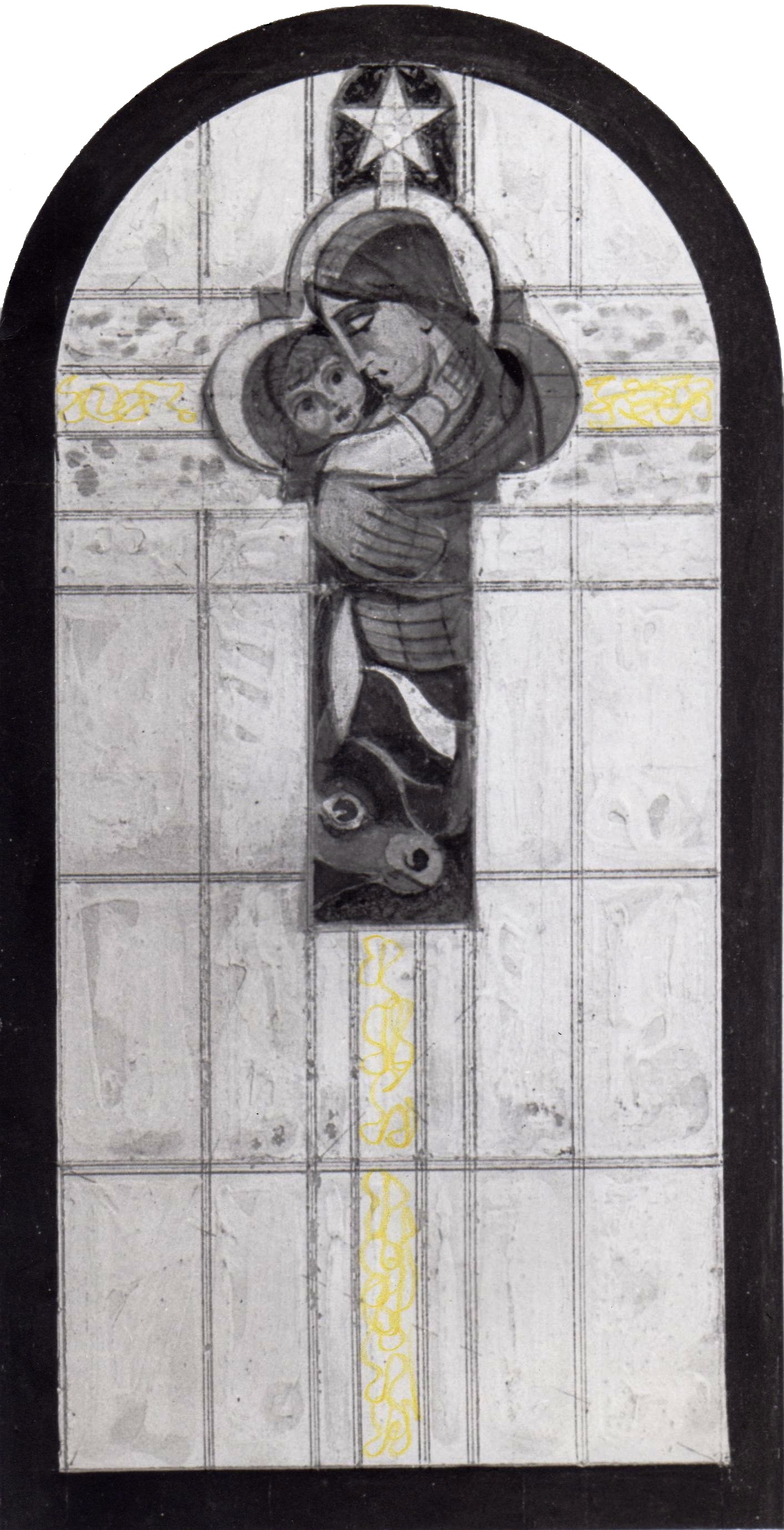
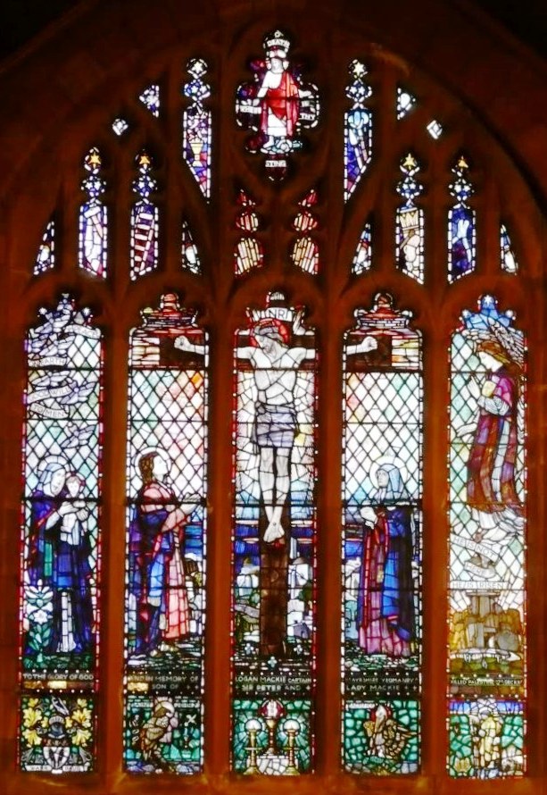 To the glory of God and in memory of Logan Mackie Captain Ayrshire Yeomanry killed in Palestine 27th December 1917 only son of Sir Peter and Lady Mackie


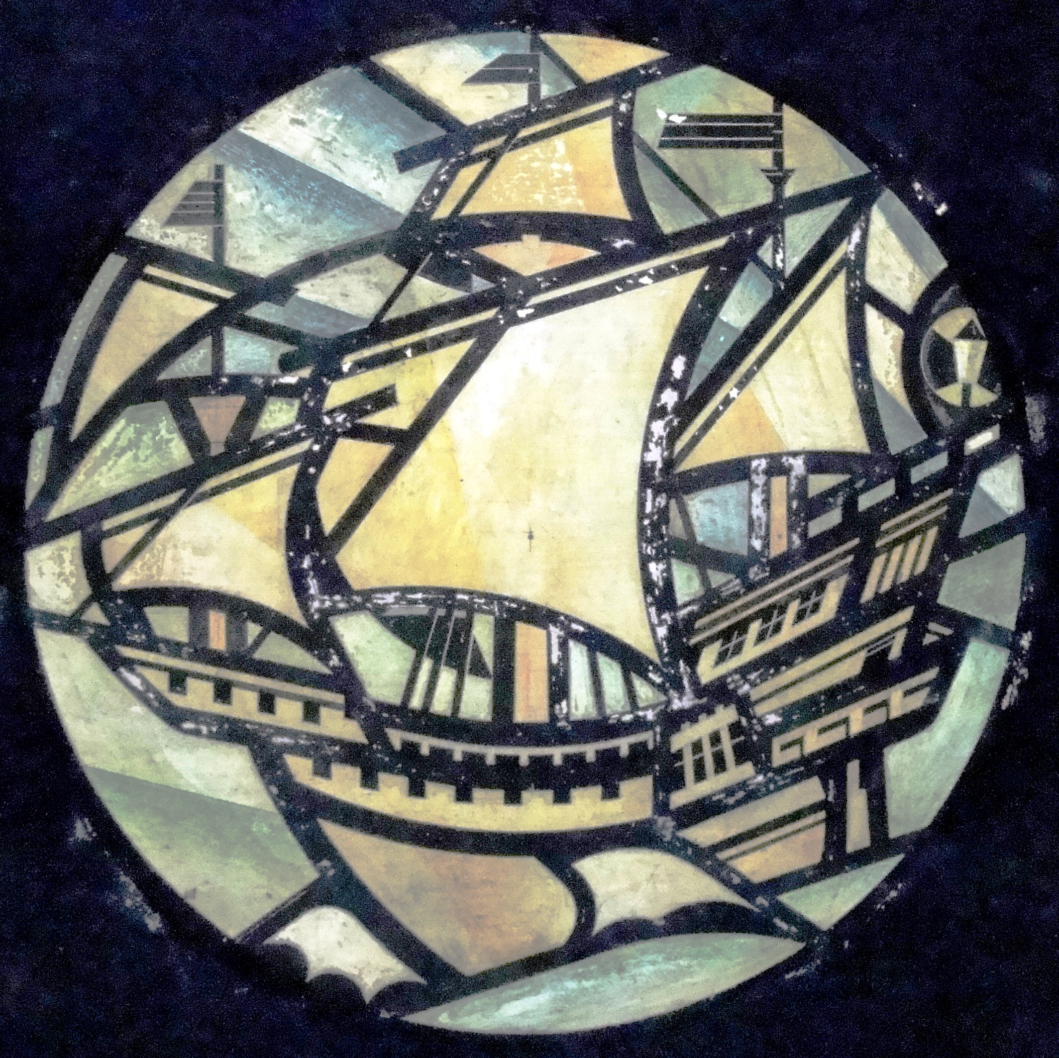
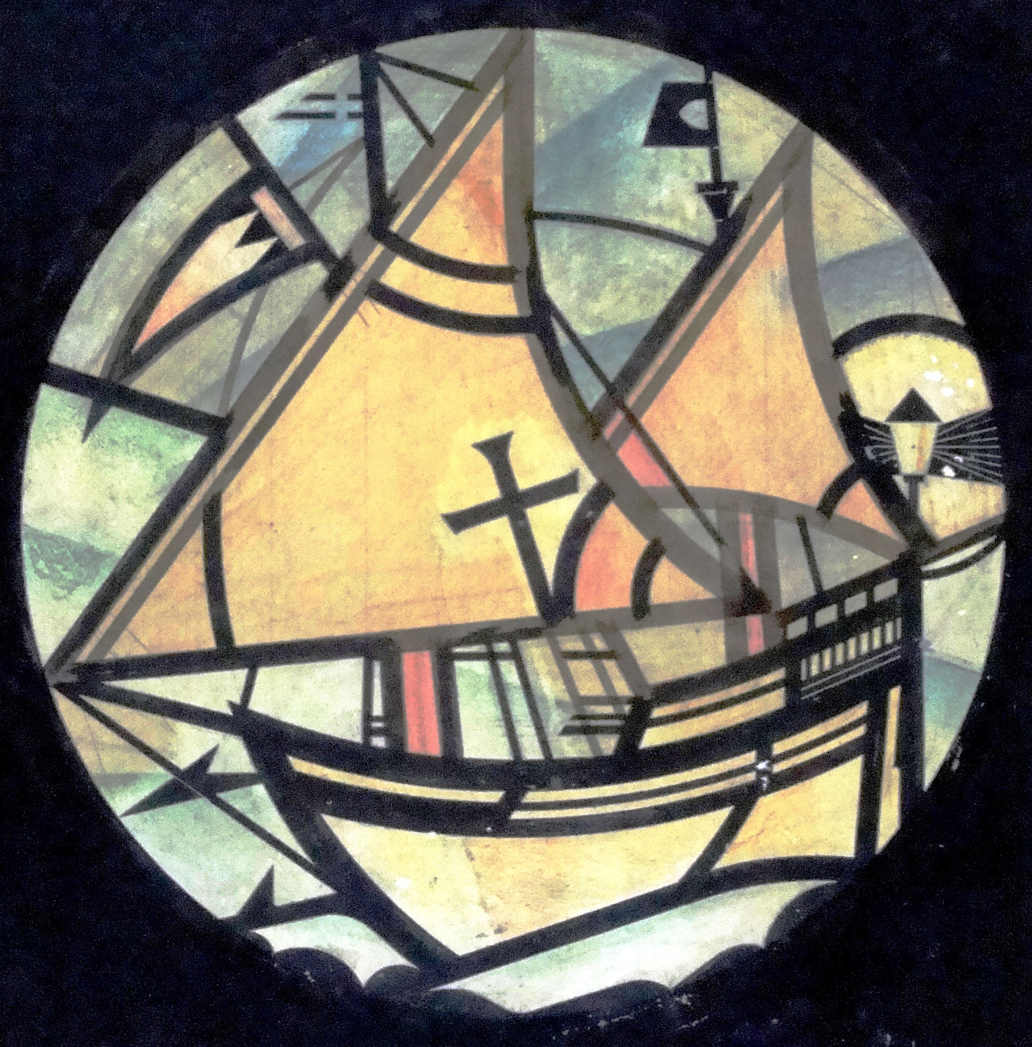
 Original art work in acrylic
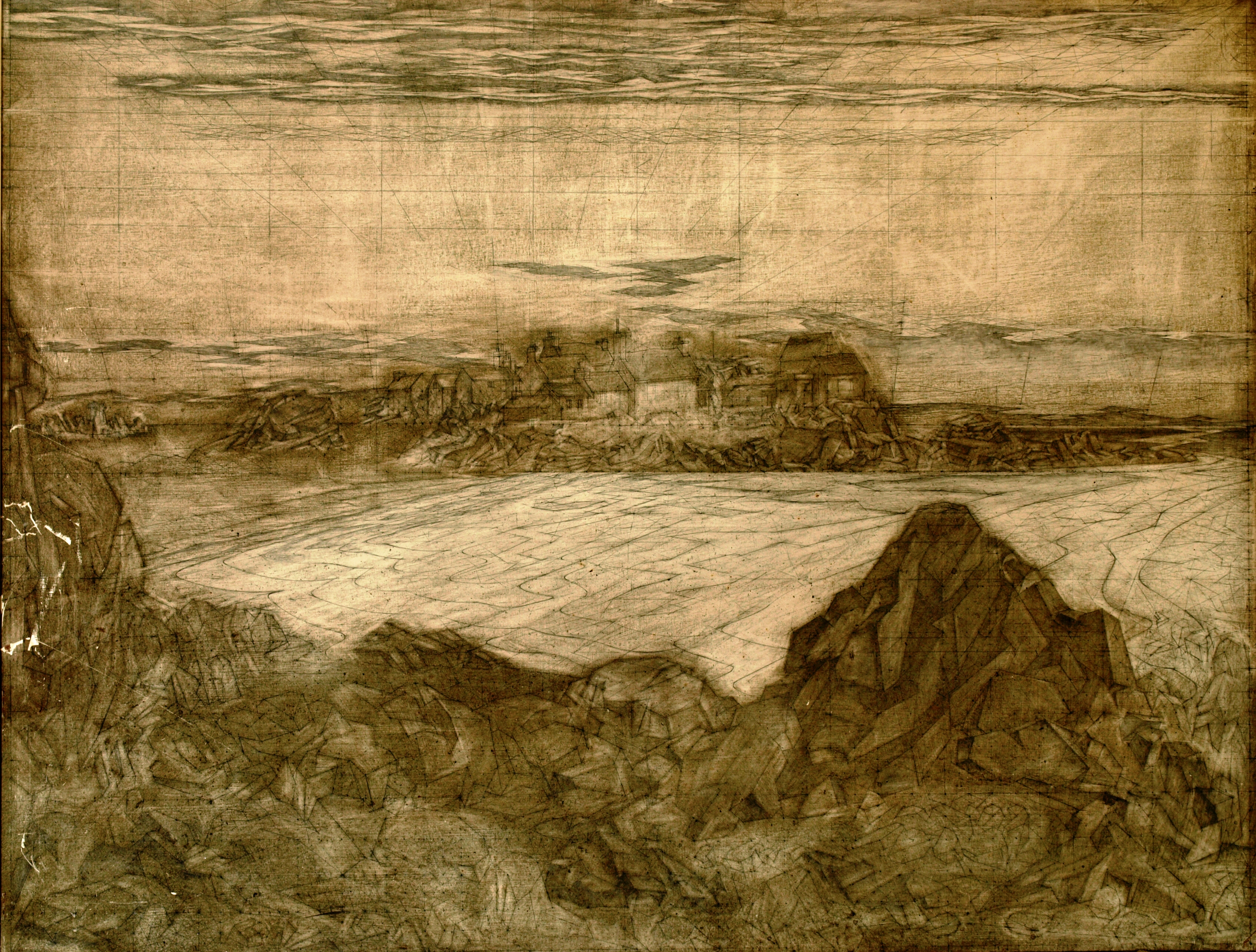
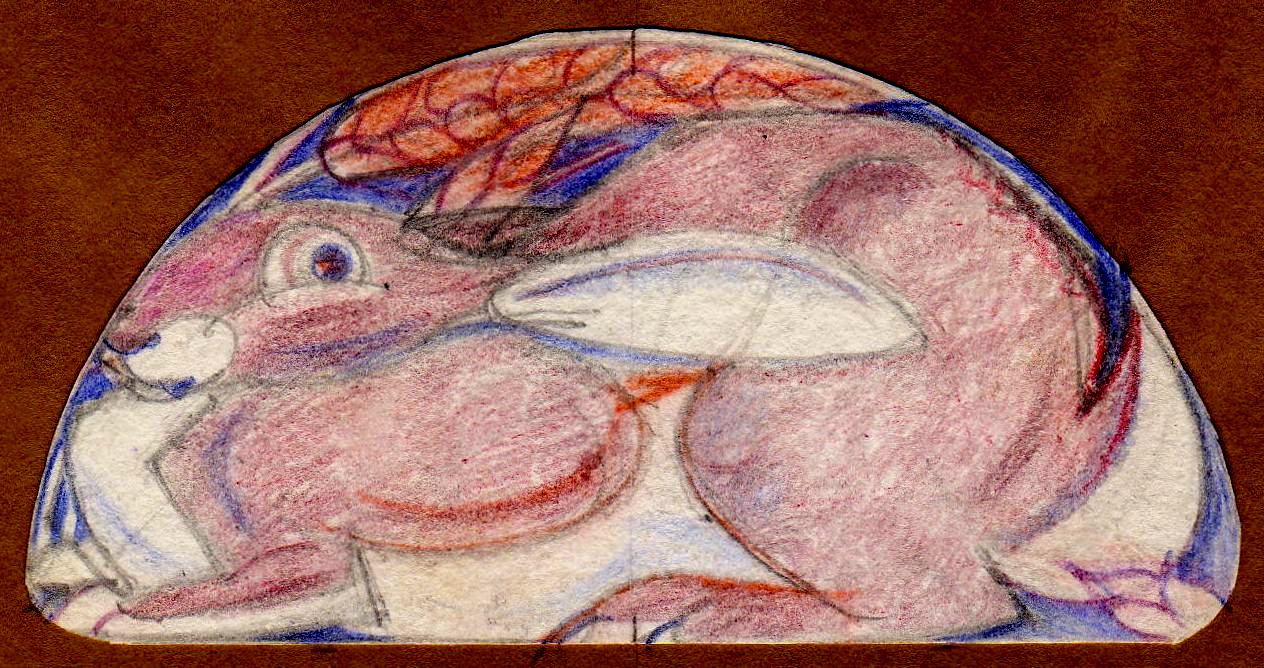
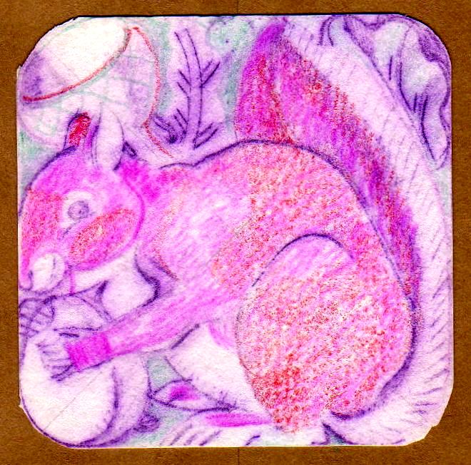
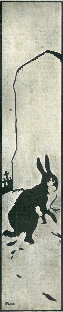 Judging by the style and signature, this drawing of a hare in a graveyard is an early work. How early I cannot say.