
In 1920 Paine received his first important commission, from Frank Pick to design advertising posters for the London Underground. (At that time the Underground Electric Railways Company of London. The London Transport Passenger Board was formed in 1933) It may be that he was recommended to Pick by his friends John Platt (1886-1967), who was his immediate superior at the Edinburgh College of Art (1919-21), and Frank Morley Fletcher (1866-1949), Director of the ECA from 1907 to 1923.
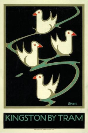
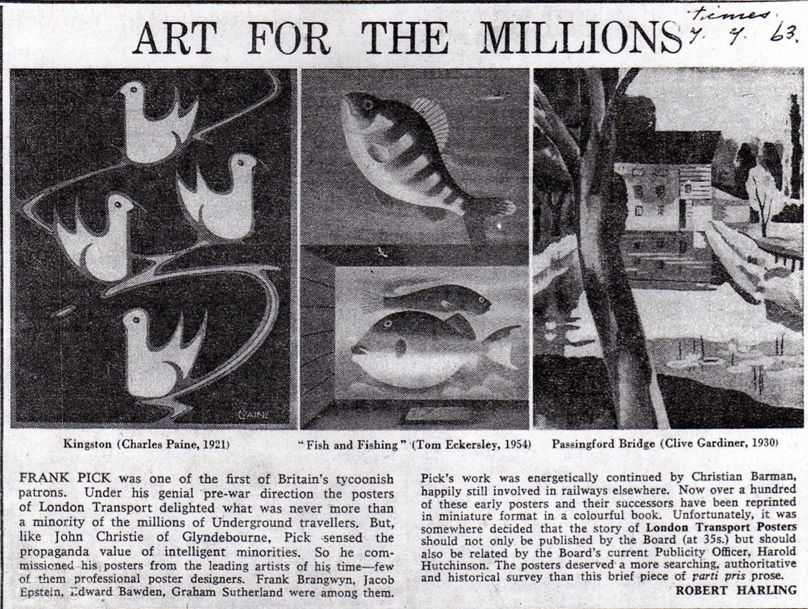
Kingston by Tram (1920) was the first poster designed by Paine for the UERL. It was included in London Transport Posters with introduction and notes by Harold F. Hutchinson published in 1963 by the London Transport Board.
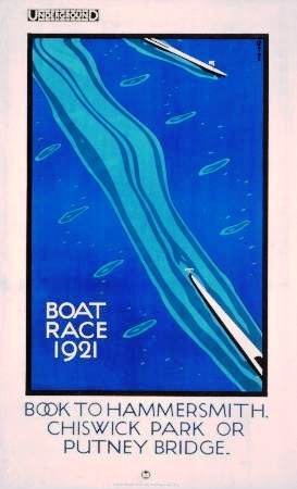
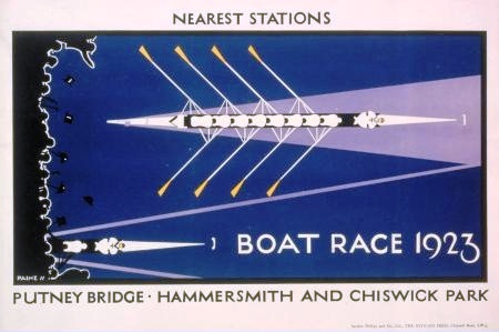
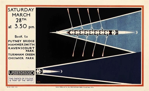
As a poster artist Paine was an innovator. His early work differed sharply from the standard advertising of the day which was dominated, according to Commercial Art, by blonde girls, dark girls, ‘girls of any sort’. Paine understood that an image need not be a literal representation of the subject but need only suggest it. His Boat Race 1921 is an excellent example of this, the excitement of the race being conveyed by the wake and the pattern of turbulence left in the water by the oars. By the use of simple shapes and only four colours Paine created an instantly striking and recognisable image. The limited palette has the added advantage of making the poster economical to reproduce. By the mid-twenties Paine’s approach was being widely copied by other poster artists.
 1925
1925
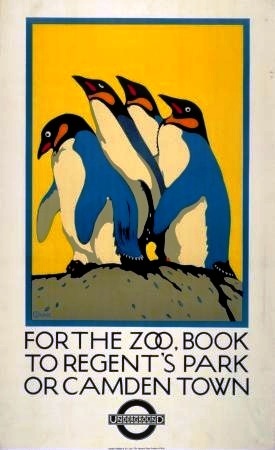
London Zoo features on more Underground posters than any other subject and this 1921 poster is one of the most popular. A typical print run in the 1920s was 1,000 of which 150 were available for purchase at the company’s head office for between two and five shillings. Originals are now hard to come by and command high prices at auction. In October 2012 Christies sold 300 original posters from the archives of the London Transport Museum, including 10 by Paine. Reproductions of the penguins poster are now on sale together with other merchandise.
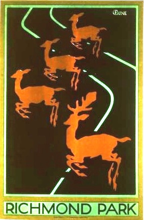
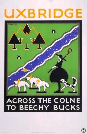
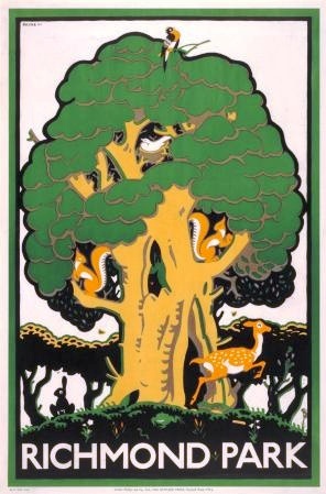
In 2013 the London Underground celebrated its 150th anniversary with an exhibition of 150 of the best posters: Poster Art 150 – London Underground’s Greatest Designs. Included were Paine’s Uxbridge (fishes), For the Zoo and Richmond Park.
The Royal Mail issued four sets of three commemorative stamps one of which included Paine’s Zoo poster.
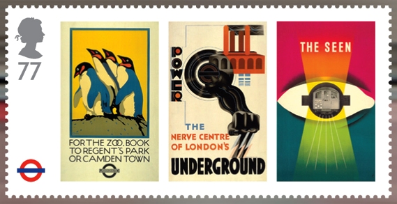
Posters featured (l to r): For the Zoo Book to Regent’s Park by Charles Paine 1921; Power by Edward McKnight Kauffer 1930; The Seen by James Fitton 1948.
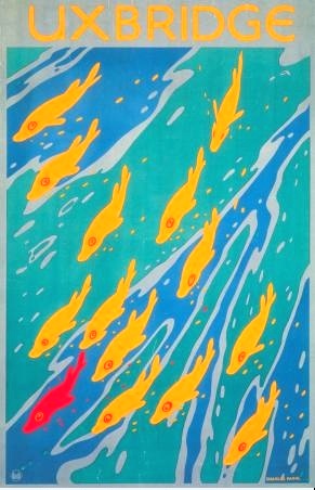
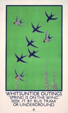
The patterns of fishes and birds in these 1921 posters suggest the countryside that may be found at the end of the railway line or bus route.
 1921 1921
By 1920 nearly all poster text was in Johnston’s classic Underground typeface, devised by the eminent calligrapher Edward Johnston in 1916 and finalised in 1918.
 1922 1922
By the early 1920s the Underground had an established reputation as a patron of the arts. When commissioned the artist would be given a fairly broad brief with the title and subject for illustration being suggested, giving him a free hand with interpretation although there was no guarantee that the work would be accepted. Pick never imposed his own tastes but judged the works on their ‘fitness for purpose’, their effectiveness as posters. As a consequence London’s Underground stations and bus shelters became an eclectic showcase for all the avant-garde European art movements of the early twentieth century – Cubism, Futurism, Orphism and Vorticism. The posters had a significant impact on popular taste, luring people into an enjoyment of pictures on the station wall that they would have disdained in the art gallery.
 1922 1922
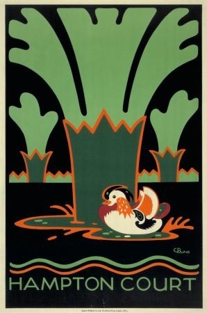
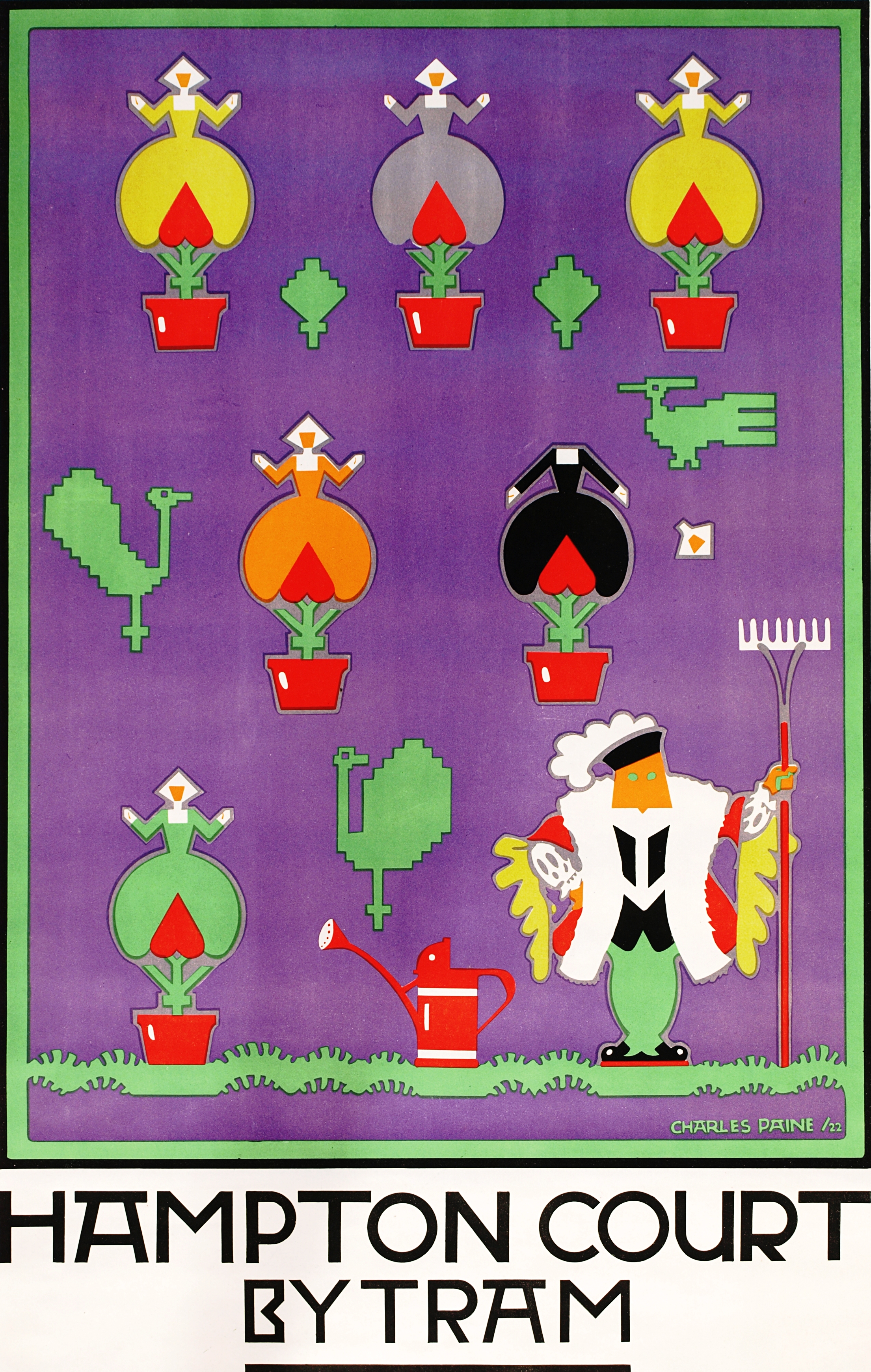
Hampton Court by Tram has some humorous touches. King Henry is depicted as a gardener with rake and watering can. Anne Boleyn has, apparently, recovered her head, for only one head is seen falling to the ground. The topiary birds are not of this world. Pick included Hampton Court, along with other works by Paine, in the volume he edited for the Design and Industries Association (date unknown).
In reference to the Hampton Court poster Commercial Art (1 October 1922) said, ‘Mr. Charles Paine … is not only a decorator, but he constantly originates new poster ideas. His mood fluctuates from the whimsical to the allegorical, and although he can also do strong, realistic work, he is at his best when he can follow his own inclinations.’
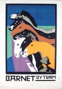
This undated and somewhat dilapidated art work is similar in design to Barnet By Tram. I don’t know if it became a finished poster.
 1922 1925
Paine’s use of solid, brightly contrasting and sometimes unnatural colours undoubtedly owes something to the technique of stained glass making. His fellow poster artist Horace Taylor (The Work of Charles Paine in Commercial Art new series vol. ii 1927) credited Paine’s artisanal training for shaping his high standards of design. He praised Paine’s ‘decorative simplicity and sense of style such as had scarcely been seen since the days of the Beggarstaffs’.
 Date unknown 1929
Not everyone appreciated the modern posters. This Cockney lament, first published in the Manchester Guardian in the 1920s, was found among Frank Pick’s private papers.
A Plaint to the Poster Artist
Oh, I want to see the country Like when I was a boy When the sky was blue and the clouds was white And the green fields was a joy
I want to see the country But the posters seem to show The country ain’t no more the place Like what I used to know
For the sky is pink and the fields are mauve And the cottages all turned yellow And the sheep all green or tangerine Enough to stun a fellow
Oh, I want to see the country And I wouldn’t mind where I went ter So long as I knoo the trees weren’t blue And the cows all turned magenta
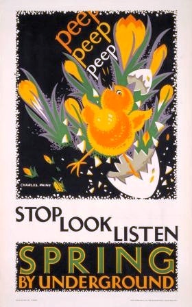
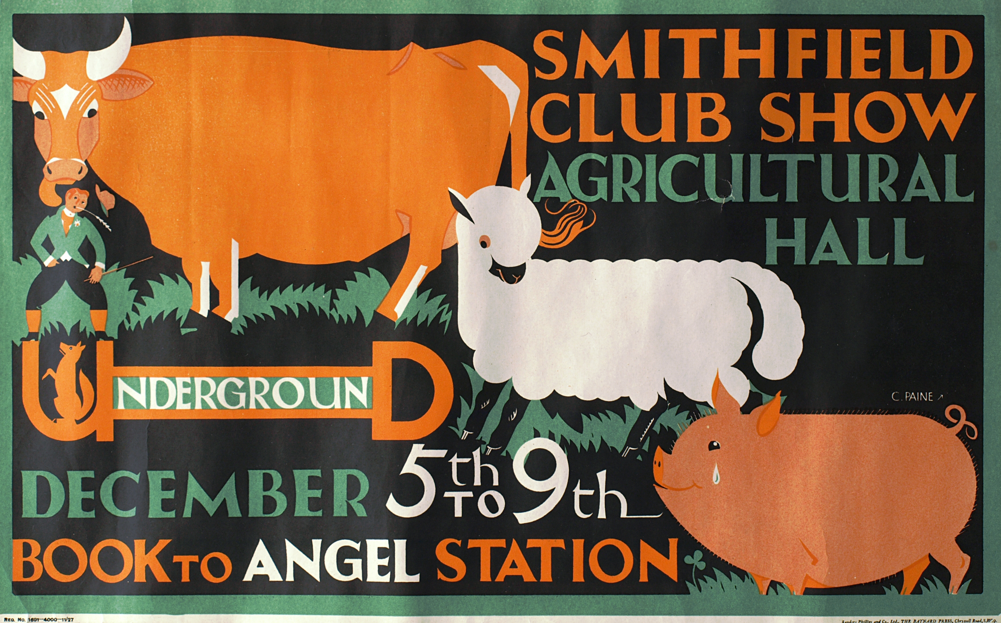 1927
1927
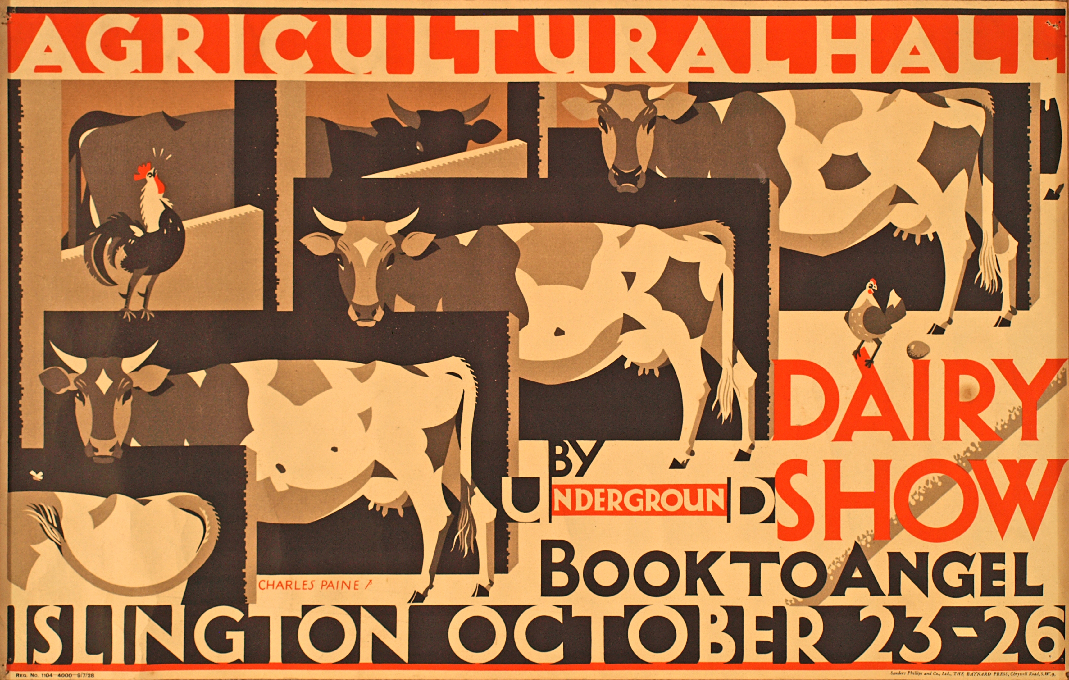
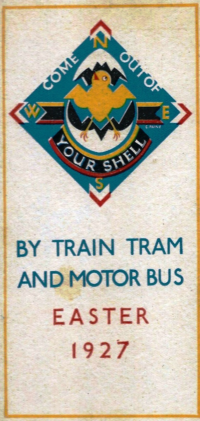
Undated. Printed by Sanders Phillips & Co. Ltd., The Baynard Press, Chrysell Road, SW9
AS early as 1922 Paine was working for the Baynard Press which printed many of London Transport’s pictorial posters. The Baynard Press consciously advanced a modernist agenda. (The Baynard Book of Badges 1921) In The Baynard Press (a leaflet held in the Special Collections of the National Art Library late 1930s) ‘the Baynard ideal’ is plainly stated: ‘To use the designs of modern artists appropriately and fine type intelligently to put beauty born of simplicity into every printed thing’. It continues, ‘The poster artist is the Cicero of the hoardings … He raises armies and rations food. He helps hospitals and builds garden cities. He elects members of Parliament and counsels citizens. The poster hoarding is the poor man’s picture gallery.’
 1926 1927
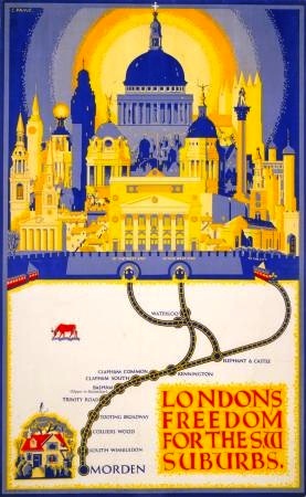
 1926 The style of London’s Freedom for the Suburbs is unlike that of any other poster by Paine that I know of.
 1928
1928

Pingback: POSTERS London Transport — Charles Paine A.R.C.A. – 365posterblog